Showing posts with label TAKE A WORD. Show all posts

Wednesday, 11 June 2014

BLACK AND WHITE FOR T.A.W., AND SO ARTFUL

One design to fit two challenges today:

Shapes in Black and White - Jez
The challenge from So Artful for June is 'Black and White', and this celebrates the time Dev and I went to see Stevie Wonder in the Birmingham NEC Arena - I think it was in 1984.  I have been reminiscing lately on great musical memories, and one of the highlights for us was seeing and hearing Stevie sing for a whole evening.

For Take a Word the theme is 'Shapes', and there are plenty of different shapes in this piece.

I have not been able to visit and comment as I normally love to 
because I am out of action and asleep much of the time.  
I do apologise, and will get back to see you and comment as soon as I can. 

Linking to Take a Word  and  So Artful Challenges

Wednesday, 26 March 2014

TAW EGG FAMILY

The theme at Take A Word this week is 'Eggs'.  With a busy week of hospital appointments this week I didn't think I'd have time for any challenges ……. but there are advantages to long waiting times.  On Monday I was able to sit and sketch the drawings, and yesterday I managed to add colour with aquarelle pencils and a water-brush.

Pitt Artists Pen and Aquarelle Pencils
- Jez
CLICK TO ENLARGE
So meet the Egg Family

Added to that, my check-up after 2 years since the cancer operation was said to be fine, though more blood tests and another CT scan to be double-sure are booked.  So all in all, Monday proved to be not a bad day.

Hope you enjoy the Egg Family, and you are probably quite glad they don't live in your street!

Tuesday, 25 February 2014

FACE NO 26 FOR 29 FACES FEBRUARY

TUESDAY, 25 FEBRUARY - FACE 26


Great day today - we managed to get out, it was sunny and we were able to go to the Matisse exhibition at the Atkinson Gallery.  This is the first time we have been out for almost two weeks because of minor health problems for my other half.  Minor it may have been, but it involved so much time that I have been very slow in visiting other '29 Facers' and commenting, and I do apologise for that because I love visiting.  I set aside yesterday afternoon to visit and comment …….. and then we had visitors, welcome visitors, but once again no commenting.  I'll be with you asap.

So I doubly enjoyed the Matisse Exhibition and the chance to sketch in the Gallery.  Today's Face 26 is drawn on my I-Pad with the Brushes App.  Not exact, but I was pleased to manage it using Brushes.    I'm sure Matisse would have loved an I-Pad, especially when he was older and in a wheelchair - but probably it would have stopped him doing his cut-outs.


I can't make out whether the poor girl has grown two sets of horns, or is perhaps wearing a helmet, and I don't think her necklace design is going to be stocked in the jewellery section.  With her lush, thick plaits and those horns she looks a bit like a Wagner heroine to me.

Linking with 29 FACES FEBRUARY 2014 and the TAKE A WORD 'Blue' theme

Friday, 24 January 2014

HATS AND WORDS AND SOMETHING NEW

FLISS'S HAT TRAGEDY
Mixed Media on Watercolour Paper
- by Jez

FLISS AND THE LADIES GROUP ANNUAL HAT COMPETITION

Fliss, as you can see, is not a happy bunny
She made her own hat and it took a lot of time and money.

She made it to her own design.
- I don't like it, but she thinks it's fine.

She loves the feather and all the flowers,
And making it passed many enjoyable hours.

But then Fliss had a great surprise
- She really couldn't believe her eyes.

A garden, some posts and washing she sees,
And a girl hanging clothes out to dry in the breeze.

This invasion by that squatter of minimal size,
Means our Fliss now has no chance of winning the prize.

That's why she looks grumpy, as grumpy can be,
Though I think the hat's improved, and I'm sure you'll agree.

A NEW APPROACH FOR ME -
SKETCH, COLLAGE AND SKETCH
When I make a collage I work directly by cutting and sticking onto the paper or card, with no sketching and with little or no pre-planning about where it is going.

I thought I would try a different approach for this piece, starting with a sketch, adding some collage elements, continuing with more sketching and then colouring.  The A3 sheet of watercolour paper I used already had splodges of pink watercolour on it.


Next I cut out the hat shape from Docrafts 'Papermania' paper and free-cut the flower shapes from magazine pages.  The flowers that look black are in fact purple, but the colours on the photo have not come out very true.


So this is how it looked when the collage/sketch was done - my entry for the Take A Word  challenge of "Hats-N-Things'',  for Creative Every Day and Sketchbook Challenge "Sketch and Collage".

'Radiant Leaves' - Jez
Watercolour on Watercolour Paper
For Collage Obsession we were asked to use Pantone's Colour of the Year - 'Radiant Orchid' - as the main colour or as an accent colour.  Radiant Orchid is a pretty name for light purply-mauve, and an attractive colour too.   I've used the nearest I could get to it for the four light mauve leaves at the top of the leaf picture.

'HAND' - Jez
Acrylic onWatercolour Paper
Word and frame added on Photoshop
I was pleased with the simplicity and colour of this painting of my hand-print for my offering to the Three Muses challenge of  'Choose a Word'.


Also linking to Paint Party Friday,  Artists Play Room, and Paper Saturdays


Monday, 13 January 2014

THE SOUND OF SILENCE

When I read the theme for January's Art Journal Journey, I had to think hard about how I could create an artwork about an abstract concept.  Then I realised that we are only conscious of Silence as a contrast to Sound, and my inspiration came from that.

"SILENCE IS MADE ALL THE SWEETER BY THE SONG OF A BIRD
Mixed media - Jez
I drew a thrush as my songbird because I have always loved his song best, more than the blackbird or the larks I used to see and hear so often during my childhood.  When I drew the thrush, it reminded me of a poem by Robert Browning I learnt at school.  Although it is called "Home-Thoughts from Abroad" and I had lived in England from the age of three, it's evocation of the English spring made it a favourite.  Browning's lines about the thrush made me listen more carefully to its song and realise how observant the poet was:

                                   "That's the wise thrush; he sings each song twice over,
                                     Lest you should think he never could recapture
                                     The first fine careless rapture!"

I used my favourite poetry book to check that I had the words exactly right, a Christmas present from my dear mother almost 59 years ago.  It has a blue cover in soft leather, and it has been used so often that the back cover has broken off.  Fortunately it slides into a blue card case that holds it together.  I looked back at the inside cover for my mother's dedication, and the years rolled back:

She wrote: "To be new born when thou art old"
SUNDAY POSTCARD ART

For Sunday Postcard Art we were asked to create a postcard (6" x 4") in monochrome, and I have made two postcards on the theme.

A little while ago Dev and I went on a one-day workshop with a talented and individual local artist called Pam Potter  to learn some of her techniques, and the two watercolour paintings below are the result of recent experiments at home with one of those techniques.

Blue Mountains
Brown Hills
To create these simple landscapes I followed Pam's method - applying watercolour paint directly from the tube onto the paper and then using a piece of old credit card to spread the paint down the page.  It certainly produces unexpected effects, and from time to time I try to improve my skill with the technique.

TAKE A WORD

Next,  the theme of "MOON" has been chosen by the Take a Word team this week.  I wanted to do something a little different and out of the ordinary to challenge myself.  It has been a while since I have made a collage from my stock of unwanted photographs so I went hunting through the box of old discarded photos.

The snaps I used to create this imaginary 'planetary collision' were so old that they had been developed and printed from photographic film in a high street photo shop years ago, and it made quite a change to go back to this type of collage.  Each element has been cut out with scissors and stuck down with PVA glue.  It looks fairly complex, but it comes together quite quickly.


"THE DAY THE RED MOON FELL ONTO THE PLANET ZOGG

This picture records that terrible night when, in the Ziluvian Galaxy, the red moon suddenly dropped out of the sky and landed on the planet Zogg, creating havoc and leaving only one home standing.  As the Ziluvian sun rose the next dawn, the magnitude of the disaster was visible to the surviving Zoggonians, and a great deal of sniffing and snuffling ensued (Zoggonians can't weep and wail!).

Full details and loads of video footage will be available on Zogg Sky News later this evening and repeated for the next two weeks on every single hourly bulletin.  Bet you're glad you don't live on Zogg.


Linking to Art Journal JourneySunday Postcard ArtTake a WordArtists Play Room

Monday, 6 January 2014

EVEN A LITTLE HOUSE IS A HOME

'CHOOSHOE HOUSE'
Coloured Pencils and Pitt Artist Pen - Jez
At So Artful there's an intriguing challenge which appealed to me instantly - "A Little House with Something a Little Bit Different".  Various ideas whizzed round my head including the kind of 'Crazy House' that you see at funfairs, and 'The Old Woman Who Lived in a Shoe', but that has been illustrated zillions of times.

Then I thought that perhaps a young woman today might like to live in a shoe house with elegant 4" high heels.  I would have liked to create the house from a shoe with 6" high stiletto heels, but this would have meant that the stairs to the upper floor would be too steep even for a young person.


Co-incidentally, over at Take a Word the theme this week is "Home" with the note that 'any home will do'.  Well, even an odd little house can be a home, so Chooshoe House is my entry for the challenge.

When houses in the UK are advertised for sale by developers or house agents they are never referred to as 'houses', they are always 'homes'.  You have to admit, there is a subtle difference in the feeling you get from 'house' and 'home' ……… and 'home' wins hands down with its warm and welcoming feel.

So 'Chooshoe House' is now being marketed as a unique and individual 'home'.   It's new on the market, so if you fancy viewing it and making an offer, put in your bid soon before the celebrity rush starts (I hear Victoria is showing interest).


Linking with So Artful ChallengesTake a Word, Paint Party Friday, and Paper Saturdays.

Monday, 30 December 2013

HAPPY NEW YEAR TO EVERYONE

Here is my card to wish all wonderful blogging friends the best of years in 2014, with a good share of joy, love, happiness, success, friendship …….. and perhaps even a little bit of World Peace thrown in.

In what has been a difficult year for us right through, as it has for many others, you have all brought me Joy and Pleasure, and I hope that 2014 will be a little easier for us all.
Digital image by Jez - click to enlarge
The snowflakes were created on a little app called 'Silk', which I enjoy playing with.  Everything else was done on Photoshop.

Apart from 'Happy New Year', the words are by Henry W Longfellow, though I'm sure he must have said Happy New Year a good few times in his life.

And this is my 6" x 4" New Year's wish postcard to everyone at Sunday Postcard Art:


I'm linking this to Moo Mania 'Snowflakes',  Take a Word 'A New Year', Inspiration Avenue 'Joy to the World', Paint Party Friday and Sunday Postcard Art 'Anything Goes'.

Monday, 4 November 2013

LAUGH, HEARTS, TREES AND DOORS


Jenn at Artists Play Room has asked us for an interpretation of  'Laugh' as her theme this week.  I decided to go for the personal approach, and this is a photograph my daughter took of me last year.  I hate having my photograph taken, and I was amazed that she could capture this shot of me laughing.  Hope this suits the theme Jenn.


With the topic of 'Hearts' at Take a Word the difficulty was to think of something a little different, and for this challenge I kept to the personal approach.  When I thought of 'Hearts' my mind said 'Where does my heart lie?' - and there is only one answer to that.  So this image contains photos of our wedding day and one taken by my daughter of ourselves as we were last year.  I chose this photo because it's one I really do like and gives the feeling of our closeness.

You may notice that in the wedding day photo Dev is wearing a medal - my mother added a medal ribbon to a chocolate medal and gave it to him saying 'You deserve a medal for marrying our Jez'!  Even after all this time he still has the medal.


At So Artful Challenges the theme is 'Trees'.  This is a photograph I took with a pinhole camera some years ago, cropped to a circle on Photoshop and with a frame added.  I like the unusual angle and the mysterious effect the pinhole camera achieved.


Over at Art Journal Journey the challenge is 'Doors'.  Whenever we are out and about I love taking photographs of doors and windows, and because the doors are invariably closed I can't help wondering what lies behind them.

Linking with Artists Play RoomArt Journal JourneySo Artful Challenges, and Take a Word,

Monday, 28 October 2013

PURPLE AND GREEN FOR TAW

 THE GUY FROM THE LAND OF PURPLE AND GREEN

Let me introduce Horratius, 
who comes from a land where almost everything is purple and green, 
including all the inhabitants.  

And if it's not purple and green, then it's green and purple.

HORRATIUS
Horratius had been lucky enough to inherit a little money from his Great Aunt Decorrus.
He decided to spend it on going abroad for a holiday.  
And he booked himself on a package tour for a week of tuition at a Dancing Academy.

In the first lesson the teacher, 
who had a misplaced sense of fun, 
introduced the students to - 
THE CHARLESTON!  

Poor old Horratius.  
His knees went in when they should have gone out, 
and his hands seemed unable to find his knees.  
He felt such a fool! 


And as everybody stopped and looked at him 
he suddenly realised 
that he was the only purple person in the room.  

He was so embarrassed by his lack of Charleston ability 
and his outstanding skin colour 
that he felt hot all over and went a very deep shade of red.


In addition he was so jealous of all the other students 
whose knees and hands went just where they should.

Like a chameleon, 
the red of extreme embarrassment quickly changed colour to green, 
so full of envy was he.


But all at once everybody smiled and laughed 
and they all applauded his performance.  

And when the music started again 
they all began to perform the new dance Horratius had invented.  

Even the teacher joined in, 
taking careful note of the moves
so that he could include the dance in his future courses.

Horratius, back to his entrancing purple shade,
led the dance,
and was the most popular person on the course for the rest of the week.

Linking to Take a WordPaint Party Friday and Manon's Paper Saturdays

Tuesday, 22 October 2013

ORANGE FOR TAW, AND IT CAN BE SOOTHING AND PEACEFUL

Take a Word this week asks us to include Orange in our work.  Immediately thoughts of orange ran through my head - heat, bright, noisy, a 'shout-aloud' colour.

Why go with the first thought!  I decided instead to try and use orange in a peaceful, calming way, and I think I have managed it.

Watercolour on watercolour paper - Jez
We don't have an aquarium, but watching goldfish swim slowly around a very large aquarium is always relaxing and therapeutic.  That's why some hospitals, business offices and dentists' waiting rooms install them in the belief that it will help people to relax before their appointments or meetings.

Watercolour on watercolour paper - Jez
Even painting these two fishy ladies (or perhaps they are gents) was relaxing, so I hope you feel I've achieved what I set out to do.

Linking to Take a Word

Tuesday, 20 August 2013

A MISCELLANY OF ENJOYMENT

I had lost my creative mojo a little bit, so I spent a few days just playing about with making postcard sized collages just for fun.  The result was that today I found it easy to get straight down to creativity and sorted out five challenge pieces.  So the enjoyment was mine, just feeling the flow, but I hope that you also enjoy something in this post.

Firstly, here is my postcard sized sketch for this week's theme of Baking for Sunday Postcard Art.  This came together so quickly.


I made a very quick sketch in my 'rough' sketchbook while I had my morning coffee, came back to the studio to draw and paint it.  When it was finished, I realised I had concentrated on the 'baking' and had forgotten the postcard size.  So I cheated a little and added some blank space at the top to get it to the right size.

We were given a colour challenge from Collage Obsession, with the colour purple to be used.  Here's my offering:


I just love the rich colour and this image which started from a photograph.  Yesterday my sweet neighbour from the apartment three floors above us came to the door with a beautiful bunch of salmon pink roses because when she saw me on Sunday she thought I didn't look well.  Such thoughtfulness and kindness, and the flowers make me happy whenever I look at them.

The purple image doesn't look much like pink roses, but that's how it started.  I photographed part of the bunch using the Photo Booth app on my i-pad and choosing one of the image types available.  I think this was 'swirl'.  Then in the PSE app (Photoshop Express) on the i-pad I changed the colours to purple.  I love the result.


This colourful scene started as a postcard sized experiment I made with acrylic paints some time ago - just the central section that suggests trees or mountains.  On Photoshop I added the blue and the sandy colours and put a frame around it.

It just fits the brief from Inspiration Avenue of 'Postcard'.  The abstract image gives me the feeling of a landscape, and with our grey cloudy skies at the moment it looks just the kind of warm and colourful place where I'd like to be spending a few days of holiday and sending a postcard back to my friend.


Jen at Artists Play Room suggested it would be a fun theme to use 'Abstracts' as our challenge this week.  So I decided to have fun and created the abstract painting above.  It consists of four waste pieces from a larger acrylic painting that I was cutting up to use for something else.  A constant saying when I was growing up was 'Waste not, Want not',  so I decided to put them together to make an abstract with a difference.

These are the three strips and triangle that I put together, cut the top and bottom straight and stuck onto another piece of card.  Quite pleased with that.

And last of all, here's my offering for the Take a Word challenge of 'Warm Colours'.


The background is something I tried out a while ago, and I have been wondering how to complete it.  I searched through my box of 'failed paintings', and this image of a girl jumped out at me from an acrylic experimental piece.  The girl's size, shape and colouring were exactly right.  I cut her out and stuck her in the cave-like space of the background.  And I loved it.

The girl came from the failed painting that produced the waste strips used for the abstract above.

All in all I've had a good arty day, great fun, and feel I've got my mojo back.

Tuesday, 6 August 2013

ON THE DARK SIDE FOR TAKE A WORD

Click to enlarge
WOW, I never expected that to appear!

How does inspiration come into your minds?  If I'm given a topic that interests me, inspiration often just shoots straight into my mind as an image, and excitement makes me want to get it down on paper right away.

When I saw the theme of "Dark" for Take a Word this week this image flashed into my mind straight away, and I had to get the initial sketch drawn before my brain started adding other ideas.


I saw the word Dark as part of the title for an imaginary book, a gory murder novel.  It's the type of book I haven't read for years so I don't know where it came from.  The page above shows what appeared when I picked up my 'rough' sketchbook to quickly scribble down the initial idea.  No neatness in that sketchbook.

The advantage of a quick sketch like this is that it gives a chance to see if something needs changing.  I realised I was wrong to have the girl's eyes closed because she just seems to be asleep.  I also decided that there would be too much bright red if I did red drips.


Fabriano Fat Pad, 300g HP
In a 'proper' A4 300g sketchbook I made a start on the final piece with Pitt Artist's pen for the head and black acrylic ink for the rest of the cover, slopped on with an old half-inch acrylic brush.

I had fun adding the black ink drips, which ran right down the page and onto the newspaper that I'd fortunately had the sense to place underneath.  Gorgeous black ink to play with.

When you're doing drips you have to accept that once dripped they are what they are, unless you want to start the whole thing again, but I was quite happy with the way these turned out.

I used red acrylic paint for the blood and the spatters, and added the text on Photoshop since I will never be able to write well enough for a book cover.


So this is how my final image was created.  When I asked Dev if he thought it was good enough to post for TAW's theme of Dark, he said:

'Well it's good, but I don't know if it represents the novel because I haven't read the book'.

Nor have I.  No-one's written it yet - so if anyone out there wants to write the story, I'll provide the cover picture for you.


Also linking with Paint Party Friday and Manon's Paper Saturdays.

Wednesday, 31 July 2013

PINK PINK PINK

What a good challenge this week from Take a Word - PINK.  What girls doesn't like pink.

The moment I saw the theme an idea leapt into my mind, making a link between pink with breast cancer.

Here's what I drew:

Pitt Artist Pen and coloured pencils - Jez
My dear e-friend Tracey had an operation this week and I wanted to cheer her up a little.  Those of you who know Tracey will realise how cheeky of me it is to post this wonky drawing of a cup when she is Queen of Cups and paints them perfectly.

I have about five or six boxes of coloured pencil of different makes, and finding any kind of pink, let alone the pinks I wanted, was much more difficult than I had expected.

I'm quite pleased with the result of this little cartoon sketch and hope it gives you both a smile and a reminder to check regularly.

Linking, later this week, with Paint Party Friday and Manon's Paper Saturdays

Monday, 22 July 2013

A CHEERFULNESS OF CHALLENGES

I don't know if there is such a thing as a collective phrase as a Cheerfulness of Challenges, but I have enjoyed making these challenge entries and they have made me feel cheerful.

To start with, here is my postcard entry to the Sunday Postcard Art theme of EPHEMERA:


The definition of ephemera includes 'something designed to be useful for a short time'.  Well, parking tickets are not just useful.  They are essential in today's world, even in hospital car parks which adds severely to the annoyance of having to visit a hospital frequently.  

I was tidying the car's glove box a few months ago (next tidy due in three years!) and I found a wad of parking tickets.  The Morrison's tickets in the card above include one each from 2008, 09, 10, 11, 12 and 13, so old the ink has faded.

The sketch below is from a ten-year-old sketchbook, and I was pleased to find it matched two challenges:


This is a page from a section in a travel journal recording an enjoyable trip to Glasgow, a first-ever visit.  For some reason this sketch popped into my mind and I took out the sketchbook recording this trip to use for the Collage Obsession challenge of 'A Page in a Travel Journal'.

We like visiting museums and sketching anything that takes our eye.  I loved this old car, and challenged myself to draw it by starting at one point and keeping my pen on the page throughout - taking a line for a walk.  I probably lifted the pen a couple of times and pretended I wasn't cheating.  It was a difficult thing to draw but worth the intense concentration involved.

We don't travel far at all these days, so re-visiting the pages of that travel journal brought back many happy memories - which makes it just right for the Take a Word challenge of 'Memories'.  One of my happiest memories of that Glasgow trip is coming across the multi-screen cinema and going to see 'Chicago', followed the next night by seeing 'Frida'.  These are now two of our favourite films, watched many times on DVD.

Lastly, the Artists' Play Room challenge is 'Weather'.  Well, the weather in the past year or so has certainly been a challenge in all parts of the world, so that's how I approached the theme.


I've drawn a very INaccurate map of England and Wales - sorry Scotland, but you are very difficult to draw.

I used weather stickers from a kids sticker book by Grafix, which seemed to me to show the way our weather travels through a range of cloud, sun, rain, sun, cloud, and hailstones all in one day.  At the moment it is too hot, humid and I can feel the pressure that comes before a tremendous rainstorm at the end of a hot period.  Just when all the farmers round about here have planted out their baby cabbages, leeks and cauliflowers.  I know I shall be sad to see them when we drive out again, all battered down with the rain.

As Moana Lott used to say on the WW2 Tommy Handley ITMA show (which only other ancients like me will perhaps remember) ...... "It's being so cheerful as keeps me going."

Also linking to Manon's Paper Saturdays

Monday, 8 July 2013

FISH SUPPER


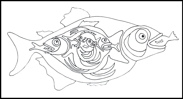
Above all forms of art I love drawing.  Nothing pleases me more than an ink line wandering across a pure white page.  No colour, just black on white.  So I am happy with my drawing today.

When the topic of 'Fish' was chosen as the challenge this week for Take a Word, I left it to sit around in the back of my mind until it came up with something a little different.


'Back of mind' came back to me with the idea of a fish inside a fish for some reason.  Then as I started to draw it, more and more fish kept appearing inside the one inside the one inside ........  I had to spend a little time at the end counting the number of fish in the drawing.


These are the smaller fish inside the large one - makes it a bit easier to count.


I thought I'd add a bit of colour with a background, and found an acrylic background in process in another sketchbook and took it into Photoshop.  Then I superimposed my drawing onto the background which actually has quite a bit of turquoise in it as well as blue and cream.


Somehow I felt compelled to add colour, even though (in my terms) it would spoil it a little.  Flat colours seemed best, so I added them in Photoshop.

How many fish?  Well, I counted ten altogether.

That poor little family of purple fish is really having a bad day today!

Friday, 5 July 2013

BUTTERFLIES ON MY MIND


This week the challenge from Take a Word is 'Butterflies', and over at Inspiration Avenue it's 'Red White and Blue'.  Then at Collage Obsession the theme is USA, celebrating the 4th July.  At first I thought I'd be giving it a miss since I am English, but then decided I could use the 'Red White and Blue' theme there.

My personal challenge was to combine butterflies with red, white and blue, a rather unlikely pairing perhaps.


I love butterflies, but I wanted a different take on them, and rather than create a picture with pretty, colourful butterflies I was inspired to turn them into a red white and blue abstract which disguised the original butterfly drawing.

My start point was the single butterfly outline above, drawn with black pen in the middle of a sheet of A4 white Bristol board.


I kept repeating the drawing fairly randomly over the page so that they interlinked.


At this point I decided that a 6" x 6" square would produce what I wanted, and cut out a frame to help me choose the section I liked best.


And this is what I chose.

'Butterflies in Hiding' - Jez
This is the finished abstract, coloured in photoshop.  You should be able to pick out some of the butterflies at least.  I do like the way the pattern has curled around in an unexpected fashion.