Showing posts with label EXPERIMENTING. Show all posts

Tuesday, 18 March 2014

CYANOTYPE, BLUE, BLUE AND MORE BLUE

ONE-DAY WORKSHOP CLASS

Two weeks ago Dev and I went to a Cyanotype workshop at the Atkinson Gallery with cyanotype artist  Sian Hughes.  Very exciting, and we produced quite a number of different images during the day.  There were only six of us on the workshop which gave us plenty of opportunity to ask questions of Sian, who was very generous with both her knowledge and materials.

I've chosen my favourite pieces from my day's output to show you.  The camera didn't seem to like the colour of the cyanotypes which come out with a deep, rich blue, even though the colour seems to vary in my photographs.

A5 Cyanotype with dried weeds and weed seeds
4" x 5.5" - Jez
Sian explains the process on her website better than I could.  She writes:

      This camera-less photographic process was developed in 1842 by the scientist John Herschel. Paper coated with a light sensitive solution turns green. When this is exposed to sunlight or ultra violet light it changes to a rich indigo.  Objects placed on the paper, blocking the light, leave precise white photographic images

A5 Cyanotype with dried stem fragments and honesty seed
4" x 5.5" - Jez
Sian had prepared paper for us in advance with the light-sensitive chemicals, and all we had to do was follow her instructions and demonstration.  We placed our prepared paper with the items chosen for our image into a vacuum bag, like the ones you store clothes in, and extracted the air.  We put it in the light box for several minutes, then took it out and placed it in water for another few minutes and then dried it on the window-sill.  

                           
                                     Cyanotype with feather, butterfly image
                                      on acetate, and small plant form
                       5.5" x 8" - Jez
2" x 7.5"
- Jez
Because we made our own choice of materials from the table full of dried plants, flowers, leaves, seeds, and other materials, everything was an experiment.  Some pieces turned out well while others were not as successful, and that was a good way to learn.  I'm showing you the ones I was most pleased with.

Cyanotype with map on clear acetate
5.5" x 4" - Jez
I can't remember exactly, because we were all working at such a speed and with so much enthusiasm, but I think this map was printed on clear acetate sheet.  I chose it to experiment with because I was intrigued by the idea of using something other than plant forms.  It came out really well (and it is the right way up), and at home I mounted it on a piece of blue paper to frame it.

Cyanotype with text printed on
thin plastic wrapper
4" x 5.5" - Jez
I picked a crumpled piece of plastic wrapper for foam cups out of one of Sian's boxes, spread it out as carefully as possible and laid it on the prepared paper, plus a paper-clip that I saw on the table, ready to put in the light box.  Lovely clear print.

Front cover of book
Dried leaves
A4 watercolour paper - Jez
Towards the end of the workshop Sian said that we were each going to make a book with several blank pages so that, back home, we could stick our day's work in it as a memento.  We each prepared a cyanotype front cover and a back cover with A4 watercolour paper and our own choice of material for the image.  I found these delicate fern-like dried leaves among Sian's supplies.

The image above shows the front of my assembled book, with slender bamboo sticks tied with blue ribbon to hold the book together, and I think the image is really stunning.

Back cover of book
Dried plant stems
A4 watercolour paper - Jez
The finished version of the back cover shown above included the addition of some pen drawing and water-colour paint to form 'flowers'.  I found that the dried plant material I had chosen for the back didn't produce a clear image as you can see below, and there wasn't time to make another one. 


This was the result of the cyanotype image when I made up the book, but at home I used a Pitt Artists Pen to turn the blotchy shapes into 'flowers' and painted them yellow, which I think improved the image greatly.

Just two more examples:

Cyanotype with scissors, strips of card
and gauze ribbon tied loosely in a knot
4" x 5.5" - Jez
As we packed up at the end of the workshop, Sian gave each of us two pieces of prepared paper, wrapped in kitchen foil to keep out the light, so that we could make a couple more images at home.  I wanted something completely different, so I used a pair of nail scissors and two strips of card that were on my desk, plus the small piece of ribbon.

I simply placed these items on the prepared paper, no vacuum bag, just the paper and the chosen items.  Then I put it on the window-sill for a few minutes on what was fortunately a sunny day.  As the sun moved across the sky, it threw the shadow of the scissor handles in slightly different positions, which makes the scissors look almost 3D.

Cyanotype with 'tree shape' cut
from thin card, plus star sequins.
4" x 5.5" - Jez
My last piece was my favourite, with a mask shape cut quickly from thin card, and sequins added for stars or flowers.  Exposed on the window-sill like the scissors image.

Such an enjoyable and productive course.  Making these reminded me that about 12 years ago I bought some 'Sun Print' paper to use with my youngest granddaughter.  We simply put the papers out on the path with our chosen material on top - a feather, dead leaves or flowers.  Then we left them to let the sun turn the unexposed paper blue, like the cyanotypes, though it is a different process.  I also remembered that I had kept the unused Sun Print paper wrapped securely in black plastic, and I even managed to find it.  I shall experiment to see if it still works.  Just Google 'Sun Print Paper, and you will find companies that sell it if you'd like to try it.

Tuesday, 11 March 2014

EXPERIMENTING WITH A NEW SKETCHING STYLE

TRYING TO LOOSEN UP

'A LITTLE PEPPER PROBLEM'
Watercolour in A4 Sketchbook - Jez

CLICK SKETCH TO ENLARGE
I've always found it difficult to work with a looser sketching style.  It comes naturally when I am doing silly doodle drawings, but when I have tried with 'proper sketching' I've felt I just made a poor drawing.    This year I am determined to move forward on this front, as well as my usual drawing style, and extend my abilities.

I was quite pleased with this PEPPER PROBLEM sketch, even though someone had used half of the pepper I was planning to draw.

I've been able to start creating in this way with more confidence because I found a wonderful blog of Lynn Cohen's called PAPER, PAINT, PENCILS AND PENS!, with a new theme every two weeks.  The current them is 'Kitchen' and seeing the work other members have created has encouraged me to show work that I would otherwise keep hidden in my sketchbook.  Check out the PPP&P blog and see the work of lots of wonderful artists.


'KITCHEN SPOONS AND FISH SLICE'
Coloured Pencil in A4 Sketchbook
I couldn't think what that middle implement was called when I was drawing these kitchen implements, nor could Dev.  Then in bed I suddenly thought of it, and said loudly "FISH SLICE" and he said "Fish Slice".  End of conversation.  After over 56 years we don't need to make lengthy explanations!

I had intended to draw just the spoons and fish slice, but when the sun suddenly shone in brightly the shadows gave such vitality and depth to the image.  I'll keep trying.

Linking to PAPER, PAINT, PENCILS & PENS!

Friday, 29 November 2013

NAEDM WEEK 4

This is the last full week for November Art Every Day Month, and I can't believe how quickly it has gone.  Dev had a medical procedure at the hospital yesterday afternoon, Friday, and woke this morning feeling unwell.  We've had plenty of hospital appointments lately, including three last week, but Friday to Monday have been far from fun with rushing about to get weekend treatment for a hospital induced infection.

Normally I'm lucky to get a couple of hours in the studio on most days, but I've been so glad of NAEDM this week.  I know I wouldn't have created anything all week otherwise, whereas it has made me snatch the off half hour or hour, and given me some relaxation.

SATURDAY

Fortunately I managed to find an hour late in the morning for a doggerel doodle while Dev went back to bed for a snooze, and Bertie Birdsong came powering in to cheer me up as I painted him.


BERTIE BIRDSONG
HE'S NO WATERFOWL, BUT HE IS A DEDICATED AQUATIC ATHLETE

Bert's a swimmer, full of vigour,
But even fuller in his figure.
He swims each day, this avian swimmer
But still his tummy gets no slimmer.

In shorts and goggles he's quite dashing
When he swims backstroke - with lots of splashing.
He feels his efforts in the water
Should make him slim - well it really ought-ter.

When Bertie leaves the briny sea
He'll have a nice hot cup of tea,
And several choccy bikkies too.
-Well I would anyway, wouldn't you!

This is where I ask for ADVICE, please.  I tried everything I could think of to give the effect of his body and swim shorts underwater - lifting the paint before it dried fully, painting over with the sea colour, even powdering a pastel colour and rubbing it over with my finger.  Does anyone have a way of getting a good underwater effect please?

SUNDAY

Dev feeling more unwell, and once again I managed to snatch an hour while he returned to bed in the afternoon.  I wanted to try out my new Gelli plate, which arrived last week.  I've resisted the lure of a Gelli plate for a long time, but decided that I might be able to use it in a way that suits me and allows me to experiment.

These are my first attempts at using the Gelli plate.  I printed only about ten pieces and these were the ones that I felt acceptable.  They are all printed on fabric, in the hope that I can work on them with stitching and drawing when I have more time.


The print above was printed on a piece of fabric I prepared last week, with strips of fabric glued to a sheet of paper and painted with watercolours.


Looks a bit of a blotchy mess, but some day I want to stitch around the vague figure shape I see.


This was the second print of the same piece, which I've cropped in a bit too much.  Before taking this print I had pressed a crinkly sheet of packing plastic over the acrylic paint left on the plate.  I liked this one better and could see more possibilities in it.


The inspiration for this print, and the idea of sticking strips of fabric to paper came from a gorgeous book I downloaded on to my Kindle - "Mixed Media Master Class with Sherrill Kahn".  I would have preferred the print version, but for some reason only the Kindle version was available at just under £6.  I've been reading it by dipping in and out on my I-Pad in my coffee breaks and finding it easy to follow and jump from to place.  Very inspirational, and although only a page or two was devoted to the Gelli Plate it was enough to give me the push to buy one.


I like this bright print, and definitely see ways of developing it with stitching, hand and machine, and adding things like beads and buttons.  At this point Dev was very unwell and I had to dash him back to the hospital.  Just had time to clean the Gelli plate and everything else was left.  He was given an antibiotic to clear things up.

MONDAY

The hospital antibiotic gave Dev an allergic reaction later in the day, which most antibiotics do, and fortunately I managed to speak to our doctor who gave me a prescription for a different one just 5 minutes before the surgery closed.  I dashed in to town to the supermarket pharmacy who fortunately had it in stock.

Untitled - Jez
A3 Watercolour paper and acrylic paints
Before the allergy mini-emergency, I managed about an hour to create.  I chose an A3 watercolour pad containing a work in progress.  I call these my 'Story Pictures' and normally do them with black and red pens, but I had decided a while ago to try one in colour with acrylics.  There is a lot to do on it still, as I usually cover the whole page with plants and creatures.  I take my time with them and just add a little more now and them which is what I did today.

Terrible day for photographing and the page is too big for the scanner, so it's difficult to see the pencil lines I added.  Today I painted a first layer of green to the dragony figure on the left, drew the bird at the top with pencil, added a few touches of colour to the teeny-tiny figures, and drew and started colouring the big fish on the left and the three little fish near the smaller dragon on the right.  This is how I work with these paintings, very unsystematically.  Pleased to have snatched just enough time to add those few touches.

TUESDAY

Managed a couple of hours while Dev was resting and snoozing in bed again, determined to get better as quickly as possible.


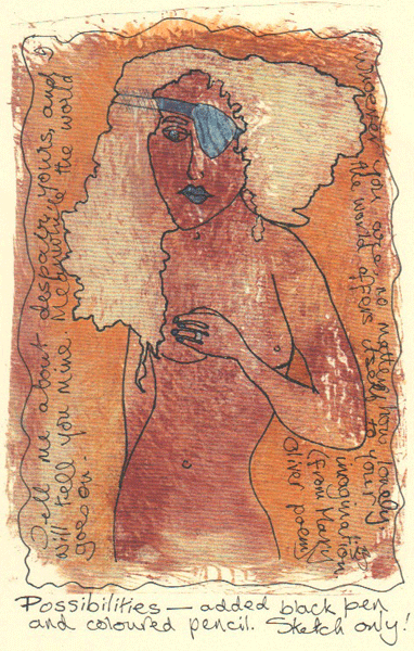
My creativity was at a bit of a low, so I picked up this fabric print I made on Sunday and added detailing with a white pen and a copper-coloured pen.  Not my usual style, but that's what experimenting is all about.

I didn't want to use the fabric print from Sunday's printing session, so I photocopied it onto cream card and drew a rough sketch on that.  The figure showed up so clearly on the second pull of the print, even though it was the result of randomly splotched paint.  You may be able to see that I carried the strap of the eye-patch across the girl's hair, then crossed it out because it should have gone under her hair.

I don't do a lot of adding text but something made me pick up my Mary Oliver poetry book and pick out two disconnected lines from a poem called 'Wild Geese', which seemed to fit the image:

Tell me about despair, yours, and I will tell you mine.
Meanwhile the world goes on.

Whoever you are, no matter how lonely,
the world offers itself to your imagination.

(The despair is definitely the eye-patch girl's - not mine.  I try always to live in hope.)

WEDNESDAY

I've been pleasantly surprised as how speedy it is to get out the Gelli plate and equipment required, take a few prints and put it all away again, with very little cleaning up to do.

These 3 prints (all I did) are my second attempt, trying the kind of approach I want to take with it.


I wanted to produce a mono print.  I cut out a mask shape inspired by a magazine advertisement and printed over it, learning as I went.  After this point I cut pieces of wavy card to put at the sides and added more blue paint.  I can see lines that show I was pressing too heavily on the brayer.

When I took the mask of the figure off I realised the paper was too thin and it tore off in short pieces.  Very difficult.  Note to self: use card next time.


Yes, the figure came out all right, but then I realised I should have started by rolling one or more light colours so that the figure was coloured.  Should have thought that one through.


Print of two giddy girls.  This time I stapled two pieces of card together and freehand cut both figures out in one go, then remembered to put the blue paint on before adding the masks.  All very simple, but I can see where I am going.

THURSDAY

Persuaded Dev to bed in the afternoon although he insisted he wouldn't sleep.  Two hot water bottles, a pillow behind his back, and an hour and a quarter later he woke up, feeling much better!

'Cockerel' - Jez
Inktense pencils and various other brands of coloured pencil
This morning I made a giant panful of thick hearty soup, enough for three meals, and a large pan of carrot, red pepper and orange soup to be semi-liquidised for three lunches.  Some in the freezer and some to use.  Even so I managed to get time here and there to add up to about three hours in the studio.

Last week I drew and pre-painted the background for this cockerel with Inktense pencils to provide a base.  This is the finished bird, using any of my several sets of coloured pencils that provided near enough the colour I wanted.  How many boxes of coloured pencil does any one person need!

As many of you find, scanning a picture into the computer never seems to get the colours right.  The colours of my cockerel are not true to the drawing, and the texture doesn't show very clearly but it's a really grey day and there was no option.

I really enjoyed doing this, it was a great relaxer, and it came together very quickly.

FRIDAY
'Vase' - Jez
Black and red pens with collaged vase
The week has been very worrying and tiring, and this afternoon we have a visit to yet another, different, clinic which Dev doesn't want to miss, so I wanted to create something quick, easy and soothing to do in the short time available in the morning.

Out come the pens, black and red.  I drew the outline for the vase then added the 'flowers'.  When I came to complete the vase my mind took a sideways step, and instead of adding a design with the pens I thought it would be good to add it as a collage.

When I was Gelli printing earlier this week I used a few scraps of fabric as rags to wipe up excess paint.  I photocopied them onto cartridge paper and chose a section to collage on for the vase.  I love the way it shows the texture as well as the colour, and will use this technique again.  All done very quickly and enjoyably.

As far as creating art is concerned this has been a satisfactory week in spite of life's problems because I would have done nothing without AEDM.

SATURDAY

Yes, I know it's not Saturday yet, but there are no rules in NAEDM, and I didn't want to do a post tomorrow with just Saturday's creation.  So here, for Saturday's piece, is a quick sketch I decided not to include last week.
I look forward to catching up with blogs I have missed this week.  Have a happy weekend.

Linking with November Art Every Day Month,  Paint Party Friday and Manon's Paper Saturdays and Try it on Tuesday

Friday, 22 November 2013

NAEDM WEEK 3

Well, here we are, week 3 of November Art Every Day Month, and somehow I'm just about managing to keep my head above water - and have fun at the same time.

SATURDAY
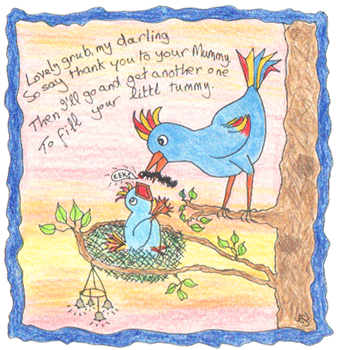
'Mother Love' - Jez
Derwent Coloursoft Pencils
Lovely grub, my darling
So say thank you to your Mummy,
Then I'll go and get another one
To fill your little tummy.

I received a brand new gift of a box of 24 Derwent Coloursoft Pencils in the post yesterday.  I couldn't wait to try them out this morning to see what they could do, and decided that a quick doggerel doodle would be just the thing for a test piece.  They are nice to use, and with all the other sets of coloured pencils I seem to have collected I should have a fairly decent range of colours overall.

SUNDAY

I'm a great admirer of Denthe's  work, and I was inspired by her PPF and NAEDM post several days ago to paint a 4" x 4" picture.  The sketch I used was in a small sketchbook just a little bigger than that size which I often take with me to the Wildfowl and Wetland Centre on one of our regular visits.

I wanted to leave my original sketch without any added paint because I liked the simple drawing, so I photocopied it twice onto nice smooth cartridge paper.  The finished 4x4s were mounted on maroon red card which looks good, but has come out looking almost black here.


All I have add paint to, using watercolour paints, are the birds and grass, exactly as drawn in the sketchbook.  In fact they are all snoozing on the grass, and that's why the blue chappie looks as if he is floating in the air in my sketch.  And no, they don't have Multi-Coloured Geese at Martin Mere, but I felt like painting them in those colours.

I enjoyed trying out this mini-size painting and the demands it makes, so 'Thank you Denthe' for the inspiration, and I'll be playing with the size and format again.


I painted them again in the same colours on the second copy, but I wasn't as happy with that.  I was going to draw over the geese with coloured pencil, but time ran out, so I scribbled in a background.  Not at all happy with that, very carelessly done.  And I prefer a clean white background to drawings and sketches.

MONDAY

After 'GARDEN OF EDEN' - c 1926
William Roberts
This was the sketch I made in the Atkinson Art Gallery last week, in the first exhibition of the newly refurbished gallery.  The painting caused controversy when it was shown in the Gallery in 1928, and was removed because of objections by certain people.  The removal was reported in local and national newspapers, and many people worried that it made Southport (a popular seaside resort) seem prudish and narrow-minded.

I love everything about this painting, the huge hands, the geometry of the columns of legs and the contrasting circles and curves.  But especially I like the way Eve is hushing Adam's mouth - "You keep quiet, I'm going to do it anyway!".

This sketch took over an hour to copy just these two main figures and the serpent.  What looks so simple is in fact complex and I found it demanding.  I hate drawing with pencil, but most galleries we go to don't allow anything else in the picture sections.  I much prefer to draw with a pen because there is no temptation to start rubbing things out and being fussy. I drew over it with Pitt pen so that it would photograph clearly, and to please myself because I like ink drawings.
 
I considered adding colour to my drawing, but then decided this is how I like it, and it's a record of what I actually did during the day at the Gallery so it's staying as an uncoloured drawing.

TUESDAY

Another hospital day, at yet another different clinic, so today I have only a couple of doodles painted on my I-Phone with the Brushes App.  Well, it helps to pass the time and keeps my mind occupied, and it's all I managed to create art-wise today.


I've decided this fellow is called 'Angrus'.  He looks a little like an angry Liver Bird.  

For those of you who don't live in the North-West of England, the mythical Liver Bird is the city emblem bird of Liverpool.  Huge carvings of the Liver Bird perch on top of domed towers on the 102-year-old Cunard Building that stands at the Pierhead overlooking the river.

The Cunard Building has two clock faces, each larger than Big Ben's clock face, and they can easily be seen from the river.  We once went on a tour up one of the towers and it was amazing to stand behind the translucent face of the clock.  The tour carried on right up the tower, but we chickened out of that.  For once our spirit of adventure deserted us.


The only problem I have with the Brushes App (in the version I have anyway) is that it is not possible to 'fill' a section like the wings and tail with paint.  I have to carefully paint inside an outline if I decide I want it completely coloured.  Still, that takes a lot of concentration and so it helps the time to pass.  We always love to see the flocks of swans flying over our home, in and out of the local Wildfowl sanctuary, though there hasn't been a brightly coloured swan like this visiting so far. That would bring the birdwatchers flocking in!

Autumn is a lovely time for the wild birds, and it's wonderful every day to see the great flocks of geese flying overhead, honking away, making for the Wildfowl and Wetland Trust Centre or the River Ribble estuary.  Little pleasures like these add so much to life.


And this ….. just the swan with a filter applied.  And I am addicted to adding a frame on Photoshop to nearly all the things I post.  I suppose I like the 'containment' feeling of enclosing the image.

WEDNESDAY


Here's my Blue Dancer, cut freehand out of fun foam as a printing experiment several days ago.  I decided to try just the male figure today and took a print using dark blue acrylic paint.  It's reasonable, but nothing special, so I'll keep experimenting.  The final result is pretty well what I had in mind, with the patterns added with white pen and a shiny copper-coloured pen - not sure what they are as they are not labelled, a little like gel pens but flowing much more freely.  Quite pleased with the final image here, but too labour-intensive for something I could have just drawn by hand, unless I decide to take more prints from it.

THURSDAY

Finger Painted Digital Image on Brushes App - Jez
Yet another clinic day for poor old Dev, and a longer one today.  So in the waiting room I followed my usual practice of drawing with the Brushes App, but this time I took my I-Pad for the purpose.  I decided on an abstract creation for a change, and this was the result with no pre-planning,  just drawing one line followed by another.  When it came to adding a few words you can see my frustrations emerging a little, even though I am a patient waiting room inhabitant from long years of practice.

Quite surprised at what emerged, and pleased with it.

FRIDAY

A work in progress today, just the first layer of what I intend to create with coloured pencils.  This was sketched from one of my own photographs.


The under-painting here is done with Inktense Pencils.  I thought I would try using them as watercolours to start the painting, and see how that would help to do what I wanted with the coloured pencils.  I'll probably use my new Coloursoft pencils, as long as I have the colours I want in the box of 24, otherwise it will be a mix of different makes of pencil.

This is as far as I got this morning - and in fact it's as far as I will get all day today as there are other things happening that will take up the rest of the day.

Thank you for visiting me, and I always welcome your comments and advice.  Have a happy weekend.

Linking with November Art Every Day MonthPaint Party Friday and Manon's Paper Saturdays.

Friday, 15 November 2013

ART EVERY DAY, WEEK 2

I no longer sell my work, and so I have the freedom to create anything that takes my fancy, silly or serious, doodling or experimenting, as you can see from the 'work' I do.  It's always fun that way.

I'm creating each day for NAEDM and combining the Saturday to Friday creations into a single post on Fridays to make life easier for myself.  Here is a run-down of some of the things that have kept me occupied this week.

SATURDAY

Garvey Greengrasse
The Green-fingered Gardener
Garvey is generally a grumpy guy
not garrulous or gregarious.
He won't grow anything 
unless it starts with G.

Garvey gardens in Greenwich
growing gigantic gourds, 
garlic, ginger and greengages, 
grapes and gooseberries.

His gardens are gorgeous 
garlanded with geraniums galore,
glorious geum, godetia and gentian,
gillyflowers, gazania, gardenia and gypsophelia
- all germinated in Garvey's greenhouse.

Go Garvey go, get going and get growing!
(but try to include some plants that start with P).

That's the total of what I created this morning and this afternoon we are off to the marriage 'Blessing Ceremony' of our youngest granddaughter Eleanor (Zoë's daughter).  The wedding has already taken place in the registry office, followed today with a blessing in the church and then the reception.  I'm hoping to be able to get a few informal snaps so I can include a couple of shots of the happy couple in tomorrow's section.

SUNDAY


A moment when Eleanor's happy, bright personality showed through as she turned just for me.


Eleanor and Andrew, such a happy young couple, together since they met at college at 16 and so in love.  I love the cheeky smile she has in this photo.


The photographer's assistant was arranging the train of her beautiful dress and it was a nice unposed moment.

MONDAY

Watercolour, text and frame added on Photoshop - Jez
As today is 11/11/11, Remembrance Day, I did my own remembering, in particular of family members who fought in WW1 or WW2, with this painting of poppies from one of my own photographs.

TUESDAY

Watercolour, with text added on Photoshop
I created this watercolour abstract for Try it on Tuesday's November challenge of COLOUR EXPLOSION.  The text was added with Photoshop, with a poem I wrote myself to match the challenge theme.

WEDNESDAY

Not a pretty sight, but this is how I am feeling this afternoon because of silly little mishap.


I went to a shelf behind my work table in the studio to select a folder I needed.  Everything dropped out of the folder and slid between the shelves and the box I keep my pens, pencils and other bits and pieces on beside my chair.  Sudden movement in annoyance - I bent down to pick them up from the narrow space and wham.  One of the mechanical pencils was point upwards, I missed the space, hit the pencil and the lead drove right into my flesh at the base of my thumb.  Very painful and deep.

Dev spent over half an hour of digging about with a needle and the help of a magnifying glass and managed to extract most of it.  By that time I agreed through gritted teeth that we just had to leave the little bit that was left and slap some Savlon and a plaster on it.

So this is a painting of how I feel now, not how I felt while he was doing it - that would not be a pretty sight.  I learnt this style of painting with acrylics on one of Kristin's 'Tutorial Tryouts on Tuesdays', very quick to do and enjoyably sloppy to do with all those drips.

THURSDAY

'The Winnower' - Bronze Sculpture
Sean Rice (1931-1997)
Pitt Artist's Pen
Dev and I went to draw in the newly re-furbished Atkinson Art Gallery in Southport today.  We had coffee and toast in a café before going in, drew for an hour or so, went out for lunch, and spent a final hour or so in the gallery again in the afternoon.

These three small sections of the sculpture took me an hour to draw!  I couldn't attempt to draw the whole thing.  It's a large sculpture mounted at eye height on a plinth, intricately convoluted and twisted, and though it is quite frightening I love it.  It certainly very demanding and tiring.  Fairly pleased with the results.

My morning piece was in pencil because it was in the picture exhibition area.  I need to draw over it with pen so that it will photograph clearly, and hopefully add a little colour to it.  So that will be a piece for next week.

FRIDAY

And here's Friday's 'Start the Day with a Warm-up' doodle.  Say hello to the Wooga Wooga Bird, who seems to be under the impression that she's in need of help.  I'd say she certainly needs help from a stylist - and a good photographer.

'THE WOOGA WOOGA BIRD'
Water Soluble Crayons on A3 'ordinary' paper

Thursday, 15 August 2013

CHAGALL COURSE WITH ADAM AND EVE


My Version of 'Adam and Eve' - Marc Chagall
In July, Dev and I went to a three-day Summer School at the Liverpool Tate Gallery with the theoretical and practical work based around their wonderful Chagall Exhibition.   We had booked quite a while earlier, and even though it was a difficult time for us decided that it would be good for us to go.

As it happened, the Course Leader had based the course around 'Memories', linking it to the way Chagall used memories in his work so much.  This was a bit of a blow because, as I mentioned a few posts ago our daughter had died only three weeks before, and the idea of drawing and painting about our memories was just not something we could face.

So we spoke to the tutor and explained, and it was arranged that we would set our own aims for what we wanted to get out of the course and opt out of the group work.  I decided that I would spend as much time as possible in the Gallery just soaking up the 60 Chagall works on display, observing and writing, and experimenting to see how it all might influence my own practice.

Easier said than done, as I'll explain, and I'll show you the mental process I had to go through to get myself even able to draw so that you will know it doesn't always come easy to me.  


I wandered around the gallery trying to get the pencil to actually touch the paper.  Have you ever felt like that?  Sometimes it's so difficult to make that initial pencil mark and this time is was particularly difficult.

The floating head piece at the top of my first page above was a complete failure, with not enough space allowed and everything really badly drawn.

So I tried to draw just the cat from Chagall's 'Paris Through the Window', a tiny part of the large painting and apparently so simple.  But could I draw it, oh no.  I tried over and over again in the same place on the page, both looking at it and without looking.  You can imagine how un-pleased I was with the page above!


I did a lot of careful observation and writing as well, including what you can see on the second page above.  Still trying with the cat at the top of the page, and then a two-way head from another part of the painting.

A bit better.   I wandered around the gallery for a while then went back to the struggle with the cat.  I will NOT be beaten by a cat!

Yes I was, and soundly beaten too.  What I have written beside it is 'I still cannot get this blasted cat right, not even his/her expression'.  The head is like a human head with cat ears, so simple but so difficult.

My mood was lifted a bit at that moment when two ladies passed by.  They obviously didn't think much of Chagall's paintings, because one said to the other 'Look at that!  He doesn't even know how to draw a cat.  It hasn't even got any whiskers.'
                                     

I felt I could tackle a drawing now, but decided that I would choose a painting I really disliked rather than something I liked.  This one, a very large painting entitled 'Homage to Apollinaire' is not typical of his work, and it is so dark and gloomy in colouring.  I read later that it's original title on his initial sketch was 'Adam and Eve', which makes a little sense of it.


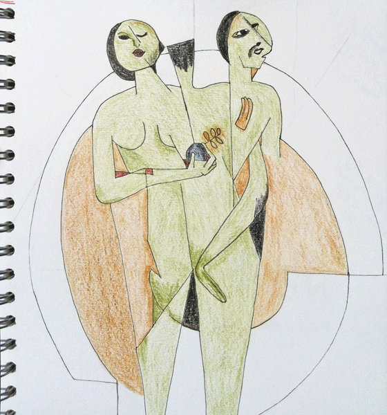
As so often happens, I forgot to take a photo of the initial drawing, and even when I did photograph it I missed out the lower legs.  This is when I'm partway through adding colour with pencils and you can see that I just focussed on the main figures.  You may just be able to see some of the faint guidelines I used to help me.

It looks such a simple image, but my goodness it was difficult to draw and it took me ages.

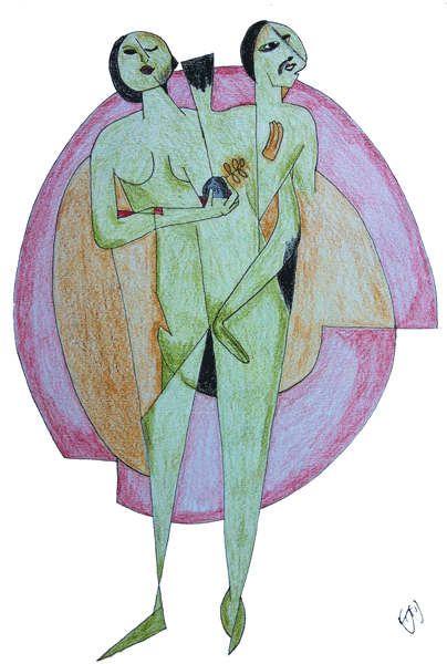
Here's the final piece of my version of the central image.  By the time I had finished I appreciated the complexity and cleverness of the Adam and Eve figure.  Two bodies emerging from the clay source, Adam first and Eve from Adam.  It is clever and subtle, especially the placement of Adam's hand.

All in all, in spite of the struggle I was happy with what I had achieved, and knew that I would be able to get into drawing easily the next day.

If you are still with me, thank you for staying to the end.

Linking to Paint Party Friday