Sunday 30 June 2013

FIRST ATTEMPTS AT PORTRAITS FROM LIFE

Oil paints on canvas board - Jez
I wanted to share with you a couple of unfinished portraits of my daughter Carol.  They are just the second level of under-paintings, and for some reason they were never finished.

Although I have always drawn faces, and copied faces from newspapers and magazines, this was the first time I tried to paint a portrait from life.

Oil paints on fine grain canvas board.
14" x 18" - Jez
This is the full size of the picture, but I think I prefer the digital crop that I showed at the top.  At the time she was just 18 years old - 36 years ago.

Is it a good resemblance?  Well not quite, but both Dev and I feel it shows her beauty, calmness and reserve, and something of her brave, determined character.

Blue Oil Paint on canvas board - Jez
This is a digital crop of a blue version I tried at the same time - again unfinished.  Now that it is displayed here I see a diagonal line of shadow at the top, cast by the window when I was taking the photograph for this post.


This is the full painting. The paintings have suffered a bit from be stored one on top of another in various cupboards over the years.  It's not quite as like her as the one with the yellow background.

Whatever their artistic value, these unfinished paintings are beyond price for Dev and me.  They are more personal than a photograph and incorporate memories of that time.

Our dear, beloved daughter Carol died last week, after years of struggle with an inoperable brain tumour.  At last she is at peace.

I would also like to share with you a poem I wrote - and put away - when she was first diagnosed in 1995.

This poem is about EVERY mother's relationship with a daughter, and the extent to which a mother's love can put right all problems.   These are not all events that happened to Carol, who was fortunate enough to have a happy marriage and a wonderful, caring husband and family.

                                     KISS IT BETTER MUMMY

                         I've hurt my knee, Mummy,
                         kiss it better.

                         I broke my doll, Mummy,
                         mend it please.

                         I lost my coat, Mummy,
                         say it doesn't matter.

                         My boyfriend left me,
                         help me see it through.

                         I crashed the car, Mum,
                         pay the garage bill please.

                         My husband's been unfaithful,
                         hug me, please.

                         You've always solved the problems,
                          I've relied on you.

                         I have a tumour on my brain,
                         kiss it better, Mummy.

Thank you for reading this tribute to our lovely daughter.

Linking to Paint Party Friday

Saturday 29 June 2013

ARC ARTWORK AND BOOK REVIEW - JUNE


It makes me happy when I am reading my chosen 'book of the month' to realise very quickly that it's a book I really WANT to recommend.  That is what happened with my June choice for the Artful Readers Club - "The Cleaner of Chartres".  I'll say at the start that this is an unusual book.

After last month's review of "The Italian Chapel", it seems strange that this is another one related to a religious building.  Many years ago I visited Chartres Cathedral and was overwhelmed by the wonderful colours shining through the huge rose window onto the flagstones below.  "The Cleaner of Chartres" made me wish I could go there again.

The story is not actually about the cathedral, it is the setting for the characters and events, which are centred around Agnes and her life past and present.  There seem to be so many books at the moment with this past/present scenario, but with this book it works well.  It was a little slow at the beginning but very quickly the story clicks in and my interest was engaged for every page that followed.  For the first 3 or 4 chapters I had to sort out whether I was in the past or present, but then I had the sense to realise that each time the chapter heading said 'Chartres' the story was back to the present.

The writing was very readable with a beautiful use of language, and sly subtle humour.  There was not a superfluous, wasted word in the whole book.  The balance of this quiet humour with sadness, true-to-life characters, history, and a gentle romance element was perfect.


A recurring element in the story is the labyrinth that is set into the floor of the cathedral.  The concept of the labyrinth and the need to safely find a way in and out of the maze echoed the idea of finding one's way through Agnes's present and past to discover what lay at the heart of her problems.

One of the main characters tells Agnes the ancient Greek story of the Cretan labyrinth with a monster at the centre, a creature that feasts on a tribute of young boys and girls. Theseus determines to kill the beast, and is given a thread by the king's daughter so that he can find his way out.  

Agnes is told that a tablet was once inlaid in the cathedral floor at the centre of the labyrinth which held an image of the Minotaur, and no-one knows why a pagan image should have been included in the fabric of the building. 

  
This small section of an image of Theseus and the Minotaur - a creature with a bull's head and tail and a man's body - is from a wine jar made and decorated 5 centuries BC.  I cropped the picture carefully with an oval shape.  This is, after all, a family blog.

Away from this strand of the story the book explores human personality and relationships, good and bad people.  I liked the characters I was meant to like, despised the baddies, and got very annoyed with the people who just did not think of the consequences of what they were doing or saying.

I read it quickly and was sorry when I reached the end.  I felt as though I had lost 'friends'.

ARTWORK

When it comes to deciding on artwork inspired by my personal book of the month, I find myself choosing to do just that, follow my inspiration.  If one subject that jumps into my mind and stays there even though I try to find another theme, then I go with the one that really is the 'inspiration'.

Since childhood I have read and loved the ancient Greek stories and myths, and treasured my books of legends, so the subject of the Minotaur captured my imagination.  Here is my version of the bull's head, and I leave you to imagine the rest of his body.


The background was a failed print from some work I was doing a couple of months ago.  It came to mind because I remembered the imprint of the coils of narrow ribbon I had used to make a design, and felt these represented Ariadne's gift of the thread.  That left a corner for the bull, just enough room for his head.

Every time I drew him, he looked like a friendly cow, and I had to make several attempts before I could make him even vaguely frightening.  I think he's evil enough now to make me frightened of meeting him in the dark.  Now you may say that a bull is not red, and is a grass eater with no fangs or sharp teeth.  That's because you've seen a bull from time to time, but I know you haven't seen a Minotaur, and my Minotaur is definitely red, with scary yellow eyes.  And how could he eat the youths and maidens if he had bovine teeth - would he suck them to death?

The bull was coloured with Inktense pencils, trying to get a rough textured appearance.  The sharp edges around the image were added with a filter in Photoshop to give a rather uncomfortable feel.  I'm quite pleased with it, and it helps to remind me of "The Cleaner of Chartres" which I know I shall read again.

You will find images of the Chartres Cathedral labyrinth on Google.  And if you don't know the ancient story of Theseus and the Minotaur, check that out on Google too.  Theseus doesn't come out of the story as a very reliable lover, and all does not end happily. Should make a good television play.  

'Theseus killing the Minotaur' is a section of an illustration of a Greek Vase in "Myths and Legends", New Burlington Books, 1992

Thursday 27 June 2013

HAPPY APPLES IN PURPLE AND LIME GREEN


Happy Apples - Card Collage
Jez
If this was my school report, then it would be saying of my Happy Apples collage "Could Do Better".  I didn't want to miss this week's Summer of Colour challenge, which asks us to combine purple and lime green, even though I had very little time.

I thought making a 'quick' collage would do the job, and in my file of coloured card I was happy to find just the colours I needed.  It was going to be easy-peasy, especially as I decided to use my narrow double-sided tape to stick the thing together.


Everything possible went wrong.  I know it was my present state of mind that caused the problems, but everything that could went wrong.  I kept measuring incorrectly, the ruler kept slipping as I cut the yellow strips, the double sided tape was just that bit too wide for the strips.  Then when it came to sticking things on, the tape stuck firmly to the card, and when I tried to remove the protective strips it brought away the surface of the card!

So I hope you forgive that wonky strip of tape in the lower half.


My inspiration for the apples came from the rich colour of the green card, and when they were at last stuck on they just asked for faces to be drawn on them.


Fortunately the themes for two other challenges fitted in perfectly with the Happy Apples collage, so I am also linking Collage Obsession and Take a Word. 

For  Collage Obsession the challenge is to "tell us something about YOU".  You may already have guessed, if you have seen some of my previous posts, that I enjoy making light-hearted, silly images, and will carry on doing so until I grow up, if I ever do!

And at Take a Word Electra has chosen the theme of "True Happiness".  Just making art of any kind makes me happy:-
"Joy fills my heart
When I make art"


Monday 24 June 2013

CO HOSTING INSPIRATION AVENUE THIS WEEK

'OUTFITS FOR ALL OCCASIONS' - INSPIRATION AVENUE CHALLENGE

IF YOU'D LIKE TO CREATE YOUR OWN COLLAGE LIKE THIS ,
THERE'S A FREE TEMPLATE BELOW FOR YOU TO COPY
AND DETAILS OF HOW I ASSEMBLED THE COLLAGE
This week is a special 'first' for me.  I am so happy to be acting as Co-Host on one of my favourite challenges, Inspiration Avenue - I hope you will pop over to see the theme I set for this week -  'Outfits For All Occasions'.  You can also see all the examples I created to provide a little inspiration.

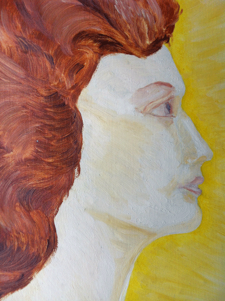
The gorgeous lady above, who has carefully chosen her outfit for her summer holiday, is MILLIE, and I love her.  She looks a lot of fun.

People often ask me where my idea for a drawing or collage comes from, so I'll show you how Millie started:


This is what I call my rough sketchbook, which is always ready by my seat on the sofa. The figure of Millie emerged from a rough scribble, and was strengthened with stronger pencil lines.  Ideas like the hat, sun, bird and beach ball were sketched in but not used in the finished collage.

Millie looks a bit fed up here, but she put on a smile when she knew she was going to be included in a blog post.

TUTORIAL and FREE TEMPLATE FOR YOU TO COPY

Materials required:

Coloured A4 card (not too thick), blue for the background and your choice of 'skintone' for the body.
Tissue paper in 3 colours to represent the sea - or any paper of your choice.
Scissors and/or sharp craft knife.
Tracing Paper, Pencil, Glue of your choice.


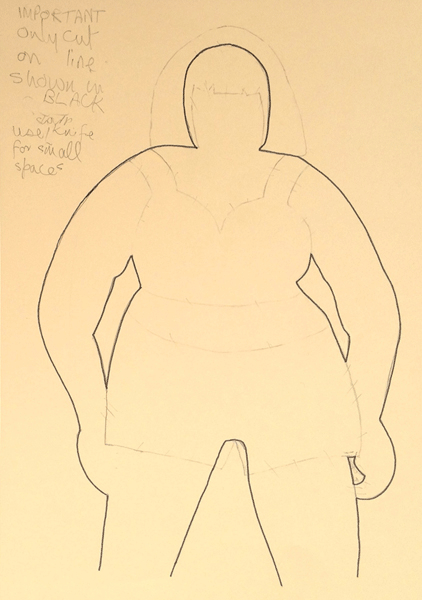
Here's the outline shape for tracing.  I wasn't sure how long I would want the legs to be, but decided to end them at the point shown in the tracing, even though I didn't draw the lines across.

COPY THE TEMPLATE IN ONE OF THE FOLLOWING WAYS:

(1)  Right click on the image.

 (2)  My Macbook has a trackpad and no mouse.  I Googled to find how to copy the template, and it can be done this way:    Hold down ctrl and left click on the image .  (ctrl key is next to alt key at bottom left of keyboard.)  A menu comes up, select Save Image as .......  Use the name shown or key in a new name, and Save to desktop.  Your image should appear on the desktop for  you to use.

(3) Take a screenshot.  (Refer to your computer manual for instructions).

(4)  If you can't use either of those methods, take a photograph with your mobile phone or camera and print from there.

Print to suit the size of A4 card.  Trace the image with tracing paper, and write the words RIGHT SIDE at the top of the page.

NOTE:  I suggest that you transfer the tracing of the image to the REVERSE side of the card if you wish to follow my directions below.  To do this, decide which is the reverse/wrong side of the card.  Place your tracing so that the image and the words 'Right Side' that you wrote are facing the card.  Complete the transfer of the drawing on to the card.


I wanted to be sure that I cut out only the BODY shape, and because I forget easily I drew over the pencil lines with a black pen, drawing only the actual shape that I wanted to cut, as shown above.  Note the two enclosed spaces between body and arms that will later be cut out with a craft knife.


Then I used a red pen to draw round the shapes needed for the hair and two-piece swimsuit, ready for tracing separately later.  This will leave the 'right side' completely clean of marks when the body shape is cut out.


Here's the cut out body shape and the collage pieces for hair and swimsuit.  When I made Millie I photocopied some fabric with a small pattern for her swimsuit, and I did the same with a spotted fabric for this version.

Find a flower or bow that you like for her hair, and a scrap of coloured or gold card to cut strips for her bracelets.

MILLIE'S TWIN SISTER - IZZY
Glue the collage hair, swimsuit, flower and bracelets to the body shape.  Add facial details of your choice, and lines where the hands touch the legs to define the legs.

Glue the body shape to the blue card, leaving space for the 'sea', and add torn strips of tissue paper in three or four layers to represent the waves.  I used tissue-paper hats that I saved from Christmas crackers which were just the right colours.

My completed collage shows Izzy who is enjoying her summer holiday at the seaside with Millie.  When I was young, people here in Lancashire would have called them 'A bonny pair of lasses', a lovely description.  I love them both.

Linking with Manon's Paper Saturdays - hop over and see everyone's entries.

Sunday 23 June 2013

GO DOODLING FOR APR

Jenn over at Artist's Play Room knows how much we all love doodling and this week she has told us to 'Go Doodle'.  Both my doodles were drawn a few weeks ago, but they seemed right for the challenge.

I always keep at least one sketchbook by me when I sit to have my coffee breaks, and my doodles most often take the form of a face or cartoony figure, who always come ready with their own name.

Here's Cecil - when I put my pencil on the page he just appeared.  He's trying to put over a good impression, but it's certainly not working on me.  I think he's got shifty eyes and a very false smile.

CECIL

CECIL
   
Cecil, Cecil, you do look quaint,
Your looks would make a Cherubim faint,
You pose as an angelic saint,
You're no angel, and a saint you ain't.


I don't very often doodle patterns and shapes, but occasionally something like this will emerge from the tip of my pen without any conscious thought, and if there's a pen handy I'll add a little colour.  I quite like this, I think it has a lot of movement.

For Sunday Postcard Art the theme is Summer Solstice, and it took me a while to think of something appropriate.


The postcard I made for SPA was inspired by this photograph of a young girl.  Last Thursday we had parked overlooking the sea at Southport - those of you in the UK may know that 'overlooking the sea' is rather a euphemism.  The land around here is so flat that most of the time the sea is just a shining line of water on the distant horizon beyond the sands.

A young girl with a circlet of flowers in her hair walked right up to our car and stood by the car door while her friend took a photograph.  I called through the window to ask if I could take a photograph, and had just a moment or two to snap her - no chance to frame the best shot.

She seemed just right for celebrating the summer solstice.  I isolated her from the background and digitally superimposed her over two pictures of Stonehenge from a vintage book I have called 'British Social History, Vol 1'.  The text and frame were added in Photoshop.

Wednesday 19 June 2013

SUMMER OF COLOUR, HOT PINK AND ORANGE

DOODLING THE DAY AWAY AGAIN

Juan and Fred
Drawn with Pitt Artist's pen
Coloured in Photoshop - Jez
When I had completed this painting for the Hot Pink and Orange theme for Summer of Colour this week, I decided Juan and Fred deserved one of my doodle doggerel verses, so here it is.


JUAN AND FRED
FLAMBINGO DANCERS EXTRAORDINAIRE

Meet Juan and Fred, Flambingo dancers,
Both renowned as great romancers.
All the way from sunny Spain
- Haughty, proud and very vain.

Adored by all Flambingo lasses
Who flock to join their dancing classes,
Fred and Juan are expert dancers
- Stampers, twirlers, splashers, prancers.

They eye the girls with hot pink flashing glances,
When they perform their
Welly-Booten Stampen-Stompen dances.
Bright plumage marks them out from all the crowd,
They splish and splash, and shout 'Olé' out 
very, very loud.

The Welly-Booten Stampen-Stompen dance
Is on in just a little while.
Watch them if you're waterproofed, but me -
I tell you folks, I'm going to run a mile!
------oOo------

This is how Juan and Fred looked in my initial drawing:

Drawn with Pitt Artist's Pen
If you would like to see a few more of my doodles with doggerel verses, click on DOODLING THE DAY AWAY in the sidebar.

I'm linking to Summer of Colour and Sunday Postcard Art 
and later in the week to Paint Party Friday and Paper Saturdays

Friday 14 June 2013

SUMMER OF COLOUR, WEEK ONE

Watercolour and Pit Artist's Pen on Watercolour Paper
with a random border added on Photoship

The challenge for the first week of Summer of Colour is to use Citron Green and Turquoise.  While I'm quite happy with my painting, I am very disappointed with the colour reproduction from my scanner.

I usually like to take a photograph because false colours reproduction is a fault with my scanner, but today it has poured with rain all day from dark grey skies and there was no hope of taking a photo.  So I hope you will accept the colours here which were, on my painting, fairly close to the Citron Green and Turquoise (particularly as I used Pthalo Turquoise paint).


I never think of saying that whatever I post on my blog is all my own work - as this is - but it will always be my own inspiration and my own work unless I state a source, or unless it's from a very old book for vintage images.

The picture above shows the starting point of the painting.  I love drawing faces, and also often decorate them with designs of various kinds in this way.

For this initial drawing I deliberately chose to add a lot more 'hair' at the back of the head so that I could make a decision when it was finished about where to crop the image.  Actually, I like this stage best, because I like the clarity of drawings as against completed paintings.

If you like the idea of seeing many other bloggers' paintings with Citron Green and Turquoise, pop over to the Summer of Colour blog.

Wednesday 12 June 2013

A COLLECTION OF CHALLENGES


The abstract watercolour painting above is my entry for this week's theme of BIRDS for Inspiration Avenue.  I was pleased when the blobs and dabs I dropped onto the paper turned into mythical bird shapes, and so I'm happy with it.

Jenn has chosen the unusual theme of BIZARRE for Artist's Play Room this week.  An interesting challenge that cried out to be a collage, so I let my mind go free and assembled a collage from torn and cut magazine pages.  The pages containing the mask and the words were collected and stored in collage stash years ago, so I apologise for not crediting the particular magazines.

What I find bizarre about collage is the way the pieces we choose suddenly combine themselves into an image we would never have thought of, which was certainly the case with the 'I want ... I don't want' collage above.

As the theme for Sunday Postcard Art is A JOURNAL PAGE, I'm also linking the 'Bizarre' collage above to Sunday Postcard Art.


For Take a Word this week we were challenged to use COOL COLOURS, and I chose blue and green - with a touch of red and yellow to add a little zing.  I find that painting watercolour abstracts with a free mind and no planning produces a painting in a fairly short time, and as with the 'Bizarre' collage above, it produces something really unexpected.  Don't ask me what this one means, I'm only the artist!

Click on the image to enlarge it so that you can read the words
I enjoyed searching my box of old photos for something connected with my family.  I have only about half a dozen family photos because sadly my parents destroyed everything except those I had filched from time to time without their knowing.  So I'm glad I was naughty enough to do that.

The theme for the Collage Obsession challenge is SISTERS AND BROTHERS, and I concentrated on sisters - my sister and me.  I realise for the first time that we never had a photo of all the children in our family together.

The photo above was taken when my sister was 7 and I was 3, 75 years ago, and was lightly tinted by hand by the photographer, though it doesn't show up too well on the scan.

The words round the edge were inspired by the old Beverley Sisters' song 'Sisters', adapted fairly loosely.  For overseas readers, the Beverley Sisters were a 1950s and '60s singing group of three real sisters, Bev, Babs and Teddie, who modelled themselves on the Andrews Sisters.

I wrote:   Sisters, sisters, there were never more devoted sisters,
               I am here to keep my eye on her
               She is here to keep her eye on me,
               Many folk have tried to split us up, but no-one can, nobody can .....

She did have to look after me while my mother looked after the younger children and worked to keep us when my father was missing and then a POW in WW2.  I was very mischievous so I was always getting into scrapes and falling from trees or fences, and my sister had to make me hide any bumps and bruises from mum.

Hope you like some of these pictures - I enjoyed making every one.  I'm so glad I found these challenge blogs - thank you to all those who put in the time and effort to run them.


I shall also be linking to Paper Saturdays and Paint Party Friday

Thursday 6 June 2013

MEET THE GUYS


Today I thought I would share with you a few drawings from my sketchbook, having been encouraged to play along with June Guys.

Put a pen or pencil in my hand and a piece of paper (or even a screen these days) and it will immediately start drawing a face - any kind of face, female, male, young, old and doodle or fantasy.


The first three here were sketched from photographs in newspapers or magazines and, as so often when I'm making quick sketches to 'get my eye in' for the day, I didn't record exactly which paper or mag it was.


I know this was from a weightlifting/body-building magazine.  It's not that I am the Body Building Granny of the UK, but these magazines are terrific for sketching because of the extreme development of the muscles.


This one was from life, sketched in a hospital waiting room.  People do tend to keep looking in different directions or shifting their positions slightly, but at least (in the kind of clinics we go to) they usually sit in the same seat for quite a while waiting for their appointment.


This is another example from a newspaper.  I was intrigued by the strength and wisdom of the profile, and really enjoyed sketching it.


And just for fun, here's another chap from the clinic waiting room.  This was a very quick sketch on my i-phone.  The advantage of the phone for drawing and painting is that people are used to seeing someone entranced by their phone and don't tend to think that you are sketching.

This does look like him, but OK he wasn't wearing a floppy red hat, nor did he have a red nose.  I just felt he needed them.  I do want to stress that we were in the blood clinic not at an AA meeting!

Thanks for visiting - I'm linking this with June Guys and Paint Party Friday


Tuesday 4 June 2013

THE LADY LOVES ORANGE


Faber Castell Artist's Brush Pens and Dovercraft Dual Tip Markers
used for all 5 drawings shown on this post
In my childhood Clarice Cliff Art Deco pottery was used for it's intended purpose - drinking a coffee, eating a meal, putting flowers in a vase.  Nowadays items can be worth hundreds or even thousands of pounds sterling depending on their size and rarity. 

When I was about 4 or 5 years old I hated the stuff, the strange orange trees and red mountains offended my sense of what was right, and what I thought of as streaky paint looked like careless painting.  And boy, did that lady love orange!


Now that I am older and wiser, and know more about art, I hate it even more.  So why have I chosen to use Clarice Cliff designs for the Artist's Playroom and Inspiration Avenue challenges?  Because I'm a sucker for punishment.  I know many people love her work and I apologise to them for my bad taste! 

I have to say that her Art Deco design for a cup handle must be the most useless ever invented.


And even worse, the APR theme is Cups and Mugs.  Now I cannot draw a cup or a mug that looks realistic with the correct curves and ellipses, and I just hope Tracey Fletcher King never makes the mistake of looking at this blog post because she is, in my eyes, the Queen of Cups.


 The designs I've drawn on my mugs are not straight copies of Clarice Cliff designs.  The crocus and strange yellow tree cups are fairly close, just to get me going.  For the other three designs I have used elements that are common in her work arranged in my own designs.

The brush pens and markers were quite good for imitating the streaky paintwork that I disliked so much as a child, and I was quite pleased with the effect.  If you are interested in Clarice Cliff pottery you can see dozens of examples on the internet and perhaps be surprised at the prices collectors will pay.


The theme for Take a Word this week is Orange, and I think there should be enough orange in my CC mugs to qualify, but here's a bright little flower centre as a bonus.

I'm going to be taking part in the Summer of Colour challenges, which start next week.  Take a look at the Summer of Colour blog to see what's going to be happening.

Saturday 1 June 2013

PAINTING BY NUMBERS WITH TUTORIAL TRYOUTS


For Kristin's Tutorial Tryouts this week she gave us the challenge of trying Vicki's approach to painting by numbers, which was quite an easy, relaxed tryout, and a bit of fun.  The pic above is my finished piece.


I decided to use a 'still life' photograph as the basis.  I recently took a thermal image photo of a vase of tulips and I selected a small section of it which I cut down even further to focus on one tulip only.


I fiddled with it a little in Photoshop until I found a version that looked promising for the colors and background.  The tutorial suggested tracing the print by hand with tracing paper from a paper copy, but because time is very short for me at the moment I wanted to find a way to do everything on the computer.


The 'tracing' above was produced by using the 'trace edges' filter on Photoshop.  I like the way sections of the background are like spray painting, but I felt it could be improved. 


Now the picture above looks more like a hand-traced version.  In fact I used an app on my i-pad called Art Rage, which has the facility to place a 'tracing paper' over a photograph so that a 'pencil' from the tools can be used to trace round the shapes.

This was so easy to do, and felt just like tracing on paper, and I was surprised and delighted with the result.  I was so enthusiastic about my tracing that I think perhaps I outlined too many small shapes which was not helpful when I was adding the colours in Photoshop.


At that point I abandoned the idea of using the same colours and instead tried a colour combination that is new for me and am fairly pleased with the result and with the ability to complete the tutorial using the computer.  I like the little touch of a few dashes of digital 'spray paint'.

Interesting and fun to do, and once again I learnt a little something new, so my thanks to Vicki and Kristin.

Sadly this is Kristin's last Tutorial Tryout - for now at least she says.  The Tryouts have been a real challenge to me, and I've learnt a lot, so I hope to see her back with them later in the year.