Showing posts with label SUMMER OF COLOUR. Show all posts

Friday, 19 July 2013

SUMMER OF COLOUR WEEK 6


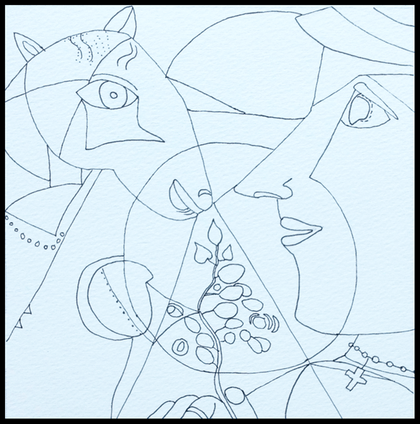
It's the last week for Summer of Colour and the colour combination is sepia and sage green.  I've been away this week on a Summer School in connection with the Tate Liverpool Gallery's current exhibition of 60 works by Chagall.  The image above is a little 'out-take' from the drawing I show below, after I have explained how it came about.


At the end of the first day Dev and I were sitting quietly in the hotel lounge with a much-needed cup of tea.  I was looking at a wall lined with veneered wood when I saw a donkey's face in the pattern - in fact a few donkey faces.

So I grabbed my sketchbook and drew a quick sketch of what I saw in my mind's eye - a sketch, not a representation of an actual donkey.  When I looked at it again in the hotel room I was quite taken by what I had done and decided to use it as my entry for the SOC sepia and sage green challenge.  I only had coloured pencils with me, so I had to use what I thought were the nearest matches for the colours.


As usual I forgot to take a photograph of the drawing before starting to add the colour, but luckily thought of it just when I had started the ears.

I have no idea why the page came out blue when I photographed it, but they weren't the best conditions for photography.


Here's the completed drawing, and as a quick sketch I'm quite pleased with it.  When I took the blue cast out of the photo on Photoshop, I've only just noticed that it took out a chunk of the red border on the left.  Hey-ho, that's what happens when you're tired!

I'm going to post a few of the drawings I made on the course in a post next week.  It was wonderful seeing so many and varied pieces by Chagall, paintings, drawings, sketches.

I have enjoyed Kristin's lovely Summer of Colour challenges for the last six weeks, so thank you Kristin for the fun and for 'stretching' me, and I hope to be able to catch up with at least some of the other entries in the next few days.

Also linking this with Paint Party Friday , Manon's Paper Saturdays , Artists in Blogland  and Inspiration Avenue's Show and Tell theme.

Wednesday, 10 July 2013

SUMMER OF COLOUR 5 FOR CHAGALL


I'm studying at the moment, and I decided to relate my studies to this week's challenge from Summer of Colour which is to use Candy Apple Red and Yellow in an image.  The sketch is derived from one of Chagall's paintings.

Next week Dev and I are attending a three-day Summer School at the Tate Liverpool Gallery which is linked into their current exhibition "Chagall! Modern Master".  Chagall is one of my favourite artists so I'm really looking forward to it, and preparing for it with some 'self-directed study'.

I'm hoping you will see that what I'm doing with the Red/Yellow sketch above is analysing and thinking about his approach and not trying to make a perfect copy of the painting, shown below:


At first glance it looks such a simple and even naive painting, folk art, almost childlike.  Yet in fact it is very complex and full of Chagall's memories of his childhood home-town in Russia.  What I wanted to examine were all the geometric shapes, which divide the picture and focus attention on particular areas of the painting.  Here's my simplified drawing.


It may look a simple painting, but I find it very difficult to copy his works.  This was the best I could manage, just focussing on the elements that interested me for this study.

I've looked at this painting in my Chagall book so many times, and trying to copy any painting really makes me concentrate on detail, but this was the first time I ever noticed the cross and the wedding ring.

My drawing is on good watercolour paper, but I wanted to save it for when I have time to use acrylic or watercolour to paint it, so for this simplified red/yellow version I printed the drawing out onto smooth cartridge paper and used Inktense pencils.


I added the green for contrast, and to separate the other two colours where I could.  The red looks rather pale, but it is a stronger red than it looks here.  I learnt quite a lot from doing this self-imposed exercise.  I'm off to study another painting in my book in a few moments.

Chagall's painting has another aspect which interests me.  Whenever I look at it these days it reminds me of journalling with its layers of memory.  I decided to pretend Chagall was going to post one of his journal pages on his blog.  And as the Inspiration Avenue challenge is to 'Use words in a piece of art', here's his journal page with one of his childhood memories to follow that theme.


The text reads:  "In my grandfather's stable there is a big-bellied cow;  she stands and stares stubbornly.  Grandfather goes up and talks to her like this:  'Hey, listen, give us your legs.  You must be tied up.  We need something to sell, meat, do you hear?'  She falls with a sigh.  I reach out to put my arms round her muzzle, to whisper a few words to her - that she shouldn't worry, I won't eat the meat; what more could I do?"

The quote is from this book in the picture below which I bought on Amazon.  It would have been more appropriate if I could have found a quote involving a goat, but I didn't find one.


Written by Chagall himself when he was 35 (he died at the age of 95), the book is only 171 pages long and beautifully written.

I hope you love Chagall's art as much as I do.

Tuesday, 2 July 2013

SUMMER OF COLOUR IN CHARCOAL GREY AND PINK


The colour theme for this week's Summer of Colour is charcoal grey and pink, a combination I've been looking forward to.

This sketch of hydrangea flowers is a pen and watercolour sketch from my sketchbook, when we visited a National Gardens Scheme Open Garden event.  The flowers were the lightest pinky-white with the colour increasing at the petal edges, and I liked the idea of using the sketch for the challenge because flowers are in my thoughts just now.

I changed the colour of the leaves and background to a light charcoal grey in Photoshop and added the double border.


This is a very personal grey and pink image, with the pink text added on Photoshop to my own black and white sky-scape photo, which was taken on my mobile phone at Southport a little while ago.

Neither of my images is very good artistically, but at the moment inspiration is rather lacking.  Both pictures have turned out as reflecting the way we are feeling just now because our dear daughter died last week of a brain tumour and they are a little tribute to her.  I hope you will find them acceptable.

Thursday, 27 June 2013

HAPPY APPLES IN PURPLE AND LIME GREEN


Happy Apples - Card Collage
Jez
If this was my school report, then it would be saying of my Happy Apples collage "Could Do Better".  I didn't want to miss this week's Summer of Colour challenge, which asks us to combine purple and lime green, even though I had very little time.

I thought making a 'quick' collage would do the job, and in my file of coloured card I was happy to find just the colours I needed.  It was going to be easy-peasy, especially as I decided to use my narrow double-sided tape to stick the thing together.


Everything possible went wrong.  I know it was my present state of mind that caused the problems, but everything that could went wrong.  I kept measuring incorrectly, the ruler kept slipping as I cut the yellow strips, the double sided tape was just that bit too wide for the strips.  Then when it came to sticking things on, the tape stuck firmly to the card, and when I tried to remove the protective strips it brought away the surface of the card!

So I hope you forgive that wonky strip of tape in the lower half.


My inspiration for the apples came from the rich colour of the green card, and when they were at last stuck on they just asked for faces to be drawn on them.


Fortunately the themes for two other challenges fitted in perfectly with the Happy Apples collage, so I am also linking Collage Obsession and Take a Word. 

For  Collage Obsession the challenge is to "tell us something about YOU".  You may already have guessed, if you have seen some of my previous posts, that I enjoy making light-hearted, silly images, and will carry on doing so until I grow up, if I ever do!

And at Take a Word Electra has chosen the theme of "True Happiness".  Just making art of any kind makes me happy:-
"Joy fills my heart
When I make art"


Wednesday, 19 June 2013

SUMMER OF COLOUR, HOT PINK AND ORANGE

DOODLING THE DAY AWAY AGAIN

Juan and Fred
Drawn with Pitt Artist's pen
Coloured in Photoshop - Jez
When I had completed this painting for the Hot Pink and Orange theme for Summer of Colour this week, I decided Juan and Fred deserved one of my doodle doggerel verses, so here it is.


JUAN AND FRED
FLAMBINGO DANCERS EXTRAORDINAIRE

Meet Juan and Fred, Flambingo dancers,
Both renowned as great romancers.
All the way from sunny Spain
- Haughty, proud and very vain.

Adored by all Flambingo lasses
Who flock to join their dancing classes,
Fred and Juan are expert dancers
- Stampers, twirlers, splashers, prancers.

They eye the girls with hot pink flashing glances,
When they perform their
Welly-Booten Stampen-Stompen dances.
Bright plumage marks them out from all the crowd,
They splish and splash, and shout 'Olé' out 
very, very loud.

The Welly-Booten Stampen-Stompen dance
Is on in just a little while.
Watch them if you're waterproofed, but me -
I tell you folks, I'm going to run a mile!
------oOo------

This is how Juan and Fred looked in my initial drawing:

Drawn with Pitt Artist's Pen
If you would like to see a few more of my doodles with doggerel verses, click on DOODLING THE DAY AWAY in the sidebar.

I'm linking to Summer of Colour and Sunday Postcard Art 
and later in the week to Paint Party Friday and Paper Saturdays. 

Friday, 14 June 2013

SUMMER OF COLOUR, WEEK ONE

Watercolour and Pit Artist's Pen on Watercolour Paper
with a random border added on Photoship

The challenge for the first week of Summer of Colour is to use Citron Green and Turquoise.  While I'm quite happy with my painting, I am very disappointed with the colour reproduction from my scanner.

I usually like to take a photograph because false colours reproduction is a fault with my scanner, but today it has poured with rain all day from dark grey skies and there was no hope of taking a photo.  So I hope you will accept the colours here which were, on my painting, fairly close to the Citron Green and Turquoise (particularly as I used Pthalo Turquoise paint).


I never think of saying that whatever I post on my blog is all my own work - as this is - but it will always be my own inspiration and my own work unless I state a source, or unless it's from a very old book for vintage images.

The picture above shows the starting point of the painting.  I love drawing faces, and also often decorate them with designs of various kinds in this way.

For this initial drawing I deliberately chose to add a lot more 'hair' at the back of the head so that I could make a decision when it was finished about where to crop the image.  Actually, I like this stage best, because I like the clarity of drawings as against completed paintings.

If you like the idea of seeing many other bloggers' paintings with Citron Green and Turquoise, pop over to the Summer of Colour blog.