Saturday 29 December 2012

DOODLING THE DAY AWAY - 1 - AVIOPHOBIA


It's time to get back to blogging ...... but all I've been doing since my last post is doodling in my sketchbook with a Faber-Castell Pitt pen and Inktense pencils.  It doesn't take any mental effort (or even artistic skill), and it's so relaxing.

I'll post a few of these doodles during the next few days.  We've still got New Year to enjoy (or get through), depending on your point of view, so that's all I'll feel like doing.


Where do doodle pictures come from?  I would never think of consciously drawing this, but it's so good to see an unexpected picture emerging from nowhere.

Can't leave a good thing alone.  As soon as I post an image I want to do some colour changes or image manipulation.


The next colour change came about quite by accident.  I intended to check the image size, but wasn't concentrating and mistakenly pressed the wrong key command. 

Wow, look what happened:


Such a surprise, and it's my favourite, better than the original.

I hope that 2013 will be a great improvement for us all as far as the weather goes, particularly for the thousands of people all over the country whose houses and businesses have been under the floods so many times this year.  The Met Office say it has been the wettest year since records began - and it's felt like it!


A HAPPY NEW YEAR TO YOU ALL

Saturday 15 December 2012

LAST DAY OF THE COURSE - SORRY IT'S OVER


Last Saturday was the final day of the 'Drawing the Line' course at the Tate Liverpool.  Didn't know what we would be doing, but I knew it would be an interesting and absorbing process, 

Out first assignment was to make blind contour drawings of any sculpture we wished, but this time with strict instructions to draw from only three different viewpoints.

I gravitated back to the Jean Arp sculpture because I have been quite captured by its curves and hollows.  The more I draw a sculpture, the more I get to understand and appreciate it.  


I started by drawing the first of the three contour outlines, but then my pencil took over and I found myself drawing in more and more of the internal contour lines, just enjoying myself.

In the end I had to write STOP on the page just to make myself get back to our assignment.  The drawing had taken quite a while, so I had to work faster to make up time and do what I was supposed to!


This was the three-views version of the Jean Arp, as instructed.  Quite interesting, but I prefer more lines instead of the two central open areas. 

Decision time then about which sculpture to choose next.  The one closest to me was Hans Bellmer's 'The Doll' or 'La Poupée' - give the sculpture one name and the second name is free.

I walked away from it quite firmly, because I really felt repelled by it.   Waaaait a minute, Jez.  That's not a good reason for avoiding it!  So I made myself walk back and pick my first viewpoint for drawing it.


I have to say as I drew I did start to appreciate the rhythm of the curves, and the fact that the top third is a 'vertical flip' version of the bottom lower section, a very generous rear end

The central portion is like a big apple squashed between the top and the other end.  A nice complicated structure of curves and ball shapes.  

The sculpture is rather difficult to explain, so here is a photograph of it - from the back.


That was it.  Three paltry drawings in an hour!  Well, I did do the first one, plus three outlines of the Arp, and three of the Bellmer which does make 7 drawings.

Back in the studio we were presented with a table full of various media, and asked to spend an hour working into the drawings we had made, shading them in, filling the shapes with colours - any other ideas we had.


I took this to mean I could do what I liked, because I didn't want to colour directly on my drawings.  I  preferred the idea of getting them photocopied at A3 size later and doing any colour shading on those, to keep the original versions intact.

One of the things I like about superimposing contour drawings over each other is that sections start to jump out as smaller abstract 'out-takes'.  I decided to look for a section that interested me, and the image below is based on an extract plus some added lines as the mood took me.


In spite of the knowledge that I would have mucky fingers I decided to be brave and use pastels, which I love using only slightly more than charcoal, and I let the painting tell me what to do.

In spite of mentally labelling my fingers Black, Dark Brown, Lighter Brown and Yellow (and forgetting which was which as I drew) I had to keep jumping up to rinse my fingers so the colours would not muddy each other.


This was the final pastel painting, which won approval from Stephen, particularly the inclusion of the red shape.  And I was really pleased with it.  I like the egg shapes that emerged in the painting.  It's so rewarding to end up with a painting that could never have emerged in any other way.

And we ended the course with a completely full A3 sketchbook to keep.

Altogether I have to say this is one of the best courses I've ever been on, with one of the best tutors.  

Next year there will be a Chagall exhibition at the Liverpool Tate - one of my favourite artists, so I just hope the Gallery puts on a similar course for that.  Fingers crossed.

Wednesday 12 December 2012

CLOSE ENCOUNTERS IN THE COFFEE SHOP


Dev and I arrived early in Liverpool on the first day of our drawing course at the Liverpool Tate Gallery, with time for a coffee and (very early) teacake at John Lewis.  Well, we do have breakfast at 6 a.m. or so every day.

It's such a great coffee shop.  No loud music, the staff walk quietly in rubber-soled shoes, sofas and armchairs to sit in, and at 9.30 a.m. there are only a few customers.  My idea of a relaxing break.

As I looked around at the paintings on all the walls, a white-haired elderly lady, probably just a little older than me, caught my eye and smiled.  She was dressed all in white, so elegant, and with a lovely fine-boned face.  

My artist's eye couldn't help thinking how beautiful she was, and I had to restrain myself from crossing the couple of yards between us to say that to her.  But restrain myself I did.


On the second day of the course history repeated itself, and as I sat down with my coffee she smiled at me again.  So this time I felt compelled to go over and tell her how beautiful she was.

To my surprise she said "You couldn't possibly have said that to me on a better day", and her husband explained that she had very recently had a serious operation.  At which she took out a photograph to show a bruised face, with a line of stitches over a cut extending from behind her ear to the hollow of her neck, and then showed me the actual cut, still healing.

We chatted for a while, and it turned out she lived just a couple of miles from us, and was so appreciative of the boost to her confidence and morale from my comment.


Second close encounter.  On the fourth morning of the course we went for coffee at John Lewis as we had done each Saturday morning.  A tall, very elegant and attractive woman of about 50 walked across to sit at the table next so us.  She was wearing the most gorgeous long red and black velvet coat.

I do so envy tall slim women, they can carry off clothes like this with great style.  I was so entranced with the coat that to stop myself tearing it from her grasp I asked if I could photograph the back, which she kindly held out for me to snap with my i-phone.

And not only that, she had bought it in a Charity Shop.  There are never clothes like that in the Charity Shops I go to.

As we chatted it turned out she had lived just two doors down from us in our last property, but before we had moved there, and now lived only a few miles from our present home.  

Then she mentioned that she had taught at the local primary school (up to age 11/12).  Not only had she taught our two grandsons (now 28 and 25) but she remembered them and gave an accurate description of them.

Close encounters indeed.


With reference to my envy of tall slim women, never mind thinking ahead to your maturity and the fact that everything starts to drop closer and closer to the floor with age, there's another shock in store.

When I was younger I measured 5 foot 7 and a half inches.  Nowadays when doctors and nurses measure me they insist that I am only 5 foot 3 inches.


SOMEONE HAS STOLEN FOUR INCHES.


Friday 7 December 2012

SATURDAY - STRUGGLING ON DAY 3 OF THE COURSE


Another demanding day at the Liverpool Tate for the 'Drawing the Line' course.  Only achieved two pieces of work last Saturday, so today's post is not a photographic marathon.  And not only that, I have to warn you that the second piece is even worse than the one above.


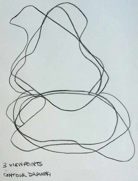
 Our first project was to return to the 'Drawing the Century' exhibition gallery, armed with the A3 sketchbook and pencil, but this time we were to choose a sculpture and make a tonal drawing. In fact I used a thick graphite stick rather than a pencil.


Strangely enough we all seemed to gravitate to the Henry Moore sculpture, probably because the lighting and the varied shapes created good shadows.


Same picture, different light when I photographed it.

I chose this viewpoint, from the 'feet' end I suppose you could say - at least it's the end opposite the head.  I liked this because the receding shapes of the carving looked like hills and valleys.  

I've NEVER been good at tonal work, as you can see from the photograph above.  It's partly sheer laziness.  I don't have the patience to continue shading in one image instead of drawing a few images with line, which is probably why I tend to use avoidance tactics on tonal work. 

So we all spent the next hour in deep concentration, not a word passed between any of us, and gallery visitors walked by without a word of complaint that they couldn't get anywhere near the sculpture.  

Stephen Ashton, our course leader, walked around from time to time, but made only the odd comment to one or two of the group.  I was pleased with the result, but mainly because I had made myself sit for an hour to do it, and it did have a vague resemblance to the sculpture.


Now this is where things get even worse.  Our task back in the studio was to use charcoal - cover the whole of an A1 piece of card with the charcoal stick, then use an eraser to carve out an image of what we had drawn.

I HATE DRAWING WITH CHARCOAL.

I opted out of the charcoal on three grounds: 
(1) I don't like getting my hands covered in black charcoal, 
(2) I didn't have an art apron and didn't want my clothes covered in black dust, and 
(3) the dust would cause me to have problems with asthma.  
Good thinking, Jez.

Stephen didn't even blink.  He said 'OK' and took me up to the exhibition gallery again to look at something I could do with different materials.  

He chose a drawing by Frank Auerbach, on which the artist had worked so much and so fiercely that the paper was worn through in one part and he had stuck a new piece over the hole, and in other places he had even torn the paper.

Stephen suggested that I might like to try something similar based on my tonal sketch.  That sounded like fun, and the next photo shows what emerged after another hour of concentrated work.


 Not a pretty sight, and definitely 'inspired by' and 'derived from' my drawing.  I chose to paint an outline of just part of my drawing with brush and black ink .

Then I worked on it, and worked on it, with the graphite stick, black ink and red acrylic paint.  I used a large brush to slop the ink and paint around.

I scrubbed at the wet ink and paint with damp kitchen towel, slopped water on and scrubbed it in with kitchen towel,
rubbed hard at areas with an eraser, 
scratched hard into it with the brush end,
scratched and stabbed with scissors.

Never worked like that before.  All without conscious direction.  


This selection of part of the image shows a little more clearly the scratching marks of the scissors and the holes in the head.

I knew that I had ruined the paper so much that there would be some effect on the reverse, even though the paper was quite a high gsm.


The reverse shows more clearly the holes, and the scribbles scratched in with the scissors.


The some of the ink and paint had even leaked through to the next page.  Stephen made the comment that the images were talking to each other.

I apologised to him for not doing the activity he had planned for us.  He said "It doesn't bother me, does it bother you?"  "No, I'm happy to have done something so different and learnt from it".  

I was pleased with it.  He was pleased with it.  What a great tutor!
Last morning of the course on Saturday.  Can't wait.   

Wednesday 5 December 2012

HERE'S LOOKING AT YOU, KID


My posts have been a bit serious lately, so this is just a bit of fun, and is a short one for a change.  When I started this digital painting I didn't know where it was going to go.  I painted it quite quickly, and the end result surprised me. 


Those eyes!  Dev says this painting makes him feel uncomfortable and he doesn't like looking at it.  I have to admit that I feel the same, even though I am pleased with it, and with the fact that the result was unexpected and very different from anything I could have imagined.


This Photoshopped version is great, but those eyes still bother me.

I always wonder why one chooses a particular idea or image as the inspiration for a drawing or painting, and how it is that the painting so often makes itself without conscious direction from the artist.


The inspiration for 'Here's Looking At You Kid' came from the photograph below of one of Antony Gormley's statues on Crosby beach, which I wrote about in a previous post. 


Even though I hadn't looked at the photographs since writing that post, this photo has kept coming back into my mind.  The flat circles (which Gormley deliberately left from the casting process) intrigued me, and I felt I needed to do something from this picture.


When I imported the photograph to Photoshop the first thing I did, without even thinking, was to draw round the circles .... and then they turned into eyes.

So that was the source of that particular piece of creativity - without that initial image this painting could never have developed.

The chance to take the next photo is one of those happenings that are absolutely serendipity.


I had prepared this blog post in advance because we're going through a very busy period at the moment.

Then last Saturday morning we were walking down to the Liverpool Tate Gallery at the Albert Dock for our third morning of the Drawing the Line course.

Suddenly I saw these words on the pavement (sidewalk) in front of me.  They were advertising a Sky exhibition by Doug Aitken, and they seemed so appropriate for adding to this post - magic!


Friday 30 November 2012

SATURDAY SPENT TUSSLING WITH WIRE

Last Saturday's course at the Tate Liverpool Gallery was not quite what I had expected on a course focussing on 'Drawing the Line', even though it does continue the process I talked about in the post Exciting Way to Spend a Saturday Morning.  

But if you get to the final picture of this post you will see how different the last drawings are from where we started.  The post is quite long, but plenty of pictures along the way, so hopefully you will stay with me.


The morning took us in such a different direction to anything I could have imagined, and has made me think about line in a different way.  Anything that makes us re-examine and re-assess our ideas about art is a really good kick in the pants.

Stephen explained that we were going to look at sculptures of our choice and draw in our A3 sketchbooks in a specified way.  We were to draw the outlines blind using continuous drawing techniques, and keeping our eyes on the sculpture at all times.  


This is part of 'Ziggurat 2012', a strange and complicated sculpture by Matthew Monahan, and yes I did really want to walk past its difficulty, but in the end forced myself to start blind drawing.  

It's black, bronze, and a woman's figure is emerging from a jumbled background and, as I drew, I started to like it - and it reminded me of the way some of Rodin's sculptures emerge from the background.  I just hope Mr Monahan never sees the drawing.


'Agricola XIII', a sculpture by David Smith in bronze and steel.  I decided to include the outlines cast by the shadows, and even the plinth, which added to the complexity of the drawing.  

If you haven't done much blind/continuous line drawing I have to tell you it is very concentrated and (for an oldie like me) quite exhausting.


A much-loved Henry Moore sculpture, though I doubt old Henry would recognise it.  Pushing myself a bit further with this one I deliberately drew very quickly as well as incorporating all the outlines of the shadows.

It might look like a mess to you (and to Henry if he's looking down), but I was pleased with it.  When I visit galleries in future I shall be looking and drawing in quite a different way, which means the course is really having an effect on me.


I cheated for this one by drawing from a charcoal and colour painting instead of a sculpture, 'Female Bomb' by Nancy Spero, which captured my imagination.  

The smudgy background was pink, so using one of my more technical art tools I licked my finger several times to spread the lines of my graphite stick to indicate the background. 

I did make a couple more drawings at the start, but they were really not good and are not included here, but all six drawings (and walking about) were done in barely 40 minutes.  Phew!!!


Back in the workroom we found coils of wire, pliers and wire cutters laid out in our places.  Having turned the 3-D sculptures into 2-D drawings, the next stage was to make a 3-D rendering in wire inspired by one of our drawings, and then photograph them from the top, bottom and sides and if possible with shadows.

The photo above shows clearly that not only did my wire sculpture look nothing like David Smith's 'Agricola XIII', it didn't even have any possibility of looking as if it was inspired by it.

I knew what I wanted to do, the wire knew what IT wanted to do, and as you can see the wire won, and I still have the sore fingers to remind me of my epic struggle with the self-willed coil of wire.


This is the sculpture the wire decided to make, and in the fairly dark workroom with no sun and little effect from the flash, there is very little shadow cast.

I know time flies when you're having fun (which I was having), but it flies even faster when you're struggling with a material and tools you're not used to.  They also say that a bad workman blammess hiss tooolls.


I just had a few minutes of class time left to photograph the 'sculpture' on top of the drawing, and then used the left-over piece of wire to shape a fairly flat version of the head in the Spero drawing.

We couldn't take our work home - lack of a box and Dev and I were planning to go on to somewhere else - but I could at least take the Spero head home.  And we even managed a sunny day yesterday so I could photograph it, without and with shadows.


The next stage would be to draw from these sculptures, 3-D back to 2-D, and then even perhaps a sculpture from those drawings if one wanted, but that's a process to continue at home.  I did manage to do two drawings from my sculpture at home:


And, of course, I couldn't resist taking the second one into Photoshop and altering it with the Emboss filter.

Very tired at the end of last Saturday morning, but very happy and what a terrific course it is.  Looking forward so much to tomorrow and the third of the four classes.


Tuesday 27 November 2012

JUST DOODLING DIGITALLY AGAIN

Several weeks ago Kristin Dudish posted some sketches she had done on an app called "Scribbler", and I immediately lusted after it and downloaded it on to my I-Pad.  

It's great fun, and produces some great results.  Thank you Kristin, it's a great way to relax. 

This was my first attempt:


Just a few straight lines to form an abstract design, and two colours to scribble with - it's always best to start simple to find out what any program can do.

Never one to leave anything alone, I opened the sketch above in Photoshop and used a filter I've not experimented with before.


This is the result of using the Liquefy filter.  I like the change from straight lines to whirls and twirls.  Doing this kind of thing always gives me inspiration for ideas to draw in my sketchbook.

After a little practice this next fishy one pleased me.


The result is always unexpected.  It takes a little experimentation to find the right amount of scribble for a drawing before you decide to stop - otherwise it gets swamped in a mass of lines.


Taking the fishy scribble into Photoshop, I used the Poster Edges filter, which gave more definition to the sketch, and adds a touch of drama.

The next one is another very simple drawing:
I stopped the scribbling process before it covered too much of the original sketch, and was pleased with the effect.

I was interested to see what I could do with another filter on Photoshop.


This time I used the Emboss filter, and fiddled with it until I got an effect that pleased me.  WOW - this really has the wow factor, a real 3-D effect.

If you are new to Photoshop and haven't used the filters very much, this is a good way to experiment and find out what they can do.

I wondered what would happen with a drawing of a face:


The face is quite an early attempt with Scribbler, again limiting the amount of scribble, and using a fine scribble line and two colours.


Taking the scribble sketch into Photoshop I tried Glowing Edges on the original, which gave quite a dramatic effect.  I have to try this kind of sketch in my black-page sketchbook with coloured inks.


For the version above I opened the original sketch in Snapseed, another of my favourite apps, and grunged it about a bit and then grunge-framed it.  Quite different, but good.

The rather startled looking chap below was quite an early sketch in Scribbler, just the basic sketch before doing any scribbling.  I saved it in my photo album so that I could try different versions of it.

That was supposed to be a mouse he's holding in his hand, but it's not very convincing!

I tried three different Scribbler versions - all put together on the image below.


Not particularly struck with any of those, so I went back to Snapseed with the original.


When I had fiddled about with it a little, using my favourite grungy thing, I was quite taken with it.

I've decided to turn it into a card to give to Stephen, the tutor, on the last morning of the Tate course, with an appropriate comment - probably something about the difficult wire sculptures we did on Saturday.  Perhaps:

"STILL STRUGGLING WITH THE WIRE BENDING"

Great fun, very therapeutic and very fruitful for further sketching ideas.