Showing posts with label PAPER SATURDAYS. Show all posts

Wednesday, 16 April 2014

MIXING IT UP A BIT

Doodle-Town Map - Jez
'Welcome to Doodle-Town' is my entry for the Mix it Monthly challenge to create a map and use pinks and browns.  Wherever you go in Doodle-Town there is a great deal of variety - in fact it can get a bit too much variety if you are driving around looking for a particular address because there are no signposts.  The best thing about Doodle-Town is that all roads lead out of town and away to something more like civilisation.

And now three digital paintings, which I created for the 'Away from Home' theme at Paper, Paint, Pencils & Pens .  I wanted to illustrate some of the holidays I would love to have taken but never got around to, and here are my imaginary holiday destinations.  All three were painted with the 'Brushes' App on my I-Pad.
Painted on I-Pad with 'Brushes' app - Jez
I love Japanese Gardens, and this little corner of the large garden of the old house we'd spend a month or so in would be where I would come to sit and enjoy the silence and serene atmosphere.

Painted on I-Pad with 'Brushes' app - Jez
Then there was the holiday we fancied in a lighthouse on a cliff, but that was in the days when we would have enjoyed climbing half a dozen or more flights of steps to see the view.  Good job it's got a television aerial and broadband.

Painted on I-Pad with 'Brushes' app - Jez
And a real castle on its own little island, with a gentle slope on the other side behind the castle with a helicopter pad and beautiful gardens leading down to the beach.  At the moment we are out for a ride in the power-boat that is included in the deal.

If you want to come and spend a little time with us in one of those lovely imaginary places, I'm sure we'd find room for you.

Linking with Mix It Monthly,

Tuesday, 18 March 2014

CYANOTYPE, BLUE, BLUE AND MORE BLUE

ONE-DAY WORKSHOP CLASS

Two weeks ago Dev and I went to a Cyanotype workshop at the Atkinson Gallery with cyanotype artist  Sian Hughes.  Very exciting, and we produced quite a number of different images during the day.  There were only six of us on the workshop which gave us plenty of opportunity to ask questions of Sian, who was very generous with both her knowledge and materials.

I've chosen my favourite pieces from my day's output to show you.  The camera didn't seem to like the colour of the cyanotypes which come out with a deep, rich blue, even though the colour seems to vary in my photographs.

A5 Cyanotype with dried weeds and weed seeds
4" x 5.5" - Jez
Sian explains the process on her website better than I could.  She writes:

      This camera-less photographic process was developed in 1842 by the scientist John Herschel. Paper coated with a light sensitive solution turns green. When this is exposed to sunlight or ultra violet light it changes to a rich indigo.  Objects placed on the paper, blocking the light, leave precise white photographic images

A5 Cyanotype with dried stem fragments and honesty seed
4" x 5.5" - Jez
Sian had prepared paper for us in advance with the light-sensitive chemicals, and all we had to do was follow her instructions and demonstration.  We placed our prepared paper with the items chosen for our image into a vacuum bag, like the ones you store clothes in, and extracted the air.  We put it in the light box for several minutes, then took it out and placed it in water for another few minutes and then dried it on the window-sill.  

                           
                                     Cyanotype with feather, butterfly image
                                      on acetate, and small plant form
                       5.5" x 8" - Jez
2" x 7.5"
- Jez
Because we made our own choice of materials from the table full of dried plants, flowers, leaves, seeds, and other materials, everything was an experiment.  Some pieces turned out well while others were not as successful, and that was a good way to learn.  I'm showing you the ones I was most pleased with.

Cyanotype with map on clear acetate
5.5" x 4" - Jez
I can't remember exactly, because we were all working at such a speed and with so much enthusiasm, but I think this map was printed on clear acetate sheet.  I chose it to experiment with because I was intrigued by the idea of using something other than plant forms.  It came out really well (and it is the right way up), and at home I mounted it on a piece of blue paper to frame it.

Cyanotype with text printed on
thin plastic wrapper
4" x 5.5" - Jez
I picked a crumpled piece of plastic wrapper for foam cups out of one of Sian's boxes, spread it out as carefully as possible and laid it on the prepared paper, plus a paper-clip that I saw on the table, ready to put in the light box.  Lovely clear print.

Front cover of book
Dried leaves
A4 watercolour paper - Jez
Towards the end of the workshop Sian said that we were each going to make a book with several blank pages so that, back home, we could stick our day's work in it as a memento.  We each prepared a cyanotype front cover and a back cover with A4 watercolour paper and our own choice of material for the image.  I found these delicate fern-like dried leaves among Sian's supplies.

The image above shows the front of my assembled book, with slender bamboo sticks tied with blue ribbon to hold the book together, and I think the image is really stunning.

Back cover of book
Dried plant stems
A4 watercolour paper - Jez
The finished version of the back cover shown above included the addition of some pen drawing and water-colour paint to form 'flowers'.  I found that the dried plant material I had chosen for the back didn't produce a clear image as you can see below, and there wasn't time to make another one. 


This was the result of the cyanotype image when I made up the book, but at home I used a Pitt Artists Pen to turn the blotchy shapes into 'flowers' and painted them yellow, which I think improved the image greatly.

Just two more examples:

Cyanotype with scissors, strips of card
and gauze ribbon tied loosely in a knot
4" x 5.5" - Jez
As we packed up at the end of the workshop, Sian gave each of us two pieces of prepared paper, wrapped in kitchen foil to keep out the light, so that we could make a couple more images at home.  I wanted something completely different, so I used a pair of nail scissors and two strips of card that were on my desk, plus the small piece of ribbon.

I simply placed these items on the prepared paper, no vacuum bag, just the paper and the chosen items.  Then I put it on the window-sill for a few minutes on what was fortunately a sunny day.  As the sun moved across the sky, it threw the shadow of the scissor handles in slightly different positions, which makes the scissors look almost 3D.

Cyanotype with 'tree shape' cut
from thin card, plus star sequins.
4" x 5.5" - Jez
My last piece was my favourite, with a mask shape cut quickly from thin card, and sequins added for stars or flowers.  Exposed on the window-sill like the scissors image.

Such an enjoyable and productive course.  Making these reminded me that about 12 years ago I bought some 'Sun Print' paper to use with my youngest granddaughter.  We simply put the papers out on the path with our chosen material on top - a feather, dead leaves or flowers.  Then we left them to let the sun turn the unexposed paper blue, like the cyanotypes, though it is a different process.  I also remembered that I had kept the unused Sun Print paper wrapped securely in black plastic, and I even managed to find it.  I shall experiment to see if it still works.  Just Google 'Sun Print Paper, and you will find companies that sell it if you'd like to try it.

Thursday, 13 March 2014

"ONE OUT, ALL OUT"

"ONE OUT, ALL OUT" - by Jez
Watercolour, Pitt Artist Pen,
Wall and floor colour added digitally
(CLICK TO ENLARGE)
It took me quite a while to think of a way to meet the So Artful Challenge of 'Dress Forms', then in my mind I saw a row of them standing in line and wondered what they were doing.  Well, as you can see, they are going out on strike, and I don't blame them.

It's also my Fantasy idea for the Art Journal Journey challenge this month, and I hope that at Opus Gluei they will agree with me that it fits the theme of an Alphabet Letter - the letter D for Dress forms.

Linking to So Artful Challenges, Art Journal Journey, Opus Gluei, and Paint Party Friday

Friday, 28 February 2014

FACE NO 29 FOR 29 FACES FEBRUARY

FRIDAY, 28 FEBRUARY - FACE NO 29
'PER ARDUA AD ASTRA'
RAF Motto - 'Through hardship to the stars'
- by Jez
I found a photograph of a pilot that appealed to me, partly because I'm always drawn to strongly shadowed faces.  I changed the features a little and simplified the image to provide the stark contrast of black and white.   I used Pitt Artists' pens, which come in 4 tip sizes - superfine, fine, medium and a brush tip. These are my favourite drawing implements.

For this drawing I used the fine tip for the basic drawing, then the brush tip for the dark areas on the face and goggles and for a thick line around the image.  I then took it into Photoshop and filled the rest of the square with black using the bucket fill.  The final touch was to make a frame around the image on Photoshop because I like my digital pieces 'framed'.

My last face of the 29 Faces Challenge - it's been a struggle but I have enjoyed it so much.  Thank you Martha for the Challenge.  And heartfelt thanks to everyone who has been kind enough to leave comments that have cheered me and given me so much pleasure.

And here are the faces I created during the rest of Week 4:

SATURDAY - An I-pad drawing aiming to get the effect of making the face with coloured wires:


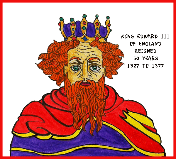
SUNDAY - Watercolour pencil painting of King Edward III of England:


MONDAY - A pretty girl with a  couple of doggerel verses to explain what she is thinking:


TUESDAY - Visit to a Matisse Exhibition resulting in an I-Pad drawing of one of his pictures:


WEDNESDAY - Inspired by a Modigliani drawing:


THURSDAY - Up-dating Philip the Good


Linking with 29 FACES FEBRUARY 2014, PAINT PARTY FRIDAY, PAPER SATURDAYS, ARTISTS PLAY ROOM

Friday, 21 February 2014

FACE NO 22 FOR 29 FACES FEBRUARY

FRIDAY, 21 FEBRUARY - FACE NO 22

Pit Artists Pen and Coloured Pencil - by Jez
Face 22 was inspired by a newspaper photograph which I cut out and kept for a future drawing.  The photo accompanied a funeral report in the local newspaper of Rabbi Sidney Kaye who died December 2013.  He looked a kind, caring, compassionate man, who perhaps had seen more sadness in his life than he should have done.

In this case, I do mean that I was 'inspired', not just by the photo but by a brief summary of his life story which formed part of the report.  Rabbi Kay, who was not then a rabbi but an ordinary soldier, was involved in the liberation of Bergen Belsen Concentration Camp at the end of WW2, and was able to give comfort to people who were sick and/or dying by speaking to them in their own language.  It was later in his life that he became a rabbi.

When I had completed the sketch I remembered that a couple of years ago I drew a quick sketch of the very same person, when his photograph was in a newspaper report about a local social event.


It is interesting to see the changes in his appearance two years later - the glasses, the fuller beard and a few more age lines delineating the structure of his face.


AND HERE IS THE ROUND-UP OF THE WEEK'S FACES

SATURDAY 15

Painted entirely with my fingers

SUNDAY 16

My attempt at cross-hatching

MONDAY 17

Flourishes in Shades of Red

TUESDAY 18

Drawn entirely with a sewing needle and ink

WEDNESDAY 19

Faces found in a watercolour scrap sheet 

THURSDAY 20


LINKING TO 29 FACES FEBRUARY 2014, PAINT PARTY FRIDAY, PAPER SATURDAYS, ARTISTS PLAY ROOM

Friday, 14 February 2014

FACE NO 14 FOR 29 FACES FEBRUARY 2014

FRIDAY 14 FEBRUARY - FACE NO 14

'TIME TO BREAK THE RULES
Sketch and Collage by Jez
Abby, in this post at her blog talked about the work of Annie Higgie and her unusual black and white collages.  Abby had created her own brilliant version, and this inspired me to try my hand at my own interpretation of the style.

Definitely way out of my comfort zone, but I was so excited thinking about it all the time and how I could approach it.  Having looked at Anna Higgie's work on the net, I shut my mind away from her images as completely as possible so that I could do something that was my own, not a poor copy.  For a start I decided on a male face instead of a female face.
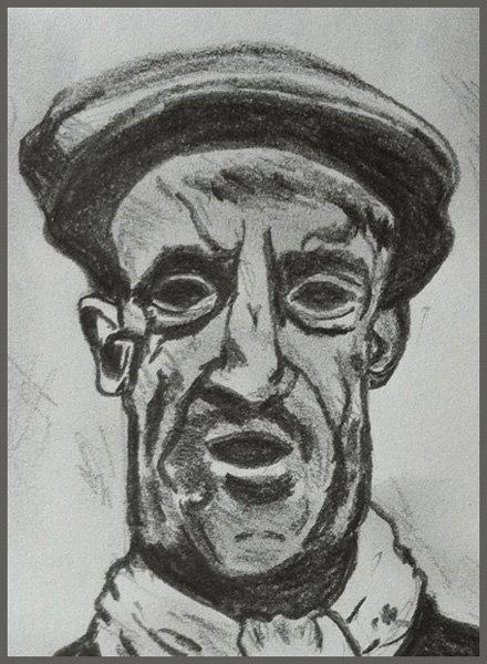

Searching through magazines for black and white patterns turned up very little, just about enough to create this sketch/collage.  Since I'd like to do more of these I had better start collecting for future efforts.  I was lucky to find the words jump out at me from one magazine, and I'm always happy to be working in my favourite 'colours' of black, white and red. 

The most difficult point for me was when I had drawn a face I was happy with ….. and then having to do something to mess it up, but having done it once I shall be able to do it more easily next time.


Here is the round-up of this week's other faces, starting with …..

SATURDAY


SUNDAY
MONDAY


TUESDAY


WEDNESDAY


THURSDAY


Linking to 29 FACES FEBRUARY 2014Three Muses Challenge, Paint Party Friday, Inspiration Avenue, Paper Saturdays,

Saturday, 8 February 2014

FACE NO 8 FOR 29 FACES

SATURDAY, 8 FEBRUARY - FACE NO 8

ANOTHER FINE MESS
Pitt Artists Pen and red gel pen
by Jez
For last September's 29 Faces I drew a pen sketch of Oliver Hardy and was very pleased with it.  In all fairness I thought I ought to do the same for Stanley Laurel.

Now this did take me out of my comfort zone a little because Stan doesn't have the same immediate impact of recognition as Olly.  I don't like Laurel and Hardy films, it's just never been my kind of humour even as a child, but at Christmas we bought a BBC film about their behind-the-scenes relationship - good film, if rather short.


I think the problems I had were to do with the fact that Stan has a much more mobile face than Olly, and really he is only 'Stan' if he is making a 'Stan face' and wearing a bowler as in the sketch, or pulling at his hair while making a face.  Otherwise he is a quite ordinary-looking man.

When I had sorted this out in my mind I was able to start.  Perhaps it is a good idea for us to analyse what it is about a technique or subject that is taking us out of our comfort zone, and that may make it a little easier to start.


So ….. I was very pleased that I had tackled Stanley, but rather less pleased with the result.  I still feel I have not really captured him, but here he is, my Face No 8 for the 29 Faces February Challenge.

Linking with 29 FACES FEBRUARY 2014, PAPER SATURDAYS and ARTISTS PLAYROOM

Friday, 7 February 2014

FACE NO 7 FOR 29 FACES

FRIDAY,  7 FEBRUARY - FACE 7

After 'Danny' by Roger Hampson
- I call my sketch of him:
'ALBERT IN HIS WORK CLOTHES'
Derwent Dark Wash Pencil - by Jez
I drew Albert at the Atkinson Art Gallery in Southport - one of our favourite places to spend a few hours sketching, and then enjoying lunch and coffee in the great café downstairs.

This sketch definitely took me well out of my comfort zone.  The painting I sat and copied is called 'Danny', a monoprint by Roger Hampson, a North-West England artist who lived from 1925 to 1996.

'Danny' is one of my favourite paintings, such a strong, real face and I always spend time studying it every time I visit the gallery.  I've always avoided trying to sit and draw from this painting because I've always thought I wouldn't be able to do it justice.  It took me quite a while, and a great deal of concentration.


The drawing at the top of this post is an out-take from this sketchbook page showing just the head, so that you can see it more clearly.  I used a Derwent Dark Wash pencil - it can be used with water, but I kept to the dry pencil sketch.  

If you've never used one of these pencils it's worth a try because it's very pleasing to draw with and takes a wash-over with a brush very well.

To say I was pleased with this is putting it mildly.  I was ecstatic with the likeness I achieved to the original.  Well worth pushing myself outside my comfort zone.

HERE ARE THE PAST WEEK'S FACES

SATURDAY
SUNDAY
MONDAY
TUESDAY
WEDNESDAY
THURSDAY
FRIDAY