Showing posts with label COLLAGE OBSESSION. Show all posts

Friday, 16 May 2014

THREE CHALLENGES

For Inspiration Avenue the challenge is Creativity and Cats, and I've created Dezzy:

Dezzy - by Jez
DEZZY THE MOVIE ACTOR

Dezzy is an actor, and he thinks that's cool,
He learnt his acting skills at the Feline Drama School.

Just now he's in a movie with a wonderful part,
Being ugly and scary, with a very black heart.

So he looks very fierce, but when all's said and done,
He's not wicked at all - he's just having fun.

I hope that the So Artful Challenge team will not mind me submitting a second entry for their theme of Friendly Monsters, but it's such a fun theme that I wanted another go:

Rose - by Jez
ROSE, THE CAMEPHANT

She's a Camephant and her name is Rose,
Four Humps, twisty tail and an oversized nose.

Rose lives in the desert, as everyone knows,
Where the land is dry and nothing grows.

And she wears her boots wherever she goes -
She can't bear getting sand in between her toes!

Finally, Collage Obsession has an Open Theme this week, so I am showing a page from my sketchbook of my art mannikin Mervynn:


Friday, 24 January 2014

HATS AND WORDS AND SOMETHING NEW

FLISS'S HAT TRAGEDY
Mixed Media on Watercolour Paper
- by Jez

FLISS AND THE LADIES GROUP ANNUAL HAT COMPETITION

Fliss, as you can see, is not a happy bunny
She made her own hat and it took a lot of time and money.

She made it to her own design.
- I don't like it, but she thinks it's fine.

She loves the feather and all the flowers,
And making it passed many enjoyable hours.

But then Fliss had a great surprise
- She really couldn't believe her eyes.

A garden, some posts and washing she sees,
And a girl hanging clothes out to dry in the breeze.

This invasion by that squatter of minimal size,
Means our Fliss now has no chance of winning the prize.

That's why she looks grumpy, as grumpy can be,
Though I think the hat's improved, and I'm sure you'll agree.

A NEW APPROACH FOR ME -
SKETCH, COLLAGE AND SKETCH
When I make a collage I work directly by cutting and sticking onto the paper or card, with no sketching and with little or no pre-planning about where it is going.

I thought I would try a different approach for this piece, starting with a sketch, adding some collage elements, continuing with more sketching and then colouring.  The A3 sheet of watercolour paper I used already had splodges of pink watercolour on it.


Next I cut out the hat shape from Docrafts 'Papermania' paper and free-cut the flower shapes from magazine pages.  The flowers that look black are in fact purple, but the colours on the photo have not come out very true.


So this is how it looked when the collage/sketch was done - my entry for the Take A Word  challenge of "Hats-N-Things'',  for Creative Every Day and Sketchbook Challenge "Sketch and Collage".

'Radiant Leaves' - Jez
Watercolour on Watercolour Paper
For Collage Obsession we were asked to use Pantone's Colour of the Year - 'Radiant Orchid' - as the main colour or as an accent colour.  Radiant Orchid is a pretty name for light purply-mauve, and an attractive colour too.   I've used the nearest I could get to it for the four light mauve leaves at the top of the leaf picture.

'HAND' - Jez
Acrylic onWatercolour Paper
Word and frame added on Photoshop
I was pleased with the simplicity and colour of this painting of my hand-print for my offering to the Three Muses challenge of  'Choose a Word'.


Also linking to Paint Party Friday,  Artists Play Room, and Paper Saturdays


Tuesday, 20 August 2013

A MISCELLANY OF ENJOYMENT

I had lost my creative mojo a little bit, so I spent a few days just playing about with making postcard sized collages just for fun.  The result was that today I found it easy to get straight down to creativity and sorted out five challenge pieces.  So the enjoyment was mine, just feeling the flow, but I hope that you also enjoy something in this post.

Firstly, here is my postcard sized sketch for this week's theme of Baking for Sunday Postcard Art.  This came together so quickly.


I made a very quick sketch in my 'rough' sketchbook while I had my morning coffee, came back to the studio to draw and paint it.  When it was finished, I realised I had concentrated on the 'baking' and had forgotten the postcard size.  So I cheated a little and added some blank space at the top to get it to the right size.

We were given a colour challenge from Collage Obsession, with the colour purple to be used.  Here's my offering:


I just love the rich colour and this image which started from a photograph.  Yesterday my sweet neighbour from the apartment three floors above us came to the door with a beautiful bunch of salmon pink roses because when she saw me on Sunday she thought I didn't look well.  Such thoughtfulness and kindness, and the flowers make me happy whenever I look at them.

The purple image doesn't look much like pink roses, but that's how it started.  I photographed part of the bunch using the Photo Booth app on my i-pad and choosing one of the image types available.  I think this was 'swirl'.  Then in the PSE app (Photoshop Express) on the i-pad I changed the colours to purple.  I love the result.


This colourful scene started as a postcard sized experiment I made with acrylic paints some time ago - just the central section that suggests trees or mountains.  On Photoshop I added the blue and the sandy colours and put a frame around it.

It just fits the brief from Inspiration Avenue of 'Postcard'.  The abstract image gives me the feeling of a landscape, and with our grey cloudy skies at the moment it looks just the kind of warm and colourful place where I'd like to be spending a few days of holiday and sending a postcard back to my friend.


Jen at Artists Play Room suggested it would be a fun theme to use 'Abstracts' as our challenge this week.  So I decided to have fun and created the abstract painting above.  It consists of four waste pieces from a larger acrylic painting that I was cutting up to use for something else.  A constant saying when I was growing up was 'Waste not, Want not',  so I decided to put them together to make an abstract with a difference.

These are the three strips and triangle that I put together, cut the top and bottom straight and stuck onto another piece of card.  Quite pleased with that.

And last of all, here's my offering for the Take a Word challenge of 'Warm Colours'.


The background is something I tried out a while ago, and I have been wondering how to complete it.  I searched through my box of 'failed paintings', and this image of a girl jumped out at me from an acrylic experimental piece.  The girl's size, shape and colouring were exactly right.  I cut her out and stuck her in the cave-like space of the background.  And I loved it.

The girl came from the failed painting that produced the waste strips used for the abstract above.

All in all I've had a good arty day, great fun, and feel I've got my mojo back.

Monday, 12 August 2013

FISH, ELEPHANTS AND BERRIES


A FISH OUT OF WATER

Three different challenges today.  First in the miscellany is my offering for Sunday Postcard Art for the theme A Fish Out of Water.  I'm afraid Florence, my goldfish, had unachievable daydreams, thinking that she was a mermaid and could live on land as well as in the water.  What a tangle she's got into.  It's going to take a couple of helpful mermaids to get her out of this fine mess.


This is my initial drawing, all done freehand so the width of the lines is not 100% even, but they're all just as much of a nuisance to Florence as if they were.  I coloured with Inktense pencils, used as watercolours.  

My inspiration for A Fish Out of Water came from a quilt I designed and made for our 40th wedding anniversary, sixteen years ago, which used on our bed every day.  I designed and appliquéd 25 original celtic designs, all different, which are set on a pale cream background.  The design around the fish is not a celtic pattern, but looking at the quilt as I placed it on the bed yesterday inspired the idea of the fish trapped within a network of lines.


LITTLE THINGS

This is a drawing from my sketchbook, part of a large page of sketches of berries and leaves from the elderberry tree, and I'm entering this for Artists Play Room.  Jen has asked us to focus on little things, and I think this sketch of the few tiny berries that have been left after the birds have taken their share contains plenty of little things.

Quite a simple drawing, with a Pitt Artist's Pen, but one that requires careful observation and concentration.  One of the things I find fascinating with elderberry flower/berry heads is how each small section of the spray looks like a miniature tree.

A little bit of re-cycling next for the Take a Word challenge of Wild Animals.


WILD ANIMALS

Now you may think that Sonia, my pink elephant doesn't look at all wild.  Well generally speaking she's the nicest elephant you could wish to meet, but if you should ever be unkind to her watch out, because then she really does get WILD.  Look what happened to this poor fellow.

This comic strip is one I drew for my January review for Artful Readers Club for a great book 'The hundred-year-old man who climbed out of a window and disappeared'.  A great title and a really entertaining read - the book is as funny as the title.  I was so happy with this little comic strip I drew that I am glad of the opportunity to re-cycle it. 
   

Tuesday, 30 July 2013

HERE COMES SUMMER

'Summer' by Jez
Click to enlarge
The theme for Collage Obsession this week is SUMMER, very appropriate in England just at the moment.  I won a prize with this wall-hanging in a competition and was very pleased because it was quite difficult to make.

I'm stretching the point a bit here with this quilted fabric wall-hanging which was made many years ago.  It's made from fabric not paper, and the details appliquéd - or collaged.  Appliqué means 'something applied to another surface' and Collage refers to 'something being applied to another surface, usually paper, wood or canvas', and even nowadays to digital collage where 'collaged' items are not actually stuck on or sewn on.

So I hope I will be forgiven for regarding this piece as collage because I love it so much, and it always makes me think of hot summer days.

23" x 19.5"
This is a close-up of the central panel.  The background is made from artificial silks and machine quilted.  The details were added in various ways.  The pier in the background was machine stitched, like a line drawing.

I imagine a quilter taking her work along with her to the beach and then thinking that there are perhaps more important things in life than quilting and just ......... well you can see what she decided to do. 


Here's an even closer view of the details, especially the miniature quilt, which is made from cotton fabrics.  It is a proper little stitched patchwork quilt with a front and a back, and each fabric square measures three quarters of an inch by three quarters of an inch.

In this close-up you can see that the blue scalloped border of cotton fabric is machine quilted with scallop shell motifs to suit the seaside scene.

I used to love making miniature quilts, but eyesight and patience and manual dexterity would make it impossible for me nowadays.


I've taken an even closer photo of this small section to show the tiny needle I included, which is in fact a piece of fine silver wire and not a needle.


Here's the completed wall-hanging again, with all its collage/appliqué pieces.  Hope you enjoy it.

Monday, 22 July 2013

A CHEERFULNESS OF CHALLENGES

I don't know if there is such a thing as a collective phrase as a Cheerfulness of Challenges, but I have enjoyed making these challenge entries and they have made me feel cheerful.

To start with, here is my postcard entry to the Sunday Postcard Art theme of EPHEMERA:


The definition of ephemera includes 'something designed to be useful for a short time'.  Well, parking tickets are not just useful.  They are essential in today's world, even in hospital car parks which adds severely to the annoyance of having to visit a hospital frequently.  

I was tidying the car's glove box a few months ago (next tidy due in three years!) and I found a wad of parking tickets.  The Morrison's tickets in the card above include one each from 2008, 09, 10, 11, 12 and 13, so old the ink has faded.

The sketch below is from a ten-year-old sketchbook, and I was pleased to find it matched two challenges:


This is a page from a section in a travel journal recording an enjoyable trip to Glasgow, a first-ever visit.  For some reason this sketch popped into my mind and I took out the sketchbook recording this trip to use for the Collage Obsession challenge of 'A Page in a Travel Journal'.

We like visiting museums and sketching anything that takes our eye.  I loved this old car, and challenged myself to draw it by starting at one point and keeping my pen on the page throughout - taking a line for a walk.  I probably lifted the pen a couple of times and pretended I wasn't cheating.  It was a difficult thing to draw but worth the intense concentration involved.

We don't travel far at all these days, so re-visiting the pages of that travel journal brought back many happy memories - which makes it just right for the Take a Word challenge of 'Memories'.  One of my happiest memories of that Glasgow trip is coming across the multi-screen cinema and going to see 'Chicago', followed the next night by seeing 'Frida'.  These are now two of our favourite films, watched many times on DVD.

Lastly, the Artists' Play Room challenge is 'Weather'.  Well, the weather in the past year or so has certainly been a challenge in all parts of the world, so that's how I approached the theme.


I've drawn a very INaccurate map of England and Wales - sorry Scotland, but you are very difficult to draw.

I used weather stickers from a kids sticker book by Grafix, which seemed to me to show the way our weather travels through a range of cloud, sun, rain, sun, cloud, and hailstones all in one day.  At the moment it is too hot, humid and I can feel the pressure that comes before a tremendous rainstorm at the end of a hot period.  Just when all the farmers round about here have planted out their baby cabbages, leeks and cauliflowers.  I know I shall be sad to see them when we drive out again, all battered down with the rain.

As Moana Lott used to say on the WW2 Tommy Handley ITMA show (which only other ancients like me will perhaps remember) ...... "It's being so cheerful as keeps me going."

Also linking to Manon's Paper Saturdays

Friday, 5 July 2013

BUTTERFLIES ON MY MIND


This week the challenge from Take a Word is 'Butterflies', and over at Inspiration Avenue it's 'Red White and Blue'.  Then at Collage Obsession the theme is USA, celebrating the 4th July.  At first I thought I'd be giving it a miss since I am English, but then decided I could use the 'Red White and Blue' theme there.

My personal challenge was to combine butterflies with red, white and blue, a rather unlikely pairing perhaps.


I love butterflies, but I wanted a different take on them, and rather than create a picture with pretty, colourful butterflies I was inspired to turn them into a red white and blue abstract which disguised the original butterfly drawing.

My start point was the single butterfly outline above, drawn with black pen in the middle of a sheet of A4 white Bristol board.


I kept repeating the drawing fairly randomly over the page so that they interlinked.


At this point I decided that a 6" x 6" square would produce what I wanted, and cut out a frame to help me choose the section I liked best.


And this is what I chose.

'Butterflies in Hiding' - Jez
This is the finished abstract, coloured in photoshop.  You should be able to pick out some of the butterflies at least.  I do like the way the pattern has curled around in an unexpected fashion.


Thursday, 27 June 2013

HAPPY APPLES IN PURPLE AND LIME GREEN


Happy Apples - Card Collage
Jez
If this was my school report, then it would be saying of my Happy Apples collage "Could Do Better".  I didn't want to miss this week's Summer of Colour challenge, which asks us to combine purple and lime green, even though I had very little time.

I thought making a 'quick' collage would do the job, and in my file of coloured card I was happy to find just the colours I needed.  It was going to be easy-peasy, especially as I decided to use my narrow double-sided tape to stick the thing together.


Everything possible went wrong.  I know it was my present state of mind that caused the problems, but everything that could went wrong.  I kept measuring incorrectly, the ruler kept slipping as I cut the yellow strips, the double sided tape was just that bit too wide for the strips.  Then when it came to sticking things on, the tape stuck firmly to the card, and when I tried to remove the protective strips it brought away the surface of the card!

So I hope you forgive that wonky strip of tape in the lower half.


My inspiration for the apples came from the rich colour of the green card, and when they were at last stuck on they just asked for faces to be drawn on them.


Fortunately the themes for two other challenges fitted in perfectly with the Happy Apples collage, so I am also linking Collage Obsession and Take a Word. 

For  Collage Obsession the challenge is to "tell us something about YOU".  You may already have guessed, if you have seen some of my previous posts, that I enjoy making light-hearted, silly images, and will carry on doing so until I grow up, if I ever do!

And at Take a Word Electra has chosen the theme of "True Happiness".  Just making art of any kind makes me happy:-
"Joy fills my heart
When I make art"


Wednesday, 12 June 2013

A COLLECTION OF CHALLENGES


The abstract watercolour painting above is my entry for this week's theme of BIRDS for Inspiration Avenue.  I was pleased when the blobs and dabs I dropped onto the paper turned into mythical bird shapes, and so I'm happy with it.

Jenn has chosen the unusual theme of BIZARRE for Artist's Play Room this week.  An interesting challenge that cried out to be a collage, so I let my mind go free and assembled a collage from torn and cut magazine pages.  The pages containing the mask and the words were collected and stored in collage stash years ago, so I apologise for not crediting the particular magazines.

What I find bizarre about collage is the way the pieces we choose suddenly combine themselves into an image we would never have thought of, which was certainly the case with the 'I want ... I don't want' collage above.

As the theme for Sunday Postcard Art is A JOURNAL PAGE, I'm also linking the 'Bizarre' collage above to Sunday Postcard Art.


For Take a Word this week we were challenged to use COOL COLOURS, and I chose blue and green - with a touch of red and yellow to add a little zing.  I find that painting watercolour abstracts with a free mind and no planning produces a painting in a fairly short time, and as with the 'Bizarre' collage above, it produces something really unexpected.  Don't ask me what this one means, I'm only the artist!

Click on the image to enlarge it so that you can read the words
I enjoyed searching my box of old photos for something connected with my family.  I have only about half a dozen family photos because sadly my parents destroyed everything except those I had filched from time to time without their knowing.  So I'm glad I was naughty enough to do that.

The theme for the Collage Obsession challenge is SISTERS AND BROTHERS, and I concentrated on sisters - my sister and me.  I realise for the first time that we never had a photo of all the children in our family together.

The photo above was taken when my sister was 7 and I was 3, 75 years ago, and was lightly tinted by hand by the photographer, though it doesn't show up too well on the scan.

The words round the edge were inspired by the old Beverley Sisters' song 'Sisters', adapted fairly loosely.  For overseas readers, the Beverley Sisters were a 1950s and '60s singing group of three real sisters, Bev, Babs and Teddie, who modelled themselves on the Andrews Sisters.

I wrote:   Sisters, sisters, there were never more devoted sisters,
               I am here to keep my eye on her
               She is here to keep her eye on me,
               Many folk have tried to split us up, but no-one can, nobody can .....

She did have to look after me while my mother looked after the younger children and worked to keep us when my father was missing and then a POW in WW2.  I was very mischievous so I was always getting into scrapes and falling from trees or fences, and my sister had to make me hide any bumps and bruises from mum.

Hope you like some of these pictures - I enjoyed making every one.  I'm so glad I found these challenge blogs - thank you to all those who put in the time and effort to run them.


I shall also be linking to Paper Saturdays and Paint Party Friday

Tuesday, 21 May 2013

LEGS, BUTTONS AND BOWS AND SEWING

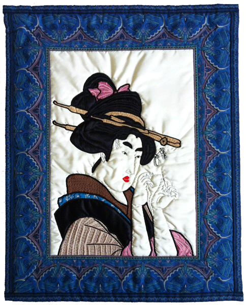
Today I'm including posts for a few challenges.  At one time I was heavily involved with textile arts for quite a number of years.  The first two images below are appliquéd and quilted wall-hangings I made just for my own pleasure rather than for sale.  When I saw the themes for the challenges I remembered these, and wanted to share them with you.

BUTTONS AND BOWS
The stylish lady in this wall-hanging is just right for the Sunday Postcard Art theme of "Buttons and Bows".  I've always been too impatient for hand quilting or appliqué (and not good enough, either), so anything I've done has always been completely made on the sewing machine.

Does anybody remember the amusing old song from the 1950s and 60s "A Sewing Machine is a Girl's Best Friend".  It started something like this:

"Oh! A sewing machine, a sewing machine is a girl's best friend,
If I didn't have my sewing machine I'd have come to no good end.
A bobbin, a bobbin, a wheel, a wheel, I while away the day,
By night I feel so weary that I never get out to play."

SEWING!
In my opinion this lass is never going to get the thread through that needle!

This lovely geisha is my offering for the Take a Word theme of "Sewing", with artificial silk fabric for the central panel.

When I made this wall-hanging, I left the puffy cream silk background as a cushiony contrast to the extensive machine embroidery on the clothes. Sadly it doesn't photograph well, and perhaps I should originally have made the decision the quilt the background as well.

The image was taken from a beautiful card, but I've lost my record of who the artist was, so I apologise for not crediting it.  

ONE WORD
The challenge from Collage Obsession this week is "ONE Word", using the word as the focal point or as an element in the artwork.  This is just a fun piece that I made a while ago.  

In Photoshop I selected the legs from a photograph I had taken of a young friend, repeated it to form a design and then printed it out onto the cream cotton fabric ready for quilting with random free-machine quilting on the sewing machine.  For the challenge I've added a red border and the word "Legs" in Photoshop. 

I'll also be linking this to Artist's Play Room , Paint Party Friday and Inspiration Avenue .


Monday, 13 May 2013

UP THE APPLES AND PEARS - 'STAIRS'


I took this photo looking down from the top floor over the huge circular stairway that is the centrepiece of the new Museum of Liverpool, at Liverpool England, and it just fits the theme for Collage Obsession this week.

And for those of you who may not of met with the phrase 'up the apples and pears', it's Cockney (London) rhyming slang for stairs, like 'trouble and strife' for wife.

My husband says his family, in Liverpool, used the phrase 'up the dancers', but he has no idea where it came from.  Until I married my family lived in a bungalow, so we never had any need to go up the stairs

And while we are on the subject of stairs, do you know this rhyme?

As I was going up the stair
I met a man who wasn't there.
He wasn't there again today,
I wish to heck he'd go away.