Showing posts with label ABSTRACTS. Show all posts

Tuesday, 12 November 2013

COLOUR AND NUMBERS


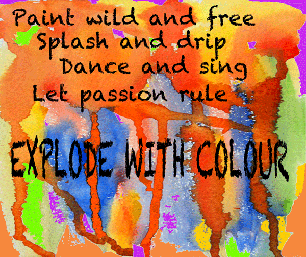
My abstract watercolour painting is my offering for Try it on Tuesday's Challenge of 'Colour Explosion', the kind of sloshy, drippy, enjoyable art that it's great to indulge in now and then.  I added a little poem I wrote to match the challenge theme and added the words on Photoshop.

Next is another Try it on Tuesday piece.  I was lucky enough to win the September challenge of 'Dots', and the prize package that arrived in the post from The Stamp Man of Keighley contained two packets of stamps by Stampendous.


This is where I admit that I have tried and tried with stamping and could easily claim another prize as The Worst Stamper in the business.  I've always admired stampers and the lovely results they achieve.  My daughter, Carol, was an expert stamper, and she bought me materials and stamps to encourage me.  I've bought books, watched video tutorials and craft demonstrations, but still find success eludes me.  I think I am not patient enough.


I promised that I would post something I had created with the stamps this collage shows the final result of my efforts.  This is where expert stampers are welcome to chuckle, and I don't blame them.  I decided the best thing was to just try each stamp separately, and the pics above are the best of pages and pages of attempts.  I don't know where the blue background came from, though the day was rather cloudy when I took these photos.  

I love all the stamps - the chair is an amazingly lovely and detailed stamp, and the green twirls look particularly useful and delicate, and as for that lovely lady .... she's gorgeous.  So I have tried really hard, and will continue trying, and hopefully will include some stamping with them in future creations.  Thank you Try it on Tuesdays.

And now, for Artists in Blogland, the Scavenger Hunt for November is 'Numbers'.  I scavenged around for an interesting house number I could photograph, and found this one on a building in Southport.


I loved the rusty look with the paint cracking here and there.
Like many people I usually like to start my arty day by doodling for a few minutes.  I almost always have a sheet of A3 paper on the big easel and I pick up any medium I fancy to start drawing.  This was drawn a week or two ago, very quickly, with jumbo wax crayons.  I started with the orange shapes - no plan in mind, just letting my hand do what it wanted. This weird shape emerged and I was surprised to find myself putting numbers in the spaces.

I would normally have scrapped the page, but fortunately didn't get round to doing so and it has found its place in the Scavenger Hunt Numbers.

Linking with Try it on Tuesday and Artists in Blogland  

Tuesday, 20 August 2013

A MISCELLANY OF ENJOYMENT

I had lost my creative mojo a little bit, so I spent a few days just playing about with making postcard sized collages just for fun.  The result was that today I found it easy to get straight down to creativity and sorted out five challenge pieces.  So the enjoyment was mine, just feeling the flow, but I hope that you also enjoy something in this post.

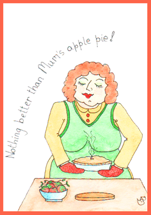
Firstly, here is my postcard sized sketch for this week's theme of Baking for Sunday Postcard Art.  This came together so quickly.


I made a very quick sketch in my 'rough' sketchbook while I had my morning coffee, came back to the studio to draw and paint it.  When it was finished, I realised I had concentrated on the 'baking' and had forgotten the postcard size.  So I cheated a little and added some blank space at the top to get it to the right size.

We were given a colour challenge from Collage Obsession, with the colour purple to be used.  Here's my offering:


I just love the rich colour and this image which started from a photograph.  Yesterday my sweet neighbour from the apartment three floors above us came to the door with a beautiful bunch of salmon pink roses because when she saw me on Sunday she thought I didn't look well.  Such thoughtfulness and kindness, and the flowers make me happy whenever I look at them.

The purple image doesn't look much like pink roses, but that's how it started.  I photographed part of the bunch using the Photo Booth app on my i-pad and choosing one of the image types available.  I think this was 'swirl'.  Then in the PSE app (Photoshop Express) on the i-pad I changed the colours to purple.  I love the result.


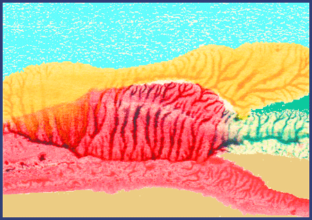
This colourful scene started as a postcard sized experiment I made with acrylic paints some time ago - just the central section that suggests trees or mountains.  On Photoshop I added the blue and the sandy colours and put a frame around it.

It just fits the brief from Inspiration Avenue of 'Postcard'.  The abstract image gives me the feeling of a landscape, and with our grey cloudy skies at the moment it looks just the kind of warm and colourful place where I'd like to be spending a few days of holiday and sending a postcard back to my friend.


Jen at Artists Play Room suggested it would be a fun theme to use 'Abstracts' as our challenge this week.  So I decided to have fun and created the abstract painting above.  It consists of four waste pieces from a larger acrylic painting that I was cutting up to use for something else.  A constant saying when I was growing up was 'Waste not, Want not',  so I decided to put them together to make an abstract with a difference.

These are the three strips and triangle that I put together, cut the top and bottom straight and stuck onto another piece of card.  Quite pleased with that.

And last of all, here's my offering for the Take a Word challenge of 'Warm Colours'.


The background is something I tried out a while ago, and I have been wondering how to complete it.  I searched through my box of 'failed paintings', and this image of a girl jumped out at me from an acrylic experimental piece.  The girl's size, shape and colouring were exactly right.  I cut her out and stuck her in the cave-like space of the background.  And I loved it.

The girl came from the failed painting that produced the waste strips used for the abstract above.

All in all I've had a good arty day, great fun, and feel I've got my mojo back.

Wednesday, 15 May 2013

GEOMETRIC PAINTING for TUTORIAL TRYOUTS


Kristin's Tutorial Tryouts this week was Denthe's geometric approach to painting abstracts.  The red and black version above, using fine point pens, was my second effort.  I decided I liked the idea of a very restricted number of colours for this technique and I always love using just red and black on white.  This was my favourite of the three I attempted.


For my first attempt I wanted to see what the technique involved so I didn't stray too far from Denthe's layout and use of birds - though the birds and design are my own.  I made two mistakes here - firstly I used A4 paper in a sketchbook with absorbent paper.

Then, because things are rather difficult at the moment, I decided to save time by using coloured pens instead of paints.  Big mistake, not helped by the fact that some of the pens started to run out before I had finished, as you can see from the streaky mess.  I was quite pleased with the result of the design, but didn't feel it was 'my own', which is why I went on to the black and red version.


Using a bit of sense for the black and red one, I drew a 4" square.  Instead of geometric shapes I drew random curvy shapes and small circles..  Filling in the colours is a little like doing a jig-saw or a puzzle, making sure colours always butt on to a different colour.  The result makes me think of circus faces.


For the fishy shapes I used more colour, again within a 4" square.  I used kiddies sparkly gel pens, and you can see some of the sparkle in the top half - we actually had a couple of hours of sunshine yesterday that highlighted the sparkles.  I quite like this one, though you will probably notice the non-deliberate mistake in colouring.  Ten points for you if you do.


I do like drawing black outlines around my shapes, though I was always told in art classes that 'people and things do not have black lines around them in real life'.  So I thought I would see what happened on this little sketch if I outlined the fish more clearly.  It loses a lot of the abstract nature, but I like it.

This is an enjoyable technique that can be adapted to anyone's style.  It is interesting trying to get the right balance of drawings, geometric shapes, 'in-between spaces' and colour, and I enjoyed the tutorial.  

My thanks to Denthe for her generosity in sharing, and to Kristin for using the tutorial this week.
Do check out Denthe's tutorial, 
and the great paintings by other artists on Kristin's Tutorial Try-outs.

Thursday, 2 May 2013

MEET THE FAMILY - Tutorial Tryouts with Kristin


THE FAMILY

No, not MY family, these are not blood relatives.  Though in a sense they are my family because I created and named them, and in spite of everything I've become a little fond of them, even if they are all big drips.  Dev said they were quite good, but in a revolting sort of way!

This week's tutorial on Kristin's Tutorial Tryouts was about painting abstract portraits on a Youtube video.  Quite an experience, though I'm not sure the word 'abstract' applies, I'd say more 'weird' which suits me down to the ground.  I like weird.

 Acrylic paint on A3 watercolour paper

I followed the video for my first effort, and intended to keep as closely as possible to the style, but this fellow took on a life of his own.  This is Jasper.  He's the failure of the family, and he knows it (the rest of them are always telling him so).  That's why he doesn't look very happy.

                                                        Acrylic paint on A3 watercolour paper

I wondered how the technique would work with a profile view, and somehow it doesn't quite seem to work on a profile.  Anyway, I went my own way for the second attempt, and this is Everett.  Now Everett is a rather nasty piece of work, and I have to admit that he is mainly the one who has given Jasper an inferiority complex.  I don't trust him an inch (or even 25 millimetres).

                                                      Acrylic paint on A3 watercolour paper

Out on my own now, doing just whatever came.  This is Samilla.  She's the brains of the family, with a PhD in the Fluidity of Acrylic Paint Drips in Temperate Climates.  At the moment she's working in McDonalds but, like Mr Micawber, she's sure something will come up very soon.


I wondered about introducing a little more realism.  Well, as you can see, it just doesn't really work.  Nor does Archibald.  He doesn't have time to go out to work because his hair and beard are very high maintenance, so he's on the Government's new Universal Benefits.  Looking at that blue cape thing, I think he's at the barber's at the moment trying to ensure that he looks his mediocre best, and he's listening to his i-pod while the job is being done.  Never wastes a moment, that lad.

I think you can see that I enjoyed myself with this tutorial, even if it was a bit of a struggle.   And I learnt quite a bit, particularly how to get really good paint drips - something that I've never been very good at.  There is clearly plenty of mileage in this technique, and I intend to keep using it and incorporating it in things other than portraits.  Try it, I'm sure you'd have fun.

Nice one, Kristin, thanks.

Tuesday, 26 March 2013

ACRYLIC ABSTRACT 'FLIGHT' - A.P.R WEEKLY CHALLENGE


The APR Challenge from Jenn at Artist's Play Room this week is FLIGHT.  As soon as I saw the title my mind went blank, because last week's challenge for Collage Obsession was 'I Can Fly'.  So no new ideas came to mind.

Today's Art Tip:  When in doubt, paint an abstract.  So I got out the acrylics and decided to let my paintbrush take the lead and see what happened.  This is what my hand and the paintbrush obligingly produced:

'Flight' - Acrylic on paper     Jez

I don't think I would have produced this if I had applied conscious thought to the painting.

 I would say it's 'not my style', but Dev often tells me that 'my style' is not to have a style, but always producing something different, yet recognisably mine.  I think that's a compliment.

 To me the painting gives the feeling of the birds flying home - into darkness!!  Creepy.


As so often happens, I took the image into Photoshop to play around with colour changes.  This red version has something, but it doesn't work for me.

I learn a lot about colour and what does work for me and what doesn't by making colour changes in Photoshop, and it's interesting how the change of colour also changes the 'story'.  I know an abstract is an abstract, but so often it's a case of 'Every picture tells a story'.


This purple and blue version is a bit more interesting, and I like the combination of the purple and blue.


While I prefer the original colours, I do like this blue one.  It makes me think that if the dark colours on the left were mainly white it would give the feeling that it was about the sea.

Which one do you prefer?