Showing posts with label I-PAD PAINTINGS. Show all posts

Tuesday, 29 April 2014

KEEP THEIR SUNNYSIDE UP

It's springtime, and the challenge at Opus Gluei is EGGS, so it seems the right topic for a vintage song, with a few changes from the original lyrics:

KEEP THEIR SUNNYSIDE UP


Keep your sunnyside up, up,
Let your laughter come through, do.
If you think it's raining for you
Just remember others are blue


Keep your sunnyside up, up
Turn that frown to a smile.
Stand up on your legs,
Go and fry some eggs,
And keep THEIR sunnyside up.


Linking to Order of the Opus Gluei,

Friday, 29 November 2013

NAEDM WEEK 4

This is the last full week for November Art Every Day Month, and I can't believe how quickly it has gone.  Dev had a medical procedure at the hospital yesterday afternoon, Friday, and woke this morning feeling unwell.  We've had plenty of hospital appointments lately, including three last week, but Friday to Monday have been far from fun with rushing about to get weekend treatment for a hospital induced infection.

Normally I'm lucky to get a couple of hours in the studio on most days, but I've been so glad of NAEDM this week.  I know I wouldn't have created anything all week otherwise, whereas it has made me snatch the off half hour or hour, and given me some relaxation.

SATURDAY

Fortunately I managed to find an hour late in the morning for a doggerel doodle while Dev went back to bed for a snooze, and Bertie Birdsong came powering in to cheer me up as I painted him.


BERTIE BIRDSONG
HE'S NO WATERFOWL, BUT HE IS A DEDICATED AQUATIC ATHLETE

Bert's a swimmer, full of vigour,
But even fuller in his figure.
He swims each day, this avian swimmer
But still his tummy gets no slimmer.

In shorts and goggles he's quite dashing
When he swims backstroke - with lots of splashing.
He feels his efforts in the water
Should make him slim - well it really ought-ter.

When Bertie leaves the briny sea
He'll have a nice hot cup of tea,
And several choccy bikkies too.
-Well I would anyway, wouldn't you!

This is where I ask for ADVICE, please.  I tried everything I could think of to give the effect of his body and swim shorts underwater - lifting the paint before it dried fully, painting over with the sea colour, even powdering a pastel colour and rubbing it over with my finger.  Does anyone have a way of getting a good underwater effect please?

SUNDAY

Dev feeling more unwell, and once again I managed to snatch an hour while he returned to bed in the afternoon.  I wanted to try out my new Gelli plate, which arrived last week.  I've resisted the lure of a Gelli plate for a long time, but decided that I might be able to use it in a way that suits me and allows me to experiment.

These are my first attempts at using the Gelli plate.  I printed only about ten pieces and these were the ones that I felt acceptable.  They are all printed on fabric, in the hope that I can work on them with stitching and drawing when I have more time.


The print above was printed on a piece of fabric I prepared last week, with strips of fabric glued to a sheet of paper and painted with watercolours.


Looks a bit of a blotchy mess, but some day I want to stitch around the vague figure shape I see.


This was the second print of the same piece, which I've cropped in a bit too much.  Before taking this print I had pressed a crinkly sheet of packing plastic over the acrylic paint left on the plate.  I liked this one better and could see more possibilities in it.


The inspiration for this print, and the idea of sticking strips of fabric to paper came from a gorgeous book I downloaded on to my Kindle - "Mixed Media Master Class with Sherrill Kahn".  I would have preferred the print version, but for some reason only the Kindle version was available at just under £6.  I've been reading it by dipping in and out on my I-Pad in my coffee breaks and finding it easy to follow and jump from to place.  Very inspirational, and although only a page or two was devoted to the Gelli Plate it was enough to give me the push to buy one.


I like this bright print, and definitely see ways of developing it with stitching, hand and machine, and adding things like beads and buttons.  At this point Dev was very unwell and I had to dash him back to the hospital.  Just had time to clean the Gelli plate and everything else was left.  He was given an antibiotic to clear things up.

MONDAY

The hospital antibiotic gave Dev an allergic reaction later in the day, which most antibiotics do, and fortunately I managed to speak to our doctor who gave me a prescription for a different one just 5 minutes before the surgery closed.  I dashed in to town to the supermarket pharmacy who fortunately had it in stock.

Untitled - Jez
A3 Watercolour paper and acrylic paints
Before the allergy mini-emergency, I managed about an hour to create.  I chose an A3 watercolour pad containing a work in progress.  I call these my 'Story Pictures' and normally do them with black and red pens, but I had decided a while ago to try one in colour with acrylics.  There is a lot to do on it still, as I usually cover the whole page with plants and creatures.  I take my time with them and just add a little more now and them which is what I did today.

Terrible day for photographing and the page is too big for the scanner, so it's difficult to see the pencil lines I added.  Today I painted a first layer of green to the dragony figure on the left, drew the bird at the top with pencil, added a few touches of colour to the teeny-tiny figures, and drew and started colouring the big fish on the left and the three little fish near the smaller dragon on the right.  This is how I work with these paintings, very unsystematically.  Pleased to have snatched just enough time to add those few touches.

TUESDAY

Managed a couple of hours while Dev was resting and snoozing in bed again, determined to get better as quickly as possible.


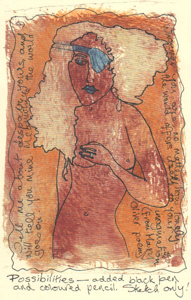
My creativity was at a bit of a low, so I picked up this fabric print I made on Sunday and added detailing with a white pen and a copper-coloured pen.  Not my usual style, but that's what experimenting is all about.

I didn't want to use the fabric print from Sunday's printing session, so I photocopied it onto cream card and drew a rough sketch on that.  The figure showed up so clearly on the second pull of the print, even though it was the result of randomly splotched paint.  You may be able to see that I carried the strap of the eye-patch across the girl's hair, then crossed it out because it should have gone under her hair.

I don't do a lot of adding text but something made me pick up my Mary Oliver poetry book and pick out two disconnected lines from a poem called 'Wild Geese', which seemed to fit the image:

Tell me about despair, yours, and I will tell you mine.
Meanwhile the world goes on.

Whoever you are, no matter how lonely,
the world offers itself to your imagination.

(The despair is definitely the eye-patch girl's - not mine.  I try always to live in hope.)

WEDNESDAY

I've been pleasantly surprised as how speedy it is to get out the Gelli plate and equipment required, take a few prints and put it all away again, with very little cleaning up to do.

These 3 prints (all I did) are my second attempt, trying the kind of approach I want to take with it.


I wanted to produce a mono print.  I cut out a mask shape inspired by a magazine advertisement and printed over it, learning as I went.  After this point I cut pieces of wavy card to put at the sides and added more blue paint.  I can see lines that show I was pressing too heavily on the brayer.

When I took the mask of the figure off I realised the paper was too thin and it tore off in short pieces.  Very difficult.  Note to self: use card next time.


Yes, the figure came out all right, but then I realised I should have started by rolling one or more light colours so that the figure was coloured.  Should have thought that one through.


Print of two giddy girls.  This time I stapled two pieces of card together and freehand cut both figures out in one go, then remembered to put the blue paint on before adding the masks.  All very simple, but I can see where I am going.

THURSDAY

Persuaded Dev to bed in the afternoon although he insisted he wouldn't sleep.  Two hot water bottles, a pillow behind his back, and an hour and a quarter later he woke up, feeling much better!

'Cockerel' - Jez
Inktense pencils and various other brands of coloured pencil
This morning I made a giant panful of thick hearty soup, enough for three meals, and a large pan of carrot, red pepper and orange soup to be semi-liquidised for three lunches.  Some in the freezer and some to use.  Even so I managed to get time here and there to add up to about three hours in the studio.

Last week I drew and pre-painted the background for this cockerel with Inktense pencils to provide a base.  This is the finished bird, using any of my several sets of coloured pencils that provided near enough the colour I wanted.  How many boxes of coloured pencil does any one person need!

As many of you find, scanning a picture into the computer never seems to get the colours right.  The colours of my cockerel are not true to the drawing, and the texture doesn't show very clearly but it's a really grey day and there was no option.

I really enjoyed doing this, it was a great relaxer, and it came together very quickly.

FRIDAY
'Vase' - Jez
Black and red pens with collaged vase
The week has been very worrying and tiring, and this afternoon we have a visit to yet another, different, clinic which Dev doesn't want to miss, so I wanted to create something quick, easy and soothing to do in the short time available in the morning.

Out come the pens, black and red.  I drew the outline for the vase then added the 'flowers'.  When I came to complete the vase my mind took a sideways step, and instead of adding a design with the pens I thought it would be good to add it as a collage.

When I was Gelli printing earlier this week I used a few scraps of fabric as rags to wipe up excess paint.  I photocopied them onto cartridge paper and chose a section to collage on for the vase.  I love the way it shows the texture as well as the colour, and will use this technique again.  All done very quickly and enjoyably.

As far as creating art is concerned this has been a satisfactory week in spite of life's problems because I would have done nothing without AEDM.

SATURDAY

Yes, I know it's not Saturday yet, but there are no rules in NAEDM, and I didn't want to do a post tomorrow with just Saturday's creation.  So here, for Saturday's piece, is a quick sketch I decided not to include last week.
I look forward to catching up with blogs I have missed this week.  Have a happy weekend.

Linking with November Art Every Day Month,  Paint Party Friday and Manon's Paper Saturdays and Try it on Tuesday

Friday, 30 August 2013

TALE OF BENJAMIN BUTTON FOR ARC AUGUST

Read on my Kindle
Here's my review and artwork for August's Artful Readers Club.  I wanted to read 'The Curious Tale of Benjamin Button' by F Scott Fitzgerald because we have the DVD and I always like to compare a movie with the original story.  Have you read 'Chocolat' by Joanne Harris and seen the movie with the lovely Johnny Depp?  Then you will know how different a film can be from the original book.

The only thing the film of 'The Curious Case of Benjamin Button' has in common with Fitzgerald's story is the title and the concept of someone being born old, living backwards and dying as a newly-born baby.  I felt Fitzgerald cheated a little here because Benjamin should have lived another nine months in the womb going backwards until he was a mere speck in the process of his creation.   It is a case of the film being so different that Fitzgerald ought to be given the opportunity to write the book of the movie if he were still alive.
And the film was better!

My version of Benjamin Button.  I think I would have enjoyed a book about these fellas instead.
Although I realised that this was only one story in a book of short stories, I expected it to take up a good proportion of the book, so it was rather a disappointment to find how quickly it ended.  When I was quite young I read a couple of Fitzgerald books and never took to his writing, and I have to say that his style doesn't appeal to me enough to read any more of his books.  In fact I'm not even tempted to read the other short stories in this book.

There's not a lot I can say about the story.  Benjy is born very old, which he objects to.  The story rambles through his life backwards in what I found was a rather pedestrian and uninspiring manner.  Sorry all you Fitzgerald fans.


ARTWORK

I was stumped to come up with an idea for the artwork, which is always the case if I haven't enjoyed or been inspired by a book.  Then I remembered reading a sentence that said various newspapers of the day ridiculed Benjamin by drawing him with the body of a fish, the body of a snake, or with horns.  That gave me a start.


This is the final piece of artwork.   

You will notice that the central figure has a tail and pitchfork as well as horns.  I thought just giving him the horns was a bit wimpish, so I gave him a bit more of a devilish appearance.

This is how I created and put the whole thing together:


I started by drawing the three figures with a Pitt Artist's pen, and painted them with Inktense pencils and a little water.


For the background I worked through various ideas in my mind, but decided in the end to cut up pieces of newspaper and glue them randomly on a sheet of paper, to represent the newspapers that were always commenting on his strange life.  I gave the newspaper background a sepia tone on Photoshop and reversed it just in case it was possible to read some of the modern text.

Then I needed a clock to indicate the reversal of the passage of time, though it is still the right way round in the picture above.  I forgot to keep the original picture before starting to alter it and had already faded it out a little and added some white lines across the clock rim.  I think the image came from a shop catalogue but I can't remember which.

I flipped the clock to indicate the reversal of time. Then I merged the three images together on Photoshop.  It took a little messing about because they were all different sizes, but I managed it in the end.  I finished off by adding the name of the book by copying the title text from the book cover.

I didn't have any faith in the whole image right from the beginning and found it hard to persevere.  It was only the absolute lack of any other idea that made me soldier on.  And you know what?  I was really happy with it in the end.
It only 'shows to go', as we often say.


Tuesday, 4 September 2012

MORE FACES


I love drawing faces, and the I-pad suits me down to the ground for the kind of faces I often like to draw.  


I've been drawing faces with patterns on for as long as I can remember, and I'm always happy when I'm drawing or painting in this way.

Just writing that reminded me of a textile workshop I attended in 1989 with Linda Straw, an absolutely marvellous and original textile designer and maker, to learn her very individual method of appliqué, using polyester silks - very difficult to work with.


The first thing we were told to do was to draw a simple design we wanted to appliqué - and of course the mind immediately goes blank - so I just drew a simple patterned face which would give me six colours to appliqué on the light green background.

Linda's technique (briefly, because it's very involved to do and describe) involves laying all the fabrics on the background in your chosen order, just pinning them at each corner.  

The machine stitching is done from the back, and the layers of colour trimmed away from the stitching on the front.  This was my first attempt, and I was not skilled enough to avoid the puckering around the outline of the head.


This is a section from one of Linda Straw's wall hangings that I was lucky enough to buy the following year.  Beautiful work, and humour in the design, with the mermaid ready to take to the land in her 'bovver boots' and biker's jacket.

So, back to my latest I-pad painting on the  'Brushes' app:


Having painted the face with white on black, I used Photoshop to reverse the colours to black on white.


And then I took the original painting into two other apps I have and played around until I was happy with a new look, like this 'vintage' version.


This last version really interested me.  The filter I used on either Snapseed or Photogene (can't remember which), changed the painting into a pencil-type version that I hadn't even started with.


The patterns are not pre-planned, I just doodle as the mood takes me, and when I have finished they often look rather like Maori face tattoos, even though I don't start out with that intention.

Just one more - a montage of my three favourite versions:


Doing this painting and playing around with it was such fun.  And to think, every time Dev wanted to buy me an I-pad I kept saying I didn't want one.  How wrong I was!


Friday, 17 August 2012

FLOWER PAINTINGS ON I-PAD


The luscious colours of this blue-purple image were the result of playing about with my latest i-pad painting, the original version being shown below.


I really enjoy painting and drawing in red and black, but for a change I decided to limited myself to red on this 'Brushes' image.

Never able to leave anything alone, I then enjoyed myself playing with digital variations.


For this darker version I took the image into my 'Snapseed' App for a dramatic change, and somehow now the flower looks quite threatening.


I love the faded sepia-toned effect, and the ragged border of this quite different image using another Snapseed variation.


Really different this one.  I would never in a month of Sundays think of painting this, even if I could be patient and careful enough to cope with all those ovals.  This was the result of taking the original into the 'ArtCircleHD' app, and choosing one of the options for circles.  I like it, and can't look at it without feeling that everything is moving.


As a change, I took the original into Photoshop, and varied the hue and saturation of the image until I found this green/turquoise to please me.

Playing around like this is fun, but it also has value in making me think about colour, and about how I can approach an image with more conventional art materials in a different way.


Finally, another one that really pleases me, created by adding the Trace Edges filter on Photoshop to the original image.  All very enjoyable.


Tuesday, 24 July 2012

FASCINATED BY FACES


Of all the things I love to draw, faces are one of my favourites, whether I'm using a pen, paintbrush or even my beloved new toys, my I-Phone or I-Pad.  The little 'out-take' above is a traditional pen and paint image, and the full picture will be at the end, but the out-take below is an I-Pad production.


The full image, created with the 'Brushes' App, started out as a simple idea to paint three or four faces surrounding a central face, each looking in a different direction.  


By the time I had roughed out the initial faces I was hooked, and kept adding another, then another, then another.  I made myself stop before I had actually filled the page (which doesn't show up here because the paper was white) because I liked the triangular shape.

I was really happy with the result.  The best thing about Brushes is pressing the 'button' that shows a rapid replay of the whole process of drawing and painting the image.

As usual, I can't leave things at that -


and for this version I took the image into the 'Snapseed' App and applied a couple of different filters to grunge it up, so that it looks like a poster that's been on a wall in the street for too long.  I'm not sure what it would be advertising.


The next painting was a pen and brush image, done a few months ago, with the same idea of multiple faces in my mind.


Once again I just started drawing - from one edge I think - and kept adding more and more faces ..... at least I hope you can see that they are faces.

I love this concept of multiple faces and my mind is busy trying to think of another way to follow through the idea.


If you had patience and nothing better to do, you could count how many different faces there are, but some colours do have more than one face, and there must be more important things in life than counting faces.  

I did try, but I gave up!  And I do have something better to do - it's coffee time.  


Tuesday, 12 June 2012

I-PAD PAINTING - MY FIRST I-PAD PAINTING

TODAY MY 'GET BETTER CHALLENGE' 


WAS 

TO PAINT AN I-PAD PICTURE


Although I have used the Brushes app for painting on my I-Phone, this is my first attempt at using it on the I-Pad, and I was determined to take advantage of the larger size by trying to paint as if I was using acrylics.  I thought I would lead you through the steps I took to produce the final result.


I didn't know what I was going to do, or where it was going to go, but just dived in and started.  When this emerged I decided it was going to be THE ELF WITH GREEN HAIR.  So this was the basic sketch to start me off, and then on to painting.


Brushes is quite a simple App, and we have downloaded a few other painting apps for the pad - Dev likes to use ArtStudio, but since I am used to Brushes on the phone this is enough for me to try at the moment.  


Brushes is a bit like Photoshop in that it uses layers.  When I use the phone to paint, I always start my painting on the first layer, leaving the original background layer blank in case I want to flood it with colour (the only way to 'fill' withy colour on Brushes is to fill the whole page, not sections like each section of 'hair').  Having painted as far as this I decided to fill the background layer with a fairly neutral colour.  


Had no idea what I was going to do next, but started another new layer just in case I was unhappy with what I did - so the 'unhappy' layer could be deleted if I wanted without damaging the painting so far.


I often like drawing lines and shapes and patterns on faces, and here I thought white designs would look right for an elf.  When I had finished I felt it had developed something of the Maori face patterns.  Loved it.


So, now I have to do something at the bottom of the picture on another layer (what did you just say about planning a painting before you start!!!!).


Pleased with that.  I wanted to echo the shapes and colours of the 'hair'.  I think he is watching something from behind the bushes.


As far as the I-Pad painting is concerned I was really happy with this - it's the first piece of art I have done since the operation and I feel it has taken me a huge step forward, even if I am pretty tired at the end of it.  Signed it and patted myself on the back.


Never one to leave well alone, and always mindful of my sculpture tutor's advice to always take things a step further I tried an experiment I haven't tried before with an App call Snapseed.  


Having sent my painting to the photos camera-roll, I was able to open Snapseed and call up the painting.  Haven't used it before, but I tried the 'Grunge' button, and then the 'Organic Frame', to produce this quite interesting version of the painting.


I can see I'll be trying out the other techniques available on Snapseed in the future - I really like the textured effect of the 'hair' and leaves - which is what I would like to have done when painting the picture.


Hope you feel as I do that painting in this way is just as valid as watercolour, acrylic, etc.  It was good for me at the moment - no need for brushes, paint, or water - just my pad on my lap.