Showing posts with label ARTISTS PLAY ROOM. Show all posts

Friday, 28 February 2014

FACE NO 29 FOR 29 FACES FEBRUARY

FRIDAY, 28 FEBRUARY - FACE NO 29
'PER ARDUA AD ASTRA'
RAF Motto - 'Through hardship to the stars'
- by Jez
I found a photograph of a pilot that appealed to me, partly because I'm always drawn to strongly shadowed faces.  I changed the features a little and simplified the image to provide the stark contrast of black and white.   I used Pitt Artists' pens, which come in 4 tip sizes - superfine, fine, medium and a brush tip. These are my favourite drawing implements.

For this drawing I used the fine tip for the basic drawing, then the brush tip for the dark areas on the face and goggles and for a thick line around the image.  I then took it into Photoshop and filled the rest of the square with black using the bucket fill.  The final touch was to make a frame around the image on Photoshop because I like my digital pieces 'framed'.

My last face of the 29 Faces Challenge - it's been a struggle but I have enjoyed it so much.  Thank you Martha for the Challenge.  And heartfelt thanks to everyone who has been kind enough to leave comments that have cheered me and given me so much pleasure.

And here are the faces I created during the rest of Week 4:

SATURDAY - An I-pad drawing aiming to get the effect of making the face with coloured wires:


SUNDAY - Watercolour pencil painting of King Edward III of England:


MONDAY - A pretty girl with a  couple of doggerel verses to explain what she is thinking:


TUESDAY - Visit to a Matisse Exhibition resulting in an I-Pad drawing of one of his pictures:


WEDNESDAY - Inspired by a Modigliani drawing:


THURSDAY - Up-dating Philip the Good


Linking with 29 FACES FEBRUARY 2014, PAINT PARTY FRIDAY, PAPER SATURDAYS, ARTISTS PLAY ROOM

Friday, 21 February 2014

FACE NO 22 FOR 29 FACES FEBRUARY

FRIDAY, 21 FEBRUARY - FACE NO 22

Pit Artists Pen and Coloured Pencil - by Jez
Face 22 was inspired by a newspaper photograph which I cut out and kept for a future drawing.  The photo accompanied a funeral report in the local newspaper of Rabbi Sidney Kaye who died December 2013.  He looked a kind, caring, compassionate man, who perhaps had seen more sadness in his life than he should have done.

In this case, I do mean that I was 'inspired', not just by the photo but by a brief summary of his life story which formed part of the report.  Rabbi Kay, who was not then a rabbi but an ordinary soldier, was involved in the liberation of Bergen Belsen Concentration Camp at the end of WW2, and was able to give comfort to people who were sick and/or dying by speaking to them in their own language.  It was later in his life that he became a rabbi.

When I had completed the sketch I remembered that a couple of years ago I drew a quick sketch of the very same person, when his photograph was in a newspaper report about a local social event.


It is interesting to see the changes in his appearance two years later - the glasses, the fuller beard and a few more age lines delineating the structure of his face.


AND HERE IS THE ROUND-UP OF THE WEEK'S FACES

SATURDAY 15

Painted entirely with my fingers

SUNDAY 16

My attempt at cross-hatching

MONDAY 17

Flourishes in Shades of Red

TUESDAY 18

Drawn entirely with a sewing needle and ink

WEDNESDAY 19

Faces found in a watercolour scrap sheet 

THURSDAY 20


LINKING TO 29 FACES FEBRUARY 2014, PAINT PARTY FRIDAY, PAPER SATURDAYS, ARTISTS PLAY ROOM

Saturday, 8 February 2014

FACE NO 8 FOR 29 FACES

SATURDAY, 8 FEBRUARY - FACE NO 8

ANOTHER FINE MESS
Pitt Artists Pen and red gel pen
by Jez
For last September's 29 Faces I drew a pen sketch of Oliver Hardy and was very pleased with it.  In all fairness I thought I ought to do the same for Stanley Laurel.

Now this did take me out of my comfort zone a little because Stan doesn't have the same immediate impact of recognition as Olly.  I don't like Laurel and Hardy films, it's just never been my kind of humour even as a child, but at Christmas we bought a BBC film about their behind-the-scenes relationship - good film, if rather short.


I think the problems I had were to do with the fact that Stan has a much more mobile face than Olly, and really he is only 'Stan' if he is making a 'Stan face' and wearing a bowler as in the sketch, or pulling at his hair while making a face.  Otherwise he is a quite ordinary-looking man.

When I had sorted this out in my mind I was able to start.  Perhaps it is a good idea for us to analyse what it is about a technique or subject that is taking us out of our comfort zone, and that may make it a little easier to start.


So ….. I was very pleased that I had tackled Stanley, but rather less pleased with the result.  I still feel I have not really captured him, but here he is, my Face No 8 for the 29 Faces February Challenge.

Linking with 29 FACES FEBRUARY 2014, PAPER SATURDAYS and ARTISTS PLAYROOM

Friday, 24 January 2014

HATS AND WORDS AND SOMETHING NEW

FLISS'S HAT TRAGEDY
Mixed Media on Watercolour Paper
- by Jez

FLISS AND THE LADIES GROUP ANNUAL HAT COMPETITION

Fliss, as you can see, is not a happy bunny
She made her own hat and it took a lot of time and money.

She made it to her own design.
- I don't like it, but she thinks it's fine.

She loves the feather and all the flowers,
And making it passed many enjoyable hours.

But then Fliss had a great surprise
- She really couldn't believe her eyes.

A garden, some posts and washing she sees,
And a girl hanging clothes out to dry in the breeze.

This invasion by that squatter of minimal size,
Means our Fliss now has no chance of winning the prize.

That's why she looks grumpy, as grumpy can be,
Though I think the hat's improved, and I'm sure you'll agree.

A NEW APPROACH FOR ME -
SKETCH, COLLAGE AND SKETCH
When I make a collage I work directly by cutting and sticking onto the paper or card, with no sketching and with little or no pre-planning about where it is going.

I thought I would try a different approach for this piece, starting with a sketch, adding some collage elements, continuing with more sketching and then colouring.  The A3 sheet of watercolour paper I used already had splodges of pink watercolour on it.


Next I cut out the hat shape from Docrafts 'Papermania' paper and free-cut the flower shapes from magazine pages.  The flowers that look black are in fact purple, but the colours on the photo have not come out very true.


So this is how it looked when the collage/sketch was done - my entry for the Take A Word  challenge of "Hats-N-Things'',  for Creative Every Day and Sketchbook Challenge "Sketch and Collage".

'Radiant Leaves' - Jez
Watercolour on Watercolour Paper
For Collage Obsession we were asked to use Pantone's Colour of the Year - 'Radiant Orchid' - as the main colour or as an accent colour.  Radiant Orchid is a pretty name for light purply-mauve, and an attractive colour too.   I've used the nearest I could get to it for the four light mauve leaves at the top of the leaf picture.

'HAND' - Jez
Acrylic onWatercolour Paper
Word and frame added on Photoshop
I was pleased with the simplicity and colour of this painting of my hand-print for my offering to the Three Muses challenge of  'Choose a Word'.


Also linking to Paint Party Friday,  Artists Play Room, and Paper Saturdays


Monday, 13 January 2014

THE SOUND OF SILENCE

When I read the theme for January's Art Journal Journey, I had to think hard about how I could create an artwork about an abstract concept.  Then I realised that we are only conscious of Silence as a contrast to Sound, and my inspiration came from that.

"SILENCE IS MADE ALL THE SWEETER BY THE SONG OF A BIRD
Mixed media - Jez
I drew a thrush as my songbird because I have always loved his song best, more than the blackbird or the larks I used to see and hear so often during my childhood.  When I drew the thrush, it reminded me of a poem by Robert Browning I learnt at school.  Although it is called "Home-Thoughts from Abroad" and I had lived in England from the age of three, it's evocation of the English spring made it a favourite.  Browning's lines about the thrush made me listen more carefully to its song and realise how observant the poet was:

                                   "That's the wise thrush; he sings each song twice over,
                                     Lest you should think he never could recapture
                                     The first fine careless rapture!"

I used my favourite poetry book to check that I had the words exactly right, a Christmas present from my dear mother almost 59 years ago.  It has a blue cover in soft leather, and it has been used so often that the back cover has broken off.  Fortunately it slides into a blue card case that holds it together.  I looked back at the inside cover for my mother's dedication, and the years rolled back:

She wrote: "To be new born when thou art old"
SUNDAY POSTCARD ART

For Sunday Postcard Art we were asked to create a postcard (6" x 4") in monochrome, and I have made two postcards on the theme.

A little while ago Dev and I went on a one-day workshop with a talented and individual local artist called Pam Potter  to learn some of her techniques, and the two watercolour paintings below are the result of recent experiments at home with one of those techniques.

Blue Mountains
Brown Hills
To create these simple landscapes I followed Pam's method - applying watercolour paint directly from the tube onto the paper and then using a piece of old credit card to spread the paint down the page.  It certainly produces unexpected effects, and from time to time I try to improve my skill with the technique.

TAKE A WORD

Next,  the theme of "MOON" has been chosen by the Take a Word team this week.  I wanted to do something a little different and out of the ordinary to challenge myself.  It has been a while since I have made a collage from my stock of unwanted photographs so I went hunting through the box of old discarded photos.

The snaps I used to create this imaginary 'planetary collision' were so old that they had been developed and printed from photographic film in a high street photo shop years ago, and it made quite a change to go back to this type of collage.  Each element has been cut out with scissors and stuck down with PVA glue.  It looks fairly complex, but it comes together quite quickly.


"THE DAY THE RED MOON FELL ONTO THE PLANET ZOGG

This picture records that terrible night when, in the Ziluvian Galaxy, the red moon suddenly dropped out of the sky and landed on the planet Zogg, creating havoc and leaving only one home standing.  As the Ziluvian sun rose the next dawn, the magnitude of the disaster was visible to the surviving Zoggonians, and a great deal of sniffing and snuffling ensued (Zoggonians can't weep and wail!).

Full details and loads of video footage will be available on Zogg Sky News later this evening and repeated for the next two weeks on every single hourly bulletin.  Bet you're glad you don't live on Zogg.


Linking to Art Journal JourneySunday Postcard ArtTake a WordArtists Play Room

Monday, 4 November 2013

LAUGH, HEARTS, TREES AND DOORS


Jenn at Artists Play Room has asked us for an interpretation of  'Laugh' as her theme this week.  I decided to go for the personal approach, and this is a photograph my daughter took of me last year.  I hate having my photograph taken, and I was amazed that she could capture this shot of me laughing.  Hope this suits the theme Jenn.


With the topic of 'Hearts' at Take a Word the difficulty was to think of something a little different, and for this challenge I kept to the personal approach.  When I thought of 'Hearts' my mind said 'Where does my heart lie?' - and there is only one answer to that.  So this image contains photos of our wedding day and one taken by my daughter of ourselves as we were last year.  I chose this photo because it's one I really do like and gives the feeling of our closeness.

You may notice that in the wedding day photo Dev is wearing a medal - my mother added a medal ribbon to a chocolate medal and gave it to him saying 'You deserve a medal for marrying our Jez'!  Even after all this time he still has the medal.


At So Artful Challenges the theme is 'Trees'.  This is a photograph I took with a pinhole camera some years ago, cropped to a circle on Photoshop and with a frame added.  I like the unusual angle and the mysterious effect the pinhole camera achieved.


Over at Art Journal Journey the challenge is 'Doors'.  Whenever we are out and about I love taking photographs of doors and windows, and because the doors are invariably closed I can't help wondering what lies behind them.

Linking with Artists Play RoomArt Journal JourneySo Artful Challenges, and Take a Word,

Tuesday, 20 August 2013

A MISCELLANY OF ENJOYMENT

I had lost my creative mojo a little bit, so I spent a few days just playing about with making postcard sized collages just for fun.  The result was that today I found it easy to get straight down to creativity and sorted out five challenge pieces.  So the enjoyment was mine, just feeling the flow, but I hope that you also enjoy something in this post.

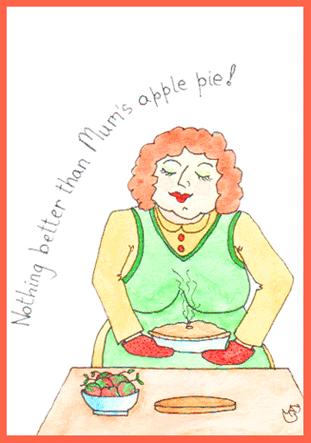
Firstly, here is my postcard sized sketch for this week's theme of Baking for Sunday Postcard Art.  This came together so quickly.


I made a very quick sketch in my 'rough' sketchbook while I had my morning coffee, came back to the studio to draw and paint it.  When it was finished, I realised I had concentrated on the 'baking' and had forgotten the postcard size.  So I cheated a little and added some blank space at the top to get it to the right size.

We were given a colour challenge from Collage Obsession, with the colour purple to be used.  Here's my offering:


I just love the rich colour and this image which started from a photograph.  Yesterday my sweet neighbour from the apartment three floors above us came to the door with a beautiful bunch of salmon pink roses because when she saw me on Sunday she thought I didn't look well.  Such thoughtfulness and kindness, and the flowers make me happy whenever I look at them.

The purple image doesn't look much like pink roses, but that's how it started.  I photographed part of the bunch using the Photo Booth app on my i-pad and choosing one of the image types available.  I think this was 'swirl'.  Then in the PSE app (Photoshop Express) on the i-pad I changed the colours to purple.  I love the result.


This colourful scene started as a postcard sized experiment I made with acrylic paints some time ago - just the central section that suggests trees or mountains.  On Photoshop I added the blue and the sandy colours and put a frame around it.

It just fits the brief from Inspiration Avenue of 'Postcard'.  The abstract image gives me the feeling of a landscape, and with our grey cloudy skies at the moment it looks just the kind of warm and colourful place where I'd like to be spending a few days of holiday and sending a postcard back to my friend.


Jen at Artists Play Room suggested it would be a fun theme to use 'Abstracts' as our challenge this week.  So I decided to have fun and created the abstract painting above.  It consists of four waste pieces from a larger acrylic painting that I was cutting up to use for something else.  A constant saying when I was growing up was 'Waste not, Want not',  so I decided to put them together to make an abstract with a difference.

These are the three strips and triangle that I put together, cut the top and bottom straight and stuck onto another piece of card.  Quite pleased with that.

And last of all, here's my offering for the Take a Word challenge of 'Warm Colours'.


The background is something I tried out a while ago, and I have been wondering how to complete it.  I searched through my box of 'failed paintings', and this image of a girl jumped out at me from an acrylic experimental piece.  The girl's size, shape and colouring were exactly right.  I cut her out and stuck her in the cave-like space of the background.  And I loved it.

The girl came from the failed painting that produced the waste strips used for the abstract above.

All in all I've had a good arty day, great fun, and feel I've got my mojo back.

Monday, 12 August 2013

FISH, ELEPHANTS AND BERRIES


A FISH OUT OF WATER

Three different challenges today.  First in the miscellany is my offering for Sunday Postcard Art for the theme A Fish Out of Water.  I'm afraid Florence, my goldfish, had unachievable daydreams, thinking that she was a mermaid and could live on land as well as in the water.  What a tangle she's got into.  It's going to take a couple of helpful mermaids to get her out of this fine mess.


This is my initial drawing, all done freehand so the width of the lines is not 100% even, but they're all just as much of a nuisance to Florence as if they were.  I coloured with Inktense pencils, used as watercolours.  

My inspiration for A Fish Out of Water came from a quilt I designed and made for our 40th wedding anniversary, sixteen years ago, which used on our bed every day.  I designed and appliquéd 25 original celtic designs, all different, which are set on a pale cream background.  The design around the fish is not a celtic pattern, but looking at the quilt as I placed it on the bed yesterday inspired the idea of the fish trapped within a network of lines.


LITTLE THINGS

This is a drawing from my sketchbook, part of a large page of sketches of berries and leaves from the elderberry tree, and I'm entering this for Artists Play Room.  Jen has asked us to focus on little things, and I think this sketch of the few tiny berries that have been left after the birds have taken their share contains plenty of little things.

Quite a simple drawing, with a Pitt Artist's Pen, but one that requires careful observation and concentration.  One of the things I find fascinating with elderberry flower/berry heads is how each small section of the spray looks like a miniature tree.

A little bit of re-cycling next for the Take a Word challenge of Wild Animals.


WILD ANIMALS

Now you may think that Sonia, my pink elephant doesn't look at all wild.  Well generally speaking she's the nicest elephant you could wish to meet, but if you should ever be unkind to her watch out, because then she really does get WILD.  Look what happened to this poor fellow.

This comic strip is one I drew for my January review for Artful Readers Club for a great book 'The hundred-year-old man who climbed out of a window and disappeared'.  A great title and a really entertaining read - the book is as funny as the title.  I was so happy with this little comic strip I drew that I am glad of the opportunity to re-cycle it. 
   

Monday, 22 July 2013

A CHEERFULNESS OF CHALLENGES

I don't know if there is such a thing as a collective phrase as a Cheerfulness of Challenges, but I have enjoyed making these challenge entries and they have made me feel cheerful.

To start with, here is my postcard entry to the Sunday Postcard Art theme of EPHEMERA:


The definition of ephemera includes 'something designed to be useful for a short time'.  Well, parking tickets are not just useful.  They are essential in today's world, even in hospital car parks which adds severely to the annoyance of having to visit a hospital frequently.  

I was tidying the car's glove box a few months ago (next tidy due in three years!) and I found a wad of parking tickets.  The Morrison's tickets in the card above include one each from 2008, 09, 10, 11, 12 and 13, so old the ink has faded.

The sketch below is from a ten-year-old sketchbook, and I was pleased to find it matched two challenges:


This is a page from a section in a travel journal recording an enjoyable trip to Glasgow, a first-ever visit.  For some reason this sketch popped into my mind and I took out the sketchbook recording this trip to use for the Collage Obsession challenge of 'A Page in a Travel Journal'.

We like visiting museums and sketching anything that takes our eye.  I loved this old car, and challenged myself to draw it by starting at one point and keeping my pen on the page throughout - taking a line for a walk.  I probably lifted the pen a couple of times and pretended I wasn't cheating.  It was a difficult thing to draw but worth the intense concentration involved.

We don't travel far at all these days, so re-visiting the pages of that travel journal brought back many happy memories - which makes it just right for the Take a Word challenge of 'Memories'.  One of my happiest memories of that Glasgow trip is coming across the multi-screen cinema and going to see 'Chicago', followed the next night by seeing 'Frida'.  These are now two of our favourite films, watched many times on DVD.

Lastly, the Artists' Play Room challenge is 'Weather'.  Well, the weather in the past year or so has certainly been a challenge in all parts of the world, so that's how I approached the theme.


I've drawn a very INaccurate map of England and Wales - sorry Scotland, but you are very difficult to draw.

I used weather stickers from a kids sticker book by Grafix, which seemed to me to show the way our weather travels through a range of cloud, sun, rain, sun, cloud, and hailstones all in one day.  At the moment it is too hot, humid and I can feel the pressure that comes before a tremendous rainstorm at the end of a hot period.  Just when all the farmers round about here have planted out their baby cabbages, leeks and cauliflowers.  I know I shall be sad to see them when we drive out again, all battered down with the rain.

As Moana Lott used to say on the WW2 Tommy Handley ITMA show (which only other ancients like me will perhaps remember) ...... "It's being so cheerful as keeps me going."

Also linking to Manon's Paper Saturdays

Friday, 12 July 2013

APR BOOKMARKS CHALLENGE


The challenge from Jenn at Artist's Play Room this week is to make Bookmarks.  A nice theme because they are quick to make and manageable even when you're busy. The feather for this one was from a print that I made a few weeks ago and was not happy with at the time, but I like its effect set against a blue background for this bookmark.


I wanted to re-use this fish drawing from my post of 8th July -  Fish Supper - simply because I was so pleased with it, and I thought it would make a good bookmark for an angler.

And now, my pièce de resistance:


I didn't have time to do this really, but once I got the idea I just had to sit down and sketch it very quickly, and I really enjoyed doing it.  In case you can't read my scrawl - I mean the bookworm's scrawl - his words read:
"Hi there!  I'm going through this for my Masters in
Cultural Bookwormology ......
It's been a bit of a slog but I'm nearly through it.
Got through 520,000 words so far -
only 40,000 words to go!"

("You can check if you want")


I shall be away from blogging and commenting all next week.  I'm going to a Summer School at the Tate Liverpool Gallery linked to their current exhibition "Chagall - Modern Master".  It was booked quite a long time ago, and I'm looking forward to it so much because Chagall is one of my favourite artists.

Also linking to Paper Saturdays Paper Saturdays tomorrow.