Wednesday 31 July 2013

PINK PINK PINK

What a good challenge this week from Take a Word - PINK.  What girls doesn't like pink.

The moment I saw the theme an idea leapt into my mind, making a link between pink with breast cancer.

Here's what I drew:

Pitt Artist Pen and coloured pencils - Jez
My dear e-friend Tracey had an operation this week and I wanted to cheer her up a little.  Those of you who know Tracey will realise how cheeky of me it is to post this wonky drawing of a cup when she is Queen of Cups and paints them perfectly.

I have about five or six boxes of coloured pencil of different makes, and finding any kind of pink, let alone the pinks I wanted, was much more difficult than I had expected.

I'm quite pleased with the result of this little cartoon sketch and hope it gives you both a smile and a reminder to check regularly.

Linking, later this week, with Paint Party Friday and Manon's Paper Saturdays

Tuesday 30 July 2013

HERE COMES SUMMER

'Summer' by Jez
Click to enlarge
The theme for Collage Obsession this week is SUMMER, very appropriate in England just at the moment.  I won a prize with this wall-hanging in a competition and was very pleased because it was quite difficult to make.

I'm stretching the point a bit here with this quilted fabric wall-hanging which was made many years ago.  It's made from fabric not paper, and the details appliquéd - or collaged.  Appliqué means 'something applied to another surface' and Collage refers to 'something being applied to another surface, usually paper, wood or canvas', and even nowadays to digital collage where 'collaged' items are not actually stuck on or sewn on.

So I hope I will be forgiven for regarding this piece as collage because I love it so much, and it always makes me think of hot summer days.

23" x 19.5"
This is a close-up of the central panel.  The background is made from artificial silks and machine quilted.  The details were added in various ways.  The pier in the background was machine stitched, like a line drawing.

I imagine a quilter taking her work along with her to the beach and then thinking that there are perhaps more important things in life than quilting and just ......... well you can see what she decided to do. 


Here's an even closer view of the details, especially the miniature quilt, which is made from cotton fabrics.  It is a proper little stitched patchwork quilt with a front and a back, and each fabric square measures three quarters of an inch by three quarters of an inch.

In this close-up you can see that the blue scalloped border of cotton fabric is machine quilted with scallop shell motifs to suit the seaside scene.

I used to love making miniature quilts, but eyesight and patience and manual dexterity would make it impossible for me nowadays.


I've taken an even closer photo of this small section to show the tiny needle I included, which is in fact a piece of fine silver wire and not a needle.


Here's the completed wall-hanging again, with all its collage/appliqué pieces.  Hope you enjoy it.

Sunday 28 July 2013

ARC REVIEW FOR JULY, SHORT AND SWEET

This month's review for Darcy's Artful Readers Club is short and sweet, rather like the book itself.  And by sweet I don't mean cloying but tender and loving.  It's MY LIFE by MARC CHAGALL.  For once it's not a Kindle book but a paperback from Amazon at £7.59. 


'My Life' covers the period of Chagall's life from childhood through to 1922.  He finished writing the book in 1922 but it was not available in English until 1965.  He was born in 1887 in Russia as Moyshe Segal, and lived until 1985.  Unlike many artists he died at 98, a respected artist and a millionaire.

I found the book on Amazon when I was about to go on a Summer Art School at the Tate Liverpool in connection with their marvellous Chagall exhibition, and reading it has been a joy.

It's a short book, only 171 pages which include 20 of his black and white sketches from that period of his life, many of them full-page pictures - so you can see why I say it is short and sweet.

The language is simple, the writing unusual like flashes or snapshots of memory, very reminiscent of some of his paintings. It's like poetry, painting pictures with words.  As well as having touches of humour it is tender, touching, sad, so many emotions in this little book.

One of the things I liked was how some of his comments helped me to understand elements of his paintings that are little miniature memories within the painting.  He says of his childhood thoughts:

"Sticks and roofs, beams, fences, and everything that lay behind, delighted me.  And you can see what was there in my picture 'Above the Town', or else, I can tell you ......'

Then there are paintings where a head is detached from its body, floating in the air and it helps to see the links with those paintings when he says:

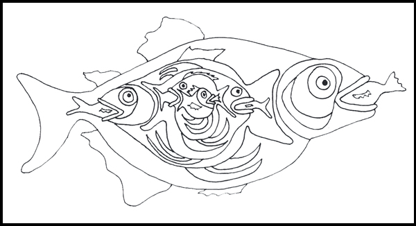
"At those words, my head gently detaches itself from my body and weeps somewhere near the kitchens where the fish are being prepared."

I had already worked out long ago that when bodies are floating in the air in his paintings he is expressing deep emotions, but it seems he felt and imagined in this way even as a child, a strange and imaginative child who always had his own vision and was determined to paint in his own way.

One more detail that linked so strongly with some of his paintings.  Writing of his schooldays he says:

"What I liked best was geometry.  At that, I was unbeatable.  Lines, angles, triangles, squares, transported me into the realms of delight.  And during the drawing period, I had everything but a throne."


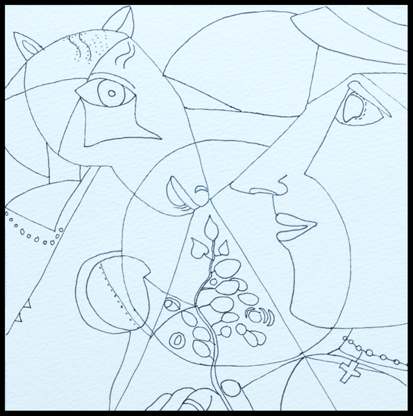
I've always been intrigued by this painting of Chagall's with its geometric circles, arcs, triangles, and though this painting is not in 'My Life' it resonates with his love of geometry.

There is so much more in this book about his life in Paris and the very difficult period he spent back in Russia when he found himself unable to return to Paris because the first World War had started in 1914 and he was only able to return to France in 1922.  If you are at all interested in Chagall and his paintings, I'm sure you would enjoy this strange little book as much as I did.

ARTWORK ..... well I apologise for offering a very unfinished piece of artwork.  Things have been a bit difficult this last month and very busy, and I also apologise for not visiting everybody's June review because of this.  I'm determined to visit everyone this month.

The A4 sketchbook page below is my response to not just the book but my immersion in Chagall recently.


This is NOT a copy of one of his paintings, it's me quickly putting down on paper rough drawings of some of his images starting with the main figure, The Juggler, whose strange position fascinates me.  If I tried that I'd definitely fall over.  Then I changed details, then turned the twisty lady into a mermaid, gave the fish seaweed instead of a bunch of flowers, added bits here and there, and Hey Presto there's something quite unlike my much slower way of working and unlike anything I would normally draw - my vision of a strange circus.  I hope Chagall will forgive me.

I want to colour this somehow - unfortunately the sketchbook paper is not strong enough for watercolour, so it needs some thought, and there's so much detail that it's going to take me ages.  But I'll do it bit by bit over time.

If you are near enough to visit the Tate Liverpool's exhibition of about 60 of Chagall's works, then I recommend it.  Check on the dates (on until October I think) and entry cost first.  Thanks for bearing with me.  Jez

Also linking with Jenn's challenge of producing a black and white line drawing for Artists Play Room - sheer serendipity that this theme appeared just after I had posted my July review!

Monday 22 July 2013

A CHEERFULNESS OF CHALLENGES

I don't know if there is such a thing as a collective phrase as a Cheerfulness of Challenges, but I have enjoyed making these challenge entries and they have made me feel cheerful.

To start with, here is my postcard entry to the Sunday Postcard Art theme of EPHEMERA:


The definition of ephemera includes 'something designed to be useful for a short time'.  Well, parking tickets are not just useful.  They are essential in today's world, even in hospital car parks which adds severely to the annoyance of having to visit a hospital frequently.  

I was tidying the car's glove box a few months ago (next tidy due in three years!) and I found a wad of parking tickets.  The Morrison's tickets in the card above include one each from 2008, 09, 10, 11, 12 and 13, so old the ink has faded.

The sketch below is from a ten-year-old sketchbook, and I was pleased to find it matched two challenges:


This is a page from a section in a travel journal recording an enjoyable trip to Glasgow, a first-ever visit.  For some reason this sketch popped into my mind and I took out the sketchbook recording this trip to use for the Collage Obsession challenge of 'A Page in a Travel Journal'.

We like visiting museums and sketching anything that takes our eye.  I loved this old car, and challenged myself to draw it by starting at one point and keeping my pen on the page throughout - taking a line for a walk.  I probably lifted the pen a couple of times and pretended I wasn't cheating.  It was a difficult thing to draw but worth the intense concentration involved.

We don't travel far at all these days, so re-visiting the pages of that travel journal brought back many happy memories - which makes it just right for the Take a Word challenge of 'Memories'.  One of my happiest memories of that Glasgow trip is coming across the multi-screen cinema and going to see 'Chicago', followed the next night by seeing 'Frida'.  These are now two of our favourite films, watched many times on DVD.

Lastly, the Artists' Play Room challenge is 'Weather'.  Well, the weather in the past year or so has certainly been a challenge in all parts of the world, so that's how I approached the theme.


I've drawn a very INaccurate map of England and Wales - sorry Scotland, but you are very difficult to draw.

I used weather stickers from a kids sticker book by Grafix, which seemed to me to show the way our weather travels through a range of cloud, sun, rain, sun, cloud, and hailstones all in one day.  At the moment it is too hot, humid and I can feel the pressure that comes before a tremendous rainstorm at the end of a hot period.  Just when all the farmers round about here have planted out their baby cabbages, leeks and cauliflowers.  I know I shall be sad to see them when we drive out again, all battered down with the rain.

As Moana Lott used to say on the WW2 Tommy Handley ITMA show (which only other ancients like me will perhaps remember) ...... "It's being so cheerful as keeps me going."

Also linking to Manon's Paper Saturdays

Friday 19 July 2013

SUMMER OF COLOUR WEEK 6


It's the last week for Summer of Colour and the colour combination is sepia and sage green.  I've been away this week on a Summer School in connection with the Tate Liverpool Gallery's current exhibition of 60 works by Chagall.  The image above is a little 'out-take' from the drawing I show below, after I have explained how it came about.


At the end of the first day Dev and I were sitting quietly in the hotel lounge with a much-needed cup of tea.  I was looking at a wall lined with veneered wood when I saw a donkey's face in the pattern - in fact a few donkey faces.

So I grabbed my sketchbook and drew a quick sketch of what I saw in my mind's eye - a sketch, not a representation of an actual donkey.  When I looked at it again in the hotel room I was quite taken by what I had done and decided to use it as my entry for the SOC sepia and sage green challenge.  I only had coloured pencils with me, so I had to use what I thought were the nearest matches for the colours.


As usual I forgot to take a photograph of the drawing before starting to add the colour, but luckily thought of it just when I had started the ears.

I have no idea why the page came out blue when I photographed it, but they weren't the best conditions for photography.


Here's the completed drawing, and as a quick sketch I'm quite pleased with it.  When I took the blue cast out of the photo on Photoshop, I've only just noticed that it took out a chunk of the red border on the left.  Hey-ho, that's what happens when you're tired!

I'm going to post a few of the drawings I made on the course in a post next week.  It was wonderful seeing so many and varied pieces by Chagall, paintings, drawings, sketches.

I have enjoyed Kristin's lovely Summer of Colour challenges for the last six weeks, so thank you Kristin for the fun and for 'stretching' me, and I hope to be able to catch up with at least some of the other entries in the next few days.

Also linking this with Paint Party Friday , Manon's Paper Saturdays , Artists in Blogland  and Inspiration Avenue's Show and Tell theme.

Saturday 13 July 2013

THE DAY I MET A WITCH

Last Thursday I met a witch, a real witch.  She rode onto the Bikers parking place at the head of the pier on a huge, blue and red three-wheeler motorbike, with her husband on the wide upholstered back seat.  The Rolls-Royce of bikes.  We love bikes and the bikers often assemble at this spot.  They are always generous with their time and information and will talk about their machines and their travels.

I knew straight away that this lady was a witch because there was a notice on the back of the bike that read:
WITCHES PARKING SPACE
ALL OTHERS WILL BE TOAD

When I asked "Are you a real witch?" she said that not only was she a witch, but that she and her husband were married on TV in a Pagan Wedding Ceremony - perhaps you saw the program, I wish I had.


She wasn't towing a Gingerbread House behind her bike, but she did raise a great lust in me - not for gingerbread but for her wonderful walking stick - both she and her husband needed them, but these were far from ordinary sticks.


Hers was covered from handle to ferrule with rhinestones that sparkled like real diamonds in the strong sun that day.


Like this!  From time to time I've had to use a stick, and though mine is pretty and covered with tiny flowers, it pales in comparison with this one.  I have promises from Dev that I can have one.

Even though Dorothy in the Wizard of Oz didn't need a stick, I'm sure she would have loved one to match her sparkly shoes.

I found this wonderful witch was called Sharon, and she told me how she had come to run a business making fancy sticks of all kinds and types.  She gave me her card and website address, and said if I sent her my blog address she would put it on her Facebook page!  How strange some chance meetings can be, and since I'm always talking to anyone who looks interesting, unusual things like do happen from time to time.


I don't use my blog for advertising, but how could I not be bewitched by this lovely witch because I wanted to tell you about her.  I looked up her well-designed GlamSticks website and read a page about 'GlamSticks Now and Then', which tells of how she came to buy the business from Debbie Deboo, the lady who started it, and Debbie's story.

That chance meeting made me very happy, so I wanted to share this chance happening and that magical stick with you.

Friday 12 July 2013

APR BOOKMARKS CHALLENGE


The challenge from Jenn at Artist's Play Room this week is to make Bookmarks.  A nice theme because they are quick to make and manageable even when you're busy. The feather for this one was from a print that I made a few weeks ago and was not happy with at the time, but I like its effect set against a blue background for this bookmark.


I wanted to re-use this fish drawing from my post of 8th July -  Fish Supper - simply because I was so pleased with it, and I thought it would make a good bookmark for an angler.

And now, my pièce de resistance:


I didn't have time to do this really, but once I got the idea I just had to sit down and sketch it very quickly, and I really enjoyed doing it.  In case you can't read my scrawl - I mean the bookworm's scrawl - his words read:
"Hi there!  I'm going through this for my Masters in
Cultural Bookwormology ......
It's been a bit of a slog but I'm nearly through it.
Got through 520,000 words so far -
only 40,000 words to go!"

("You can check if you want")


I shall be away from blogging and commenting all next week.  I'm going to a Summer School at the Tate Liverpool Gallery linked to their current exhibition "Chagall - Modern Master".  It was booked quite a long time ago, and I'm looking forward to it so much because Chagall is one of my favourite artists.

Also linking to Paper Saturdays Paper Saturdays tomorrow.

Wednesday 10 July 2013

SUMMER OF COLOUR 5 FOR CHAGALL


I'm studying at the moment, and I decided to relate my studies to this week's challenge from Summer of Colour which is to use Candy Apple Red and Yellow in an image.  The sketch is derived from one of Chagall's paintings.

Next week Dev and I are attending a three-day Summer School at the Tate Liverpool Gallery which is linked into their current exhibition "Chagall! Modern Master".  Chagall is one of my favourite artists so I'm really looking forward to it, and preparing for it with some 'self-directed study'.

I'm hoping you will see that what I'm doing with the Red/Yellow sketch above is analysing and thinking about his approach and not trying to make a perfect copy of the painting, shown below:


At first glance it looks such a simple and even naive painting, folk art, almost childlike.  Yet in fact it is very complex and full of Chagall's memories of his childhood home-town in Russia.  What I wanted to examine were all the geometric shapes, which divide the picture and focus attention on particular areas of the painting.  Here's my simplified drawing.


It may look a simple painting, but I find it very difficult to copy his works.  This was the best I could manage, just focussing on the elements that interested me for this study.

I've looked at this painting in my Chagall book so many times, and trying to copy any painting really makes me concentrate on detail, but this was the first time I ever noticed the cross and the wedding ring.

My drawing is on good watercolour paper, but I wanted to save it for when I have time to use acrylic or watercolour to paint it, so for this simplified red/yellow version I printed the drawing out onto smooth cartridge paper and used Inktense pencils.


I added the green for contrast, and to separate the other two colours where I could.  The red looks rather pale, but it is a stronger red than it looks here.  I learnt quite a lot from doing this self-imposed exercise.  I'm off to study another painting in my book in a few moments.

Chagall's painting has another aspect which interests me.  Whenever I look at it these days it reminds me of journalling with its layers of memory.  I decided to pretend Chagall was going to post one of his journal pages on his blog.  And as the Inspiration Avenue challenge is to 'Use words in a piece of art', here's his journal page with one of his childhood memories to follow that theme.


The text reads:  "In my grandfather's stable there is a big-bellied cow;  she stands and stares stubbornly.  Grandfather goes up and talks to her like this:  'Hey, listen, give us your legs.  You must be tied up.  We need something to sell, meat, do you hear?'  She falls with a sigh.  I reach out to put my arms round her muzzle, to whisper a few words to her - that she shouldn't worry, I won't eat the meat; what more could I do?"

The quote is from this book in the picture below which I bought on Amazon.  It would have been more appropriate if I could have found a quote involving a goat, but I didn't find one.


Written by Chagall himself when he was 35 (he died at the age of 95), the book is only 171 pages long and beautifully written.

I hope you love Chagall's art as much as I do.

Monday 8 July 2013

FISH SUPPER


Above all forms of art I love drawing.  Nothing pleases me more than an ink line wandering across a pure white page.  No colour, just black on white.  So I am happy with my drawing today.

When the topic of 'Fish' was chosen as the challenge this week for Take a Word, I left it to sit around in the back of my mind until it came up with something a little different.


'Back of mind' came back to me with the idea of a fish inside a fish for some reason.  Then as I started to draw it, more and more fish kept appearing inside the one inside the one inside ........  I had to spend a little time at the end counting the number of fish in the drawing.


These are the smaller fish inside the large one - makes it a bit easier to count.


I thought I'd add a bit of colour with a background, and found an acrylic background in process in another sketchbook and took it into Photoshop.  Then I superimposed my drawing onto the background which actually has quite a bit of turquoise in it as well as blue and cream.


Somehow I felt compelled to add colour, even though (in my terms) it would spoil it a little.  Flat colours seemed best, so I added them in Photoshop.

How many fish?  Well, I counted ten altogether.

That poor little family of purple fish is really having a bad day today!

Friday 5 July 2013

BUTTERFLIES ON MY MIND


This week the challenge from Take a Word is 'Butterflies', and over at Inspiration Avenue it's 'Red White and Blue'.  Then at Collage Obsession the theme is USA, celebrating the 4th July.  At first I thought I'd be giving it a miss since I am English, but then decided I could use the 'Red White and Blue' theme there.

My personal challenge was to combine butterflies with red, white and blue, a rather unlikely pairing perhaps.


I love butterflies, but I wanted a different take on them, and rather than create a picture with pretty, colourful butterflies I was inspired to turn them into a red white and blue abstract which disguised the original butterfly drawing.

My start point was the single butterfly outline above, drawn with black pen in the middle of a sheet of A4 white Bristol board.


I kept repeating the drawing fairly randomly over the page so that they interlinked.


At this point I decided that a 6" x 6" square would produce what I wanted, and cut out a frame to help me choose the section I liked best.


And this is what I chose.

'Butterflies in Hiding' - Jez
This is the finished abstract, coloured in photoshop.  You should be able to pick out some of the butterflies at least.  I do like the way the pattern has curled around in an unexpected fashion.


Tuesday 2 July 2013

SUMMER OF COLOUR IN CHARCOAL GREY AND PINK


The colour theme for this week's Summer of Colour is charcoal grey and pink, a combination I've been looking forward to.

This sketch of hydrangea flowers is a pen and watercolour sketch from my sketchbook, when we visited a National Gardens Scheme Open Garden event.  The flowers were the lightest pinky-white with the colour increasing at the petal edges, and I liked the idea of using the sketch for the challenge because flowers are in my thoughts just now.

I changed the colour of the leaves and background to a light charcoal grey in Photoshop and added the double border.


This is a very personal grey and pink image, with the pink text added on Photoshop to my own black and white sky-scape photo, which was taken on my mobile phone at Southport a little while ago.

Neither of my images is very good artistically, but at the moment inspiration is rather lacking.  Both pictures have turned out as reflecting the way we are feeling just now because our dear daughter died last week of a brain tumour and they are a little tribute to her.  I hope you will find them acceptable.