Friday, 30 August 2013

TALE OF BENJAMIN BUTTON FOR ARC AUGUST

Read on my Kindle
Here's my review and artwork for August's Artful Readers Club.  I wanted to read 'The Curious Tale of Benjamin Button' by F Scott Fitzgerald because we have the DVD and I always like to compare a movie with the original story.  Have you read 'Chocolat' by Joanne Harris and seen the movie with the lovely Johnny Depp?  Then you will know how different a film can be from the original book.

The only thing the film of 'The Curious Case of Benjamin Button' has in common with Fitzgerald's story is the title and the concept of someone being born old, living backwards and dying as a newly-born baby.  I felt Fitzgerald cheated a little here because Benjamin should have lived another nine months in the womb going backwards until he was a mere speck in the process of his creation.   It is a case of the film being so different that Fitzgerald ought to be given the opportunity to write the book of the movie if he were still alive.
And the film was better!

My version of Benjamin Button.  I think I would have enjoyed a book about these fellas instead.
Although I realised that this was only one story in a book of short stories, I expected it to take up a good proportion of the book, so it was rather a disappointment to find how quickly it ended.  When I was quite young I read a couple of Fitzgerald books and never took to his writing, and I have to say that his style doesn't appeal to me enough to read any more of his books.  In fact I'm not even tempted to read the other short stories in this book.

There's not a lot I can say about the story.  Benjy is born very old, which he objects to.  The story rambles through his life backwards in what I found was a rather pedestrian and uninspiring manner.  Sorry all you Fitzgerald fans.


ARTWORK

I was stumped to come up with an idea for the artwork, which is always the case if I haven't enjoyed or been inspired by a book.  Then I remembered reading a sentence that said various newspapers of the day ridiculed Benjamin by drawing him with the body of a fish, the body of a snake, or with horns.  That gave me a start.


This is the final piece of artwork.   

You will notice that the central figure has a tail and pitchfork as well as horns.  I thought just giving him the horns was a bit wimpish, so I gave him a bit more of a devilish appearance.

This is how I created and put the whole thing together:


I started by drawing the three figures with a Pitt Artist's pen, and painted them with Inktense pencils and a little water.


For the background I worked through various ideas in my mind, but decided in the end to cut up pieces of newspaper and glue them randomly on a sheet of paper, to represent the newspapers that were always commenting on his strange life.  I gave the newspaper background a sepia tone on Photoshop and reversed it just in case it was possible to read some of the modern text.

Then I needed a clock to indicate the reversal of the passage of time, though it is still the right way round in the picture above.  I forgot to keep the original picture before starting to alter it and had already faded it out a little and added some white lines across the clock rim.  I think the image came from a shop catalogue but I can't remember which.

I flipped the clock to indicate the reversal of time. Then I merged the three images together on Photoshop.  It took a little messing about because they were all different sizes, but I managed it in the end.  I finished off by adding the name of the book by copying the title text from the book cover.

I didn't have any faith in the whole image right from the beginning and found it hard to persevere.  It was only the absolute lack of any other idea that made me soldier on.  And you know what?  I was really happy with it in the end.
It only 'shows to go', as we often say.


Saturday, 24 August 2013

BLACK AND WHITE AND RED ALL OVER

I mentioned in my last post on Tuesday that for various reasons I had 'lost my mojo'.  (I've just looked the word up.  It means magic, or a spell, and is probably of West African origin.)

So over last weekend I decided to step back, forget about all the arty things I needed to do and play about instead with some bits of collage that I didn't care about if they came out useless.  I decided to focus on black, white and red using postcard sized watercolour paper.  

When I was a child a standard riddle we'd ask each other was 'What's black and white and red all over?  Answer, a newspaper'.  It doesn't really work now with colour printing in our newspapers.


For the first one I used red tissue paper, slightly wrinkled to give it texture.  I don't know what the Chinese writing says, because I tore the piece from an old, tattered poster in Liverpool.  I hope it's polite.  I liked the simplicity of the black shape.


What I like about simple collages is the way one just cuts out a few images, or shapes from paper in a magazine, adds a word or two and suddenly it comes together without any great thought.

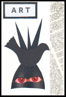
The strip at the side of this one is a piece of sellotape accidentally stuck onto an old book page some time ago when I was making something else.   When I lifted it off, it brought the writing with it and I decided to save it for later use.  It seemed right for this, and just in case nobody realised the collage was Art with a capital A, I added the word to make it clear.


The central round shape on this one was cut from an advertising postcard I picked up somewhere, I don't remember where.  It looks like something a pop group might use as a logo, but as the text was written in Polish I wasn't able to read it, so I apologise to them for not crediting.

I liked the word EVOL I found printed in a magazine.  It gives me the feeling both of love and of evolution, or even evil.  The dandelion word is added to cover up the name in the centre.  Another result that pleased me.


This one has scanned a little orangey, but it is actually red.  I started with a few lines drawn across the postcard with a very fine pen and then added the black strips cut from a black section of a magazine page.  The lines I cut were so narrow and the paper so thin that it was a pain trying to stick them on.  The rest simply came together when I found a magazine picture of a car and there was a limited amount I could cut from it.  I like the final effect, it gives a feeling of depth, as if the red shapes are floating above the network of lines.  Happy with this too.


This is an ATC.  When I cut my watercolour paper into 6 postcard sizes, there was just enough left over for 2 ATCs.  Quite pleased with this.


The black and white lines for this last effort came from a wallpaper design in a magazine, and I cut out the only two pieces that made a continuous line.  Red didn't work with them somehow, so I abandoned my concept and tried other colours.  The shapes looked so good on a piece of orange tissue paper and then of course it called for some blue as a contrast.  The little notice reads 'Please read conditions on reverse' - but in fact the reverse is blank.


Here's a montage of the four black, white and red postcards.  The change of activity and working without trying to meet some pre-determined goal was so restful.  And feeling pleased with each one as I finished it gave me a real boost.

Stepping back like this is good for bringing back the mojo, and with a fresh mind I was able to complete my set of challenges that I posted on Tuesday in no time.  All your encouraging comments on Tuesday's post are appreciated so much.  I try to get back to your blog, but August has been a particularly full month of unpleasant hospital appointments between the two of us, and September is beginning to shape up the same way, so I've not been able to visit and comment as much as I'd like.

Keep happy, keep making art, and enjoy every moment of the day as best you can.

Tuesday, 20 August 2013

A MISCELLANY OF ENJOYMENT

I had lost my creative mojo a little bit, so I spent a few days just playing about with making postcard sized collages just for fun.  The result was that today I found it easy to get straight down to creativity and sorted out five challenge pieces.  So the enjoyment was mine, just feeling the flow, but I hope that you also enjoy something in this post.

Firstly, here is my postcard sized sketch for this week's theme of Baking for Sunday Postcard Art.  This came together so quickly.


I made a very quick sketch in my 'rough' sketchbook while I had my morning coffee, came back to the studio to draw and paint it.  When it was finished, I realised I had concentrated on the 'baking' and had forgotten the postcard size.  So I cheated a little and added some blank space at the top to get it to the right size.

We were given a colour challenge from Collage Obsession, with the colour purple to be used.  Here's my offering:


I just love the rich colour and this image which started from a photograph.  Yesterday my sweet neighbour from the apartment three floors above us came to the door with a beautiful bunch of salmon pink roses because when she saw me on Sunday she thought I didn't look well.  Such thoughtfulness and kindness, and the flowers make me happy whenever I look at them.

The purple image doesn't look much like pink roses, but that's how it started.  I photographed part of the bunch using the Photo Booth app on my i-pad and choosing one of the image types available.  I think this was 'swirl'.  Then in the PSE app (Photoshop Express) on the i-pad I changed the colours to purple.  I love the result.


This colourful scene started as a postcard sized experiment I made with acrylic paints some time ago - just the central section that suggests trees or mountains.  On Photoshop I added the blue and the sandy colours and put a frame around it.

It just fits the brief from Inspiration Avenue of 'Postcard'.  The abstract image gives me the feeling of a landscape, and with our grey cloudy skies at the moment it looks just the kind of warm and colourful place where I'd like to be spending a few days of holiday and sending a postcard back to my friend.


Jen at Artists Play Room suggested it would be a fun theme to use 'Abstracts' as our challenge this week.  So I decided to have fun and created the abstract painting above.  It consists of four waste pieces from a larger acrylic painting that I was cutting up to use for something else.  A constant saying when I was growing up was 'Waste not, Want not',  so I decided to put them together to make an abstract with a difference.

These are the three strips and triangle that I put together, cut the top and bottom straight and stuck onto another piece of card.  Quite pleased with that.

And last of all, here's my offering for the Take a Word challenge of 'Warm Colours'.


The background is something I tried out a while ago, and I have been wondering how to complete it.  I searched through my box of 'failed paintings', and this image of a girl jumped out at me from an acrylic experimental piece.  The girl's size, shape and colouring were exactly right.  I cut her out and stuck her in the cave-like space of the background.  And I loved it.

The girl came from the failed painting that produced the waste strips used for the abstract above.

All in all I've had a good arty day, great fun, and feel I've got my mojo back.

Thursday, 15 August 2013

CHAGALL COURSE WITH ADAM AND EVE


My Version of 'Adam and Eve' - Marc Chagall
In July, Dev and I went to a three-day Summer School at the Liverpool Tate Gallery with the theoretical and practical work based around their wonderful Chagall Exhibition.   We had booked quite a while earlier, and even though it was a difficult time for us decided that it would be good for us to go.

As it happened, the Course Leader had based the course around 'Memories', linking it to the way Chagall used memories in his work so much.  This was a bit of a blow because, as I mentioned a few posts ago our daughter had died only three weeks before, and the idea of drawing and painting about our memories was just not something we could face.

So we spoke to the tutor and explained, and it was arranged that we would set our own aims for what we wanted to get out of the course and opt out of the group work.  I decided that I would spend as much time as possible in the Gallery just soaking up the 60 Chagall works on display, observing and writing, and experimenting to see how it all might influence my own practice.

Easier said than done, as I'll explain, and I'll show you the mental process I had to go through to get myself even able to draw so that you will know it doesn't always come easy to me.  


I wandered around the gallery trying to get the pencil to actually touch the paper.  Have you ever felt like that?  Sometimes it's so difficult to make that initial pencil mark and this time is was particularly difficult.

The floating head piece at the top of my first page above was a complete failure, with not enough space allowed and everything really badly drawn.

So I tried to draw just the cat from Chagall's 'Paris Through the Window', a tiny part of the large painting and apparently so simple.  But could I draw it, oh no.  I tried over and over again in the same place on the page, both looking at it and without looking.  You can imagine how un-pleased I was with the page above!


I did a lot of careful observation and writing as well, including what you can see on the second page above.  Still trying with the cat at the top of the page, and then a two-way head from another part of the painting.

A bit better.   I wandered around the gallery for a while then went back to the struggle with the cat.  I will NOT be beaten by a cat!

Yes I was, and soundly beaten too.  What I have written beside it is 'I still cannot get this blasted cat right, not even his/her expression'.  The head is like a human head with cat ears, so simple but so difficult.

My mood was lifted a bit at that moment when two ladies passed by.  They obviously didn't think much of Chagall's paintings, because one said to the other 'Look at that!  He doesn't even know how to draw a cat.  It hasn't even got any whiskers.'
                                     

I felt I could tackle a drawing now, but decided that I would choose a painting I really disliked rather than something I liked.  This one, a very large painting entitled 'Homage to Apollinaire' is not typical of his work, and it is so dark and gloomy in colouring.  I read later that it's original title on his initial sketch was 'Adam and Eve', which makes a little sense of it.


As so often happens, I forgot to take a photo of the initial drawing, and even when I did photograph it I missed out the lower legs.  This is when I'm partway through adding colour with pencils and you can see that I just focussed on the main figures.  You may just be able to see some of the faint guidelines I used to help me.

It looks such a simple image, but my goodness it was difficult to draw and it took me ages.

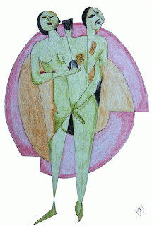
Here's the final piece of my version of the central image.  By the time I had finished I appreciated the complexity and cleverness of the Adam and Eve figure.  Two bodies emerging from the clay source, Adam first and Eve from Adam.  It is clever and subtle, especially the placement of Adam's hand.

All in all, in spite of the struggle I was happy with what I had achieved, and knew that I would be able to get into drawing easily the next day.

If you are still with me, thank you for staying to the end.

Linking to Paint Party Friday

Monday, 12 August 2013

FISH, ELEPHANTS AND BERRIES


A FISH OUT OF WATER

Three different challenges today.  First in the miscellany is my offering for Sunday Postcard Art for the theme A Fish Out of Water.  I'm afraid Florence, my goldfish, had unachievable daydreams, thinking that she was a mermaid and could live on land as well as in the water.  What a tangle she's got into.  It's going to take a couple of helpful mermaids to get her out of this fine mess.


This is my initial drawing, all done freehand so the width of the lines is not 100% even, but they're all just as much of a nuisance to Florence as if they were.  I coloured with Inktense pencils, used as watercolours.  

My inspiration for A Fish Out of Water came from a quilt I designed and made for our 40th wedding anniversary, sixteen years ago, which used on our bed every day.  I designed and appliquéd 25 original celtic designs, all different, which are set on a pale cream background.  The design around the fish is not a celtic pattern, but looking at the quilt as I placed it on the bed yesterday inspired the idea of the fish trapped within a network of lines.


LITTLE THINGS

This is a drawing from my sketchbook, part of a large page of sketches of berries and leaves from the elderberry tree, and I'm entering this for Artists Play Room.  Jen has asked us to focus on little things, and I think this sketch of the few tiny berries that have been left after the birds have taken their share contains plenty of little things.

Quite a simple drawing, with a Pitt Artist's Pen, but one that requires careful observation and concentration.  One of the things I find fascinating with elderberry flower/berry heads is how each small section of the spray looks like a miniature tree.

A little bit of re-cycling next for the Take a Word challenge of Wild Animals.


WILD ANIMALS

Now you may think that Sonia, my pink elephant doesn't look at all wild.  Well generally speaking she's the nicest elephant you could wish to meet, but if you should ever be unkind to her watch out, because then she really does get WILD.  Look what happened to this poor fellow.

This comic strip is one I drew for my January review for Artful Readers Club for a great book 'The hundred-year-old man who climbed out of a window and disappeared'.  A great title and a really entertaining read - the book is as funny as the title.  I was so happy with this little comic strip I drew that I am glad of the opportunity to re-cycle it. 
   

Tuesday, 6 August 2013

ON THE DARK SIDE FOR TAKE A WORD

Click to enlarge
WOW, I never expected that to appear!

How does inspiration come into your minds?  If I'm given a topic that interests me, inspiration often just shoots straight into my mind as an image, and excitement makes me want to get it down on paper right away.

When I saw the theme of "Dark" for Take a Word this week this image flashed into my mind straight away, and I had to get the initial sketch drawn before my brain started adding other ideas.


I saw the word Dark as part of the title for an imaginary book, a gory murder novel.  It's the type of book I haven't read for years so I don't know where it came from.  The page above shows what appeared when I picked up my 'rough' sketchbook to quickly scribble down the initial idea.  No neatness in that sketchbook.

The advantage of a quick sketch like this is that it gives a chance to see if something needs changing.  I realised I was wrong to have the girl's eyes closed because she just seems to be asleep.  I also decided that there would be too much bright red if I did red drips.


Fabriano Fat Pad, 300g HP
In a 'proper' A4 300g sketchbook I made a start on the final piece with Pitt Artist's pen for the head and black acrylic ink for the rest of the cover, slopped on with an old half-inch acrylic brush.

I had fun adding the black ink drips, which ran right down the page and onto the newspaper that I'd fortunately had the sense to place underneath.  Gorgeous black ink to play with.

When you're doing drips you have to accept that once dripped they are what they are, unless you want to start the whole thing again, but I was quite happy with the way these turned out.

I used red acrylic paint for the blood and the spatters, and added the text on Photoshop since I will never be able to write well enough for a book cover.


So this is how my final image was created.  When I asked Dev if he thought it was good enough to post for TAW's theme of Dark, he said:

'Well it's good, but I don't know if it represents the novel because I haven't read the book'.

Nor have I.  No-one's written it yet - so if anyone out there wants to write the story, I'll provide the cover picture for you.


Also linking with Paint Party Friday and Manon's Paper Saturdays.

Sunday, 4 August 2013

CELEBRATING GRANDMA

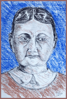
Grandma - from memory
This week the theme of 'Celebrating Women' is the challenge for Sunday Postcard Art.  I decided that I wanted to celebrate my grandma, the only grandparent I knew, and the little I know about her is quite a story - I'll tell you some of it.

Although my mother told me virtually nothing about her mum, she must have been quite a strong character to cope with the difficult life she had.

I think I saw her less than a dozen times in my life because of a family rift created by my Irish grandfather, a terrible, cruel and very Victorian story, and I think my gran must have been very unhappy at what happened.  Perhaps one day I will tell that sad story, which is just like a novel.

I was almost an adult before I met her when my granddad was no longer alive and the connection didn't really 'take'.  The last time I saw her was when Carol was born 54 years ago.


This picture from my sketchbook was drawn a while ago, and I think I used pastel pencils.  I wanted to draw my grandma from memory, simply because I had no photos.  I tried a pencil sketch first, then an acrylic painting and then this sketch which is the one most like her.  Fortunately when I reduced the size on Photoshop ready for posting, it measured just 6" x 4" for the SPA postcard size.

She was a Londoner from the East End born in 1884, a true Victorian, and she lived to the age of 92.  Even as an old lady, barely 5 feet tall, she had straight black hair, which she always wore plaited and rolled up on each side like earphones.  I think in fact they covered her ears.

Her black hair was apparently explained by a foreign ancestor.  My mum always used to tell us that we had a Spanish Princess way back in our family.  My sister and I always discounted this as a family tale with no reality in fact.

But when my niece's husband researched a family tree he found that one of my ancestors was a soldier in the Portuguese campaign of the Peninsula Wars with Wellington.  Napoleon of France had armies in Spain and was looking to capture Portugal.  All this was part of the Napoleonic war which ended in defeat for France by Wellington's army at Waterloo.

The Spanish princess was in fact a Portuguese woman brought back to England as a wife by our soldier ancestor, so mum's story was true in essence.


When she was young grandma was courting a young man, the brother of my eventual granddad.  My mother told me that her father said to his brother 'I can take her away from you any time I want' - and he did.  I know they moved to south Wales, where my mum was born, and then up to Lancashire looking for work in the depression years of the 1920s, where my mum met my dad.

I know granddad was very strict, and that he tended to be violent when he was drunk on whisky, which he often was I gather.  It is very sad that mum told me so little about her own mother, and I would so like to have known more.  So this picture is my way of remembering and celebrating my gran and giving my grandchildren an idea of what she looked like.