Sunday 28 April 2013

COLOUR, COLOUR, COLOUR - LOVE IT ..... ARTFUL READER'S CLUB

          
I'd like to tell you about "COLOUR" by Victoria Finlay in pictures as far as possible.  I'll scatter little digital grafitti sketches on the way through, with my artwork inspired by the book at the end.  The graffiti sketches illustrate the colours that Finlay investigates as she travels all around the world to find their origins and history. 

This is a paperback, not a Kindle book, and fortunately the print was of a size I could read.  I bought it for Dev at Christmas, but I had sneaky plans to read it myself as soon as possible.  And what a joy it has been, especially after my problems with my March book.  Finlay is a journalist, and she really knows how to write a readable book on an unusual topic.  


If, as an artist you are interested in colour - and how can you not be - then you will love this book.  It's even better than I expected, and how often can you say that of a book?

The first decision I made was that I was allowed to write in it.  I know I'm a big girl now, but the rules of childhood start to echo in the brain as soon as a pen gets anywhere near a book, but I was strong and scribbled as much as I liked.


From this photo of the contents page you can see the structure of the book.  I realised that each chapter stood alone, and that I didn't need to take them in order, and I numbered the order of the colours as I read about them.

I planned to read about one colour at a time and alternate the book with a novel, but I became so involved that I couldn't stop and read the whole book before moving on to my May novel.  But it is the type of book you can pick up now and then to read about one of the colours.

The preface is fairly technical and a little hard going, but very worth the effort of reading it to set the scene for the book itself.  This is such good writing and easy reading - Victoria Finlay is a reporter and knows how to interest the reader.


I also decided to mark any sections that I would want to refer to again, and you can see from this double page spread what happened nearly all the way through!  You can also see the wonderful bookmarks I seem to use - torn pieces of post-it notes and a paper serviette - no matter how many I have painted or been given.


Black and Brown are dealt with together in the same chapter, and these were my fifth choice of colour because I thought, quite wrongly, that there wouldn't be too much of interest in reading about these colours.   What do I know!   I would never have expected to be reading about Egyptian mummys in the section about Brown.  

Obviously the subject of charcoal came up in the Black chapter, and I didn't know that the ancient charcoal willow is quite a different tree from our popular weeping willow which was only imported into the country in the eighteenth century. 
                        

There is a surprise in every chapter.  I've been reminded of things I knew -  I did know that the cochineal I used to use for making pink cake mix was from an insect, but I was surprised that it was so interesting to read about the cochineal bug.  I also learnt things I didn't know, enjoyed the stories she told and was surprised that a writer could make me chuckle so much just talking about colour.


The section on Yellow, entranced me, with its stories about saffron.  I knew saffron was yellow and often wondered how Saffron Walden in Essex got its name - sadly there are no Essex saffron fields now.  The images Finlay brought into my mind of saffron fields in other parts of the world are still a pleasure in my mind.

The saffron fields of purple flowers open for one day only and must be picked in the morning, the yellow pistils most carefully removed and the purple flowers thrown away.  Even the heaps of discarded flowers must be beautiful.


I think perhaps you've got the message that I thoroughly enjoyed this book.  It is the best non-fiction book I have read for many, many years.  I do recommend it to anyone who enjoys non-fiction and who may have wondered about the history of colour.

Now for my artwork inspired by the book.  When I thought about representing the book in a single painting, I realised that although I enjoyed all of it, the chapter that had left a lasting impression on me was the first one I read - Ochre, in all its different shades of colour, and particularly the cave paintings of Australia.


I have a number of books about folk art and the art of ancient civilisations.  In one called simply Folk Art I found a picture of a cave painting about 3,000 years old at a site near Darwin, Australia.  What surprised me most was the use of blue paint which contrasted so well with the ochre of the rocks.


This is not a copy of the cave painting, it is inspired  by it, and is a combination of digital background with the collaged fish drawn with brown Pitt Artist's pen and coloured with Inktense pencils.  I wanted to use the blue and ochre together for the contrast. I have used the general idea of the fish, but adapted their shapes to make the picture my own.  I'm quite pleased with it, and it will be a happy memory of the book.

Thursday 25 April 2013

ME AND MY FRIEND LISA GHERARDINI - COLLAGE OBSESSION

'What historical figure would you like to write to?' - that's the question on Collage Obsession this week.

So I decided to send a postcard to my friend Lisa Gherardini, who is at the moment on holiday in the south of England here.  I think she was hoping that the weather would be better than in her home country of Italy.

Lisa's been taking the opportunity while she's over here to have a little mid-life make-over, but I don't think she's quite got the hang of it yet.


Here's the reverse, with my message -


I always thought her name was MONA LISA, but apparently Mona means the equivalent of 'madam' or, I suppose in today's usage, 'Mrs'.  Good job I didn't address it to 'Mrs Mona Lisa Gherardini'


I was quite pleased with the result, so I'm linking it to both Collage Obsession, and to Manon Popje's blog for Paper Saturdays on Saturday.  Why not hop over to to them both and see some great work.


Tuesday 23 April 2013

EASY WATERCOLOUR PORTRAITS - TUTORIAL TRYOUTS

This week I really enjoyed working through the Easy Watercolour Portraits tutorial suggested by Kristin Dudish at Tutorial Tryouts every Tuesday.  It was fun from beginning to end, and I was very happy with the results.

  
As it happens, my watercolour portraits also fit right into Jenn's theme for Artist's Play Room for 'Heads and Shoulders', and I have added an extra image at the end specially for APR - a different type of 'Heads and Shoulders' image. 

It took me all morning to find a photograph to use for the tutorial because I spent almost the whole morning looking through the photo boxes for a picture matching the type Elise recommended, and only a moment to choose one when I saw it.  Still, it made an enjoyable and nostalgic morning.


This is a school photo of my daughter, Carol, when she was 8 years old (46 years ago), and apart from the fact that it is a lovely image, the balance of light and shadow is just right for the technique.


Elise gave instructions for using PicMonkey, but it proved very simple in Photoshop.  I scanned the photo into Photoshop and used the Posterise filter, with a reduction on the darker/lighter scale, to make a posterised copy, as in the middle photo.

I then used the Trace Edges filter, as in the third picture on the line-up of three above. I printed the posterised and traced images, but decided that although I liked the effect of Trace Edges, I would trace the outline from the posterised version with tracing paper, as instructed in the tutorial.


As you can see, I simplified the right side a little to make the image clearer, and produced my outline tracing in pencil.  I used a simpler method than the tutorial suggested for transferring my tracing onto watercolour paper.

I turned the page of tracing over and re-drew exactly on the traced lines, as we did when we were children.  Then I flipped the paper back over to the front side and drew over the lines again onto the watercolour paper for the preparatory image.  Doing it this way meant that I was able to repeat the process and use the same tracing for all four of the paintings.


When I looked at the pencil lines on the watercolour paper, I felt they were rather dark, and I erased the traced lines until they were just barely visible.  At least that's what I did on all the others, but forgot to do this for the gold one, as you can see if you look closely.  I think it is worth erasing until there is just a faint outline to guide you.

The gold painting is quite nice, but it's just not the colour I associate with Carol - blue and turquoise seem to be her colours.


One of the things that is really annoying about getting older is the fact that I get a shaky hand, and I think you can see the effect of that on this dark blue version.  I did the whole tutorial in one day, so I was also getting rather tired.   The line around the chin on this one is rather too dark, but I'm pleased with the result.  It's amazing how such a simple approach and speedy painting can produce such a realistic image.


One of the reasons I use Inktense watercolour pencils so much these days is that it helps me to avoid the shaky-hand syndrome.  I wanted to try another painting, and decided I would see how it came out with Pitt artist pen and Inktense pencils.

I'm really pleased with the result, gentle and tender, just right to portray a gentle and tender person.


This has been my favourite tutorial so far, and I'm sure I shall use the technique again.


ARTIST'S PLAY ROOM

Finally an extra 'Head and Shoulders' image for Artist's Play Room.  This is a small sketch in my sketchbook for a painting I am doing - it's been put on one side for quite a while because I was having difficulty with part of it.  Hopefully I will get down to finishing it one day.

I heard a programme on the radio about THE LONG MARCH, an event near the end of WW2.  It affected me so much that I sat down straight away and drew this coloured pencil sketch, with the intention of working it up into a painting.


If you like the idea of making a watercolour portrait, I really do recommend this tutorial.  It meant a lot to me because I was painting the portraits of Carol.  At the moment she is not very well at all, as I wrote about her in my post The Bravest Person I Know a few weeks ago.

Thank you Karen for suggesting the tutorial, and to Elise for her generosity in sharing the technique.


Saturday 20 April 2013

MINI ACCORDION BOOK - PAPER SATURDAYS


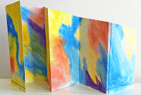
I made two little accordion fold booklets to post to Manon's Paper Saturdays, both painted randomly with watercolour front and back so that each side can be used for drawing or stamping.


FRONTS                                          BACKS

They are only small - 6 inches high by 16.5 inches - cut from a single sheet of paper.  I found these were the hardest things I've ever tried to photograph for a blog post, but I did my best! 


This is what they look like from above when they are folded out.


I wanted to make them just a little different from the usual by angling the top edge of each 'page' on a slant.

Very simple to make, but I like this kind of booklet, and it's easily slipped into a pocket or bag along with a pen when going out, just in case there's something to sketch.

--------

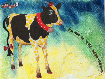
The next picture is a card I made and sent to my friend Karen a few weeks ago.  I hope she does't mind me showing it here, but I was really happy with the result.

The cow was a cut-out, and I decorated it with collaged hat, scarf and ribbon bow, and painted her 'toenails' red.  The yellow dots were added with a pen, and the cow collaged on to my own painted and textured background.


Last week I made a mess of trying to link up to Manon's Paper Saturday, and found I had posted the link as a new post on my own blog, which I had to delete quickly.  I hope I can manage to do it successfully this week.

Monday 15 April 2013

EMERALD - OR AT LEAST AS CLOSE AS I CAN GET


Emerald the Evil, the Green-Eyed Monster, 
just lying in wait for the chance 
to plant the seeds of envy 
in someone's unsuspecting heart.

I'm sure this is not what the Collage Obsession theme of 'Emerald' for this week, was supposed to produce.

My mind went through emerald jewellery, lovely dresses for red-haired ladies, fields of green in the Emerald Isle.  I even thought of something connected with the Emerald City but that's not having such a good press here in the UK at the moment.

I firmly decided to create some emerald jewellery designs, and even drew a hanging hook for the first earring ..... but when I put my pen on the paper, this is what happened.  I don't know where he came from, but I never do know where creatures like this come from.  I shudder to think what's inside my mind when I see this kind of thing developing on the page.

So, emerald may be seen mostly as a colour of beauty, green is also the colour of envy which, when it goes too far and becomes jealousy, can be one of the worst vices.


So let's put all the blame on Emerald the Evil.

I drew his outline with Pitt Artist's pen, and coloured him with Inktense pencil, and sparkly gel pens for his eyes and claws.  I wanted to get an unpleasant feel to his skin, so I put the fairly thin paper of my sketchbook directly on to my battered desk (i.e., ex-dining-table), so that the grain and other bits of battering affected the pencil work.  He's not really emerald in colour, but this is as near as I could get to it, whatever medium I tried.

As an example of pencil work it looks horrible, but that's what I wanted, and his skin makes my flesh creep.

I scanned the finished drawing into Photoshop and added the wiggly, snake-like border with a distortion filter called 'waves'.

So that's enough about him.

Now I'm looking forward to seeing all the really beautiful creations of other artists
over at Collage Obsession.  Why don't you take a look too.

P.S. - IF YOU HAPPEN TO BE COMMENTING
YOU ARE ALLOWED TO SAY
IT'S 'ORRIBLE.
I THINK IT IS!

Sunday 14 April 2013

I LOVE BLARLET


This is one of those 'coincidence' posts.  I had made some monochrome prints for Kristin Dudish's Tutorial Try Outs on Tuesdays, and had decided to complete some of them with red. 

Then I checked out this week's theme for Artist's Play Room and found we were to follow Tracey Fletcher's lead a few weeks ago of Blorange (a combination of blue and orange) and invent a name for two colours we like to use.  

I love working in black and red so I chose BLARLET.  It should really, of course, make the word Bled, or perhaps Bred, but neither of those is very interesting and have other connotations.  So I stepped sideways a little and combined BLACK and SCARLET to use for my prints, and this will also be my entry for Artist's Play Room this week.


You know those students who take a serious interest in everything a teacher is saying - and then go and do something different.  Here I am, guilty of just that.

The excellent tutorial was about gelatine printing.  I enjoyed the tutorial, but realised straight away that I really don't have the room or the facilities or even the time to try this type of printing.

Now taking a course or following a tutorial is really about learning something new and stretching oneself.  The gelatine seems to give a soft base, so I decided to find something I already had that would be softer than the usual printing plate, and came up with a kiddies pack of A5 foam sheets.  I taped a sheet to card with masking tape and set to.


I chose black because my first attempts with acrylic paint dried too quickly (and I was too lazy to mix it with flow improver as a retarder).  The only printing ink I had left was a tube of black, so that's when I decided to go with Blarlet, using a new foam sheet, and just make monochrome images.

For an inking-up sheet I used a paper palette with special shiny sheets made for using acrylic paint.  This saved some cleaning up at the end because I could just fold up the used sheet and put it in my waste bin.

I made about 30 prints, some OK, some reasonable and some failures, and the ones I show in this post are just a few that I was fairly happy with.  I like the way the masking tape forms a border around the prints, and in some cases I left it as a border.

This is the Blarlet version:


The printing was done yesterday, and today I had hoped to add the red with paint or pencils, but time being what it is, in the end I decided to cheat and add the colour on Photoshop.  I can always add the colour by hand another day.


I kept trying different materials for the masking pieces, and some proved less successful than others.  I can see that one advantage of the gelatine print seems to be that it is so soft that things like twigs sink into the gelatine and make a good image, whereas they didn't sink into the foam as successfully.  Even these stencils I made from thin card didn't show all the detail when I printed.

The images above show the first and second pulls - and I often like the second pull better than the first.  Here's the Blarlet version:


Again, I left the masking tape border - or at least most of it.  This has been over-cropped.  I like the contrast of the golden slipper with the black and red.


Some of the images were printed on thick white cartridge paper and others on cream.  I tried colouring the faces red but it didn't work, and I like the monochrome for the 'conversation piece'.  The ribbon print was not too successful, and I think I have posted it upside down, but I've included it because given more time it should be possible to make a better print.


The ribbon really stands out in red against the black background.


At this stage I experimented a little more, and placed a screwed-up-and-opened-out piece of cling film around another foam sheet, which I taped to card as well as I could.

The image isn't marvellous, but I can see that it has possibilities.  The print above has a look of a mysterious wood, so I'm quite pleased with it.


This was my last print.  It's  certainly different, and has a lot of movement.  The face mask was added just to see if it was possible to mix masking with the cling film, and it is.  More there to experiment with some time.

I wanted to experiment more with the cling film approach, but energy levels had dropped and I was tired - didn't even clear up much which I always try to do.

So, I'm sorry I didn't actually use gelatine, Kristin, but watching the tutorial did make me use a couple of printing methods I hadn't tried before, but that I will include in my printing 'armoury'.  And I've got plenty of prints that can be used in collages, etc.  So altogether I'm very glad I took the plunge.

Check out Tutorial Try Outs on Tuesdays here, and have a look at the Artist's Play Room in a few days for some great images.


Friday 12 April 2013

HAPPY ORANGES FOR A.P.R. - AND A BIT OF DOGGEREL TOO!


These three cheeky orange pals, with their orange leaf 'hair', are my first offering for the Artist's Play Room this week, on the theme of  'Fruit'.

In fact this is my 'Two for the price of One' week, because there is a painting with a different approach to the theme at the end of the post.

I drew the oranges with a Pitt Artist's pen and painted them with my trusty Inktense pencils.  I took them into Photoshop to experiment with different backgrounds, but everything I tried took away the graphic quality I like against the white background.


So I decided that they are three LEVITATING ORANGES.

How did I come up with the idea for this design?  Well looking at all the freshly bought fruit on our kitchen side table, my eyes were drawn to the oranges.  And they reminded me of childhood, when we used to do silly things with food (which was all right as long as we ate it afterwards).  I took photos to show you my starting point -


I cut out two wedge shapes, a largish one at the back and a smaller one on the front.  Then I took piles of photographs of them in different positions, and the ones in the collage were about the best.  You should be able to see where the smile and the teeth come from for my drawings.

This reminded me of another daft thing we did.  We would eat the orange from the wedge-shaped skin, and trim it to a size that would fit our mouths.  We then used a knife (no namby-pamby nonsense for us about kitchen safety in the olden days!) to slice a horizontal line almost through the pith, and vertical lines to shape 'teeth'.  Then we would stuff the 'false teeth' into our mouths and just act daft.

I did make a set of orange peel teeth yesterday and took a photo of myself wearing them, but it was ghastly and my beloved said I looked revolting, so I decided to save you the horror of seeing the photo.

So here are the Levitating Oranges again, together with their doodling doggerel:


WHEN FRIENDSHIP TURNS TO LOVE

Meet Hal, Hattie, Hugh, three sweet orange friends,
They've vowed to be buddies till life itself ends.

Now Hattie is loved by both Hugh and by Hal,
And each of them wants her for his special gal.

Hal gives her vacations, and chocolates to eat.
Hugh gives her rings, and 'Jim Choos' for her feet.

(Hattie hasn't got feet, but she does like nice shoes
And Hugh feels his gifts will help her to choose.)

Now Hattie's no dope, she piles on the soft soap,
And vows to each chap she will one day elope.

She tells Hugh, and then Hal, that she's ready to marry,
Then leaves and shacks up with a
lemon called Larry!

-----------------

That's enough silliness.  Here's my second offering for the APR 'Fruit' theme.


This was painted a while ago, but it seemed appropriate for the challenge.  It was painted using a 'wash-off' technique, with waterproof black ink and gouache.

Hope you enjoyed both the pictures and the post - I enjoyed every minute of doing them.